35 Hall Colour Combinations 2026: Wall Colour Ideas That Make Living Rooms Pop
Written by Karthik M, Chief Designer at Roomantic (IIT Guwahati, Design). Last updated August 2026.
Key Takeaways
- The hall is the one room every guest sees, so its colour combination does more reputational work than any other wall in the house.
- Two colours almost always beat one. A base shade on three walls, a deeper accent wall on the fourth. That single move is 80% of what people call "designer colour".
- Paint is the cheapest big decision in your home. A repaint costs a fraction of redoing a wardrobe, so this is where you're allowed to be brave.
- Small or dark hall? Light-reflective bases win: off-whites, warm sands, icy blues, muted sage.
- Sample on your actual walls before committing. Every shade shifts with your light direction, so the right wall colour combination is always a local decision.
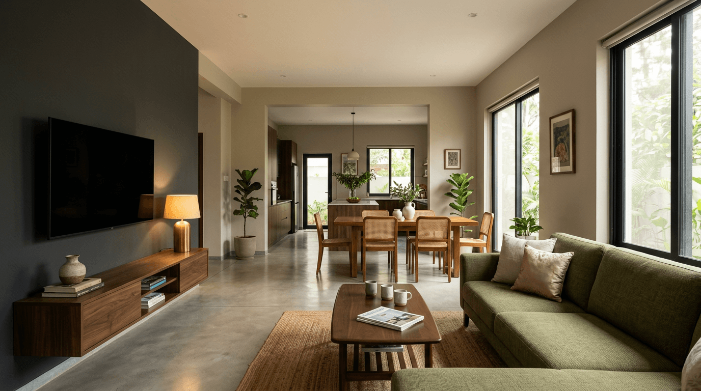
The 2026 palette shift, in three sentences. Indian living rooms are moving away from cool greys toward warm minimalist earth tones — sand, clay, olive, cream. Jewel shades survive as single feature walls, not full rooms. And biophilic sage-and-cream pairings are the fastest-growing brief we see, because they carry warmth in both daylight and evening lamp light.
The Best Wall Colour Combination for Living Room Walls: 2026 at a Glance
These are the stylish colour combinations for Indian halls leading the year — the wall colours, the accents, and where each combination works:
| Combination | Base Shade (60%) | Accent (30%) | Best Light | Suits |
|---|---|---|---|---|
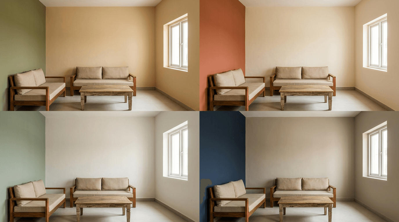
| Earthy Olive & Sand | Warm sand | Muted olive green | Warm white (3000K) | Most Indian halls |
| Terracotta & Cream | Soft cream | Baked terracotta | Strong natural light | Large, bright halls |
| Sage & Off-White | Chalky off-white | Dusty sage | North-facing rooms | Small halls |
| Navy & Warm Grey | Warm greige | Deep navy feature wall | Halls over 180 sq ft | Modern interiors |
| Blush & Ivory | Ivory | Muted blush clay | Any | Compact apartments |
Why Your Living Room Wall Colour Combination Matters Most
We design and build interiors, which means we pick a colour, paint it, and then stand in that hall two years later when the client calls us back for the next room. That feedback loop teaches you things a shade card can't.
The biggest lesson: nobody regrets a calm base. They regret loud full-room colours, and they regret flat single-colour walls that make the room feel like a corridor. The fix for both is the same — a considered two colour combination.
(A quick language note. Hall, living room, and drawing room mean the same space in most Indian homes. And on US sites you'll see the same advice filed under color combination, wall color and paint color ideas — same walls, same rules, different spelling. If you browse international galleries, searching wall color combination for living room surfaces a whole different set of images worth borrowing from.)
One honest note before the gallery. You'll see paint brands publish these lists with exact shade codes. We don't specify codes in an article, because the same code reads completely differently in a South-facing Hyderabad hall and a North-facing Pune one. Colour design is mostly light management. Shade families first; codes at the sampling stage, on your wall.
Two-Tone Wall Colour Combination Ideas for Living Room Walls (Designs 1–12)
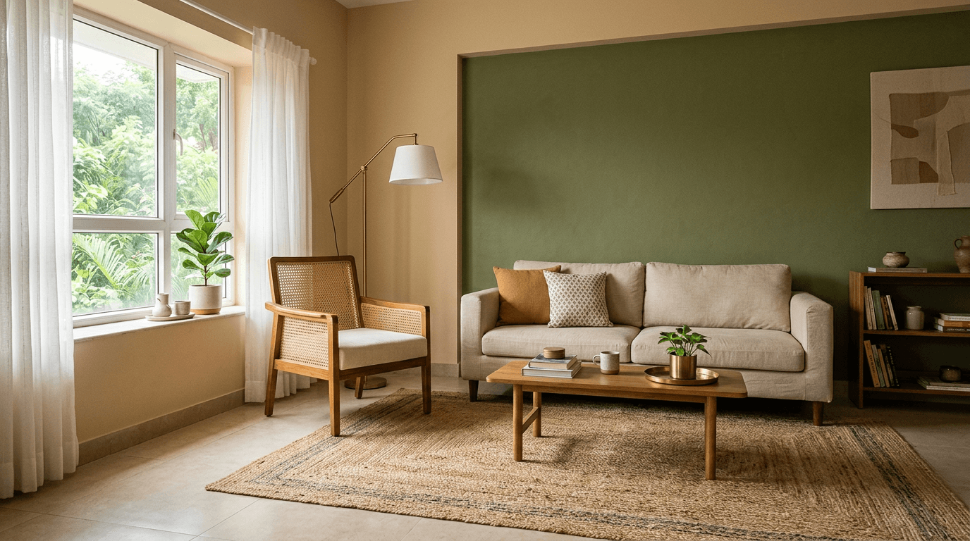
The double colour formula is the most searched colour combination for living room walls in India: one quiet shade over roughly 60% of the room, one deeper partner on the feature wall. These living room colour combinations are the pairings we keep returning to.
- Warm sand + muted olive. The 2026 default. Earthy, forgiving, flatters wood.
- Cream + terracotta. A colour like terracotta brings sunset warmth without orange walls everywhere.
- Off-white + dusty sage. The biophilic pairing, and an easy choice for living rooms that face traffic noise and need calming down.
- Warm grey + deep navy. Crisp and modern. Needs decent light.
- Ivory + blush clay. Soft, flattering to skin tones in evening light.
- Pale butter + walnut brown. A classic colour pairing — old-school, very Indian, very durable.
- Light greige + charcoal. The grey colour route for monochrome lovers who don't want a cold room.
- Sky mist + indigo. A blue colour story that stays serene, not corporate.
- Almond + burnt sienna. Pairs beautifully with terracotta pots and cane.
- Soft white + forest green. High contrast, but green forgives clutter.
- Pistachio + deep teal. Two greens, one light and one moody. Surprisingly easy to live with.
- Warm white + ochre yellow. The cheerful one. A bold colour like ochre belongs on a single wall.
If you're stuck, start at number one. In our Hyderabad projects it's the combination clients pick most often once they see it rendered, because it works with every wood tone from teak to walnut. There's no single perfect living room wall colour in the abstract — there's the one that survives your light.
Beige & Neutral Wall Colour Combinations for Indian Living Rooms (Designs 13–18)
Beige got boring because people used one beige everywhere. Layer two or three neutrals of different depths and a neutral wall colour combination turns quietly expensive-looking instead.
- Double beige. A pale biscuit base with a caramel feature wall. Zero risk, real depth.
- White + warm beige with wooden trim. The white wall colour combination is still the most popular wall colour route across India, and warming it up is what keeps it from feeling clinical — every colour combination with white gains light.
- Greige + mushroom. Grey-leaning neutrals for modern furniture.
- Ivory + tan leather shades, matched to a tan sofa.
- Neutral + textured neutral. Same shade, one wall in a subtle lime-plaster or rustic texture finish.
- Warm white + oatmeal, with black metal accents doing the contrast work.
A real example. For Dr. Kirti Goud's 4,000 sft apartment in My Home Bhooja, the brief was a rental-ready home she could stay carefree about. We kept every surface in universally acceptable colours — timeless neutrals, least-maintenance finishes — because a rental hall has to please tenants we'd never meet. Years of design thinking in one sentence: neutrals are not a compromise, they're a strategy.
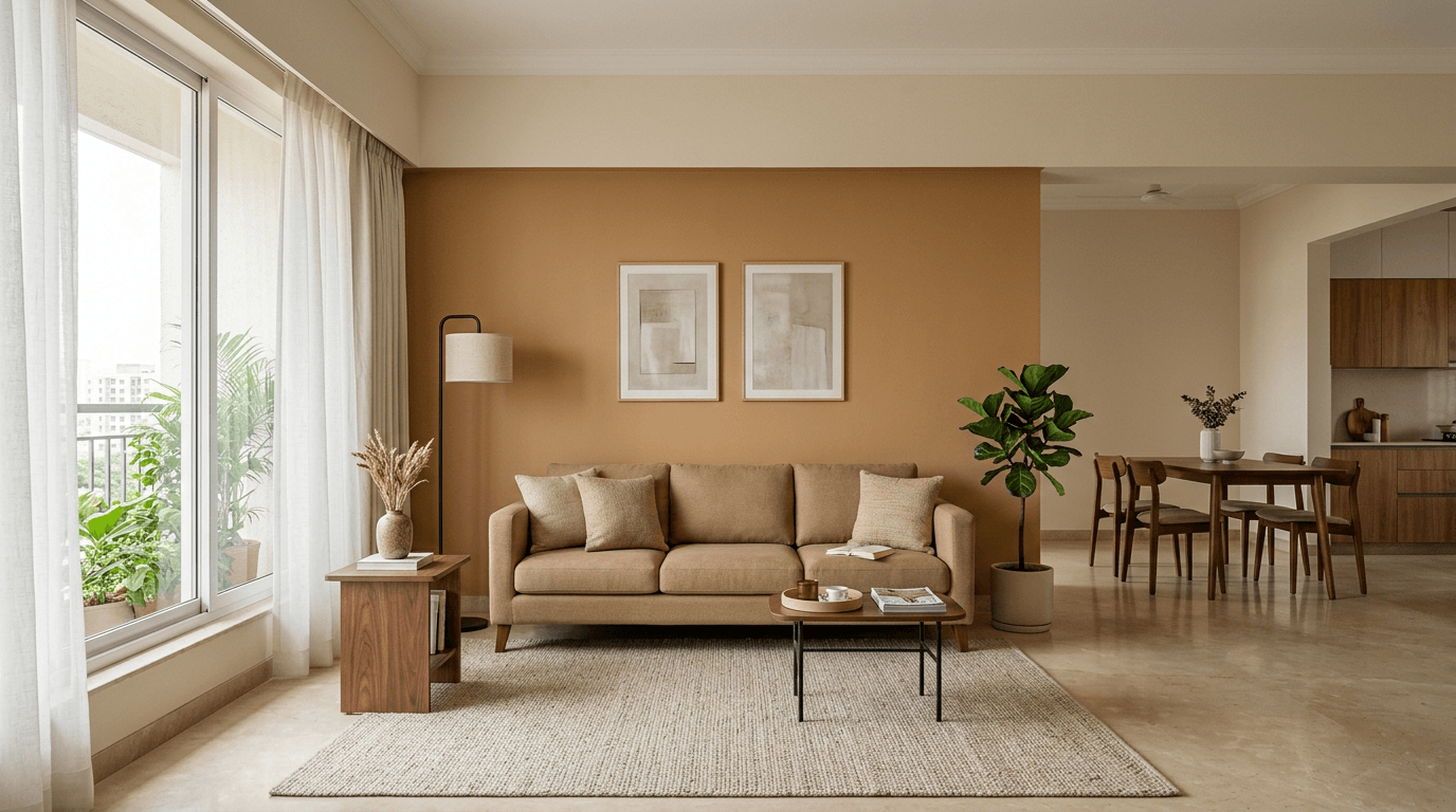
Bold & Rich Colour Combinations for the Living Room: Accent Wall Ideas (Designs 19–24)
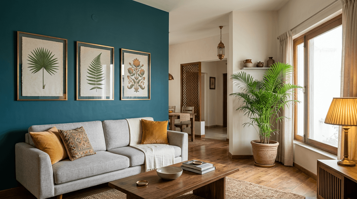
A bold shade on one wall of the living room is a fully reversible decision. That's why we push hesitant clients here rather than toward bold furniture — living room paint is the cheapest brave thing you can do.
- Charcoal accent + warm white. The TV wall favourite; screens disappear into it.
- Deep teal + brass accents. A rich colour with jewel-box depth, one wall only.
- Wine + blush. Dramatic but warm. Wants warm white lighting.
- Forest green + cane furniture. The green wall makes every plant look intentional.
- Ink blue + white trim. Crisp, slightly colonial, ages well.
- Aubergine + grey. A unique combination in a genuinely different colour direction — for clients who've done beige twice already.
For Navya Reddy's parents' apartment, the brief was literally "cozy, simple yet bold" — a retired army couple, a grandmother whose sentimental old bed we refurbished rather than replaced, and a memory wall for family photographs. The bold move wasn't colour everywhere. It was one strong wall carrying the memory display, with everything else kept simple. That's how a bold combination works in a family hall: concentrated, not scattered.
Simple Hall Colour Combination for Small House: Room Colour Combinations That Make Every Room Look Bigger (Designs 25–30)
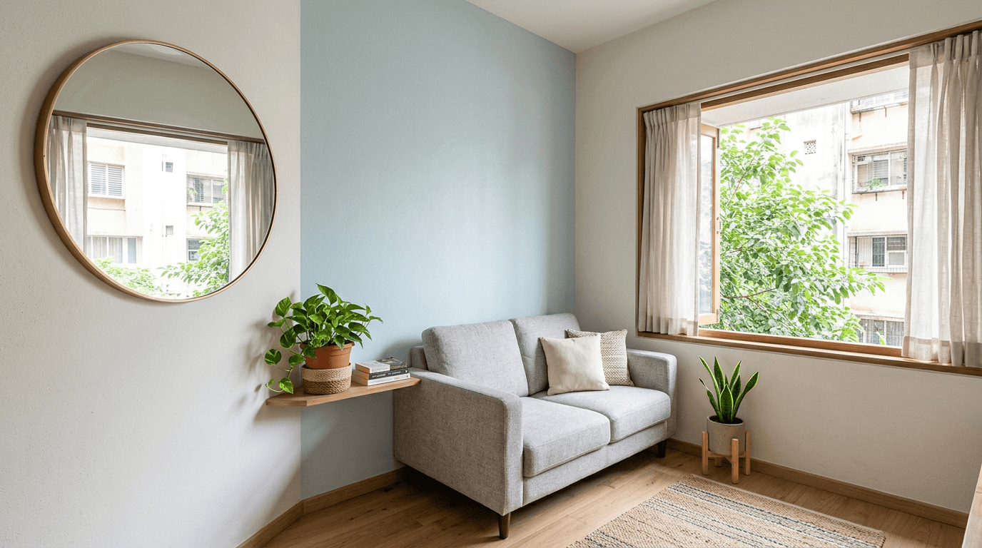
The question we get most: what's a calming double colour combination for a small, dark living room? Short answer — a light-reflective base plus a soft mid-depth accent. Dark shades opposite the window make the room shrink; pale ones push the walls apart. These are the small-space room colour combinations that make your living room look bigger than the floor plan says.
- Off-white + icy blue. The small-hall workhorse.
- White + pale sage. Fresh without feeling cold.
- Cream + light peach. Warms up North-facing rooms that never get direct sun.
- Pale grey + powder blue. Coolest of the set; best where afternoon sun overheats the room.
- Ivory + muted lilac. Unexpected, gentle, photographs beautifully.
- One colour, two finishes. Same soft white in matte on three walls and eggshell sheen on one. The sheen wall bounces light like a second window, making the room feel taller and wider at once.
Sometimes the answer isn't paint at all. In Pushpa Nilayam G2, a 1,000 sft apartment, Mrs. Padmavathi's living area needed more light than its walls could reflect. We removed the old showcase between kitchen and living and made a window there instead. Light first, then colour — a pale colour scheme in a hall with borrowed light beats any clever combination in a dark one.
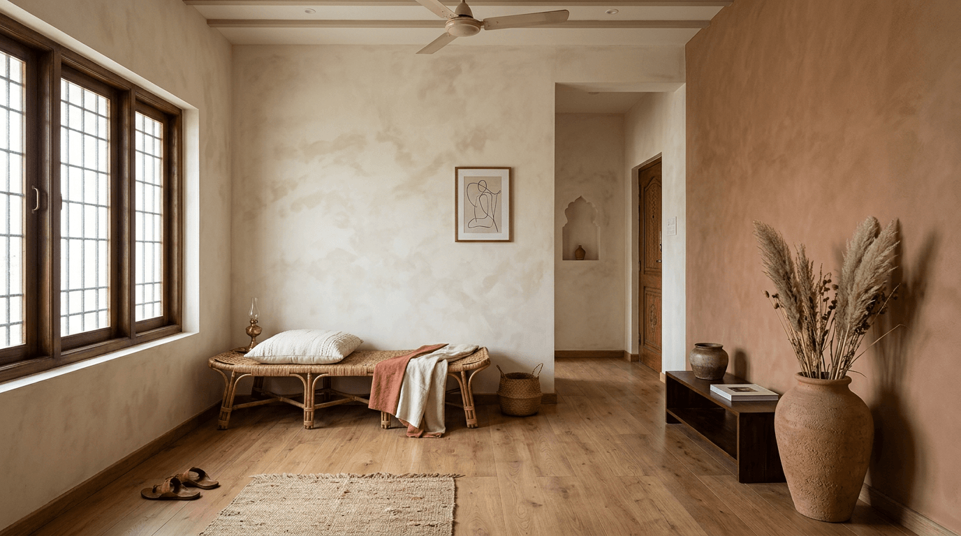
2026 Colour Trends: A Warm Home Colour Palette for Every Living Room in 2026 (Designs 31–35)
Home colour trends this year lean decisively warm. This is the colour palette territory we're actually specifying, not just pinning.
- Clay + cream + rattan. The warm minimalist earth-tone stack. If 2026 has one look, it's this.
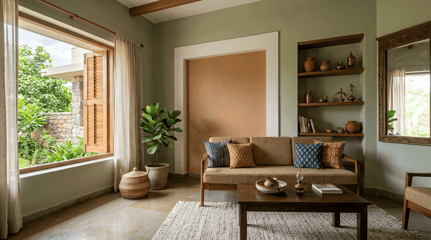
- Sage + cream + unlacquered brass. Biophilic and slightly vintage at once.
- Chocolate + latte. Browns are back in living room decor, layered like a coffee — dark below the dado line.
- Limewash texture in bone white. Not a colour, a surface — soft cloudy variation that makes white walls feel handmade.
- Monochrome warm white. The confident minimalist option: one warm white everywhere, contrast from wood, stone, and shadow.
If none of these five fit, the earlier galleries hold thirty more wall colour combinations to raid — the colour combinations don't expire, only the styling around them does.
Number 35 deserves a story. Mr. Manikantha's 3-bedroom apartment brief was clean, low-maintenance, zero open shelves, minimalistic — and it remains the only home we know without a television. When the walls stay one quiet colour, the room's interest has to come from proportion and material. It's still beautiful years later, which is the whole argument for restraint.
How Do You Choose the Right Wall Colour Combination for Your Hall?
Measure the room, face the light, then apply 60-30-10: a base colour on 60% of surfaces, a secondary on 30% (feature wall or large furniture), and an energetic 10% in decor. An interior colour combination is really just this rule applied with taste. There is no perfect colour, only the right wall colour combination for living room and hall light. Match the base to your light direction — warm shades for North-facing halls, cooler ones where the sun is generous.
Your Colour Choice Checklist for Indian Homes: Tone, Light & Different Room Sizes
Three checks in the colour selection before you buy a single litre of paint:
- Room size. Under about 150 sq ft, stay light everywhere. Over 180 sq ft with good windows, you've earned a dark accent wall.
- Light direction. North light is cool and constant — warm your base (cream, sand, peachy warmth). South and West light is warm and strong — cooler bases like sage, greige, and blue survive it better.
- What's staying. Flooring, sofa, and curtains outlast paint. The right colour flatters what you already own, not the other way round. Your colour choice is really a furniture decision in disguise.
And sample properly: a 2 x 2 ft patch on two different walls, checked at noon and again under your actual evening bulbs. Test the wall combination at night too — bulbs betray more colours than daylight does. Every client who skips this step calls us within a week of painting.
Matte, Eggshell or Texture: Living Room Paint Finishes & the Wall Paint Colour Combination
The wall paint colour combination is only half the decision; the finish is the other half. Matte hides wall imperfections and looks the most premium, but marks easily — fine for adults, risky at toddler height. Eggshell and satin take a wet cloth, which is why we default to them in family halls. Texture finishes (rustic, combed, lime-plaster) turn one wall into decor by themselves, and cost sits in a clear order: plain emulsion, then premium emulsion, then texture, then panelling. If budget is tight, spend on preparation — putty and primer — before you spend on the fancy tin. Smooth walls make an ordinary paint look expensive; bumpy walls make an expensive paint look ordinary.
Colour Combination for Hall Types: A Stylish Interior Colour Combination Cheat-Sheet
Different halls need different colour combinations, so here's the shortcut version — the living room colour combination we'd reach for first in five common situations, with the wall colours and paint finish spelled out. Treat it as a starting colour scheme, not a verdict; your light gets the final vote on the colour combination for hall walls.
| Your Situation | Wall Colours (Base + Accent) | Why This Colour Combination | Paint Finish |
|---|---|---|---|
| Compact 2BHK living room | Off-white + icy blue | Light-reflective colour combinations enlarge small living room walls | Matte base, eggshell accent |
| Large villa living room | Warm sand + muted olive | Earthy colour combinations ground big volumes | Premium matte |
| Rental apartment hall | Biscuit beige + caramel | Neutral colour combinations please every tenant | Washable eggshell |
| North-facing living room | Cream + light peach | Warm wall colours offset cool constant light | Matte |
| Open-plan hall + dining | One warm greige throughout + charcoal TV wall | A single-base colour combination unifies zones | Matte, satin on TV wall |
Notice the pattern: the paint gets quieter as the room gets smaller, and every living room colour combination here keeps the ceiling white. That part is non-negotiable. Wall colours behave like clothes — the same colour combinations read differently in every body of light, which is why the sampling step below matters more than any table.
Colour Psychology, Warmth & Vastu Colours for Hall Walls
Colour psychology in one paragraph: warm earth tones read welcoming and grounded, greens read restful, blues read calm but can go cold under white LED light, and high-saturation reds and oranges raise energy — great for a cafe, tiring for the room you unwind in. Pick the mood you want, then the shade. If you want your living room to be the room people relax in, warmth wins.
On Vastu: every Roomantic project is designed vastu-informed, and halls are usually best placed North or East, where tradition favours light, airy colours — whites, creams, light greens and blues — as auspicious and welcoming. Deeper shades sit better on Southern walls if you use them at all. If Vastu matters to your family, treat it as a tiebreaker between shades you already like; it aligns surprisingly well with what daylight physics would tell you anyway.
Coordinating Wall Colours With Sofa, Curtains, Decor & TV Wall
Colour combinations for the living room never perform alone. The sofa is the third colour in the room whether you planned it or not, and the best interior schemes decide the hero before the shade card comes out.
- Sofa: neutral sofa, braver walls; colourful sofa, quieter walls. Pick one hero before choosing an accent colour for your living room. Our sofa design guide goes deeper on fabric and colour.
- Curtains: one step lighter or darker than the wall they hang on, never a perfect match. Perfect matches make the room look like a showroom.
- TV wall: darker shades hide the black rectangle; a charcoal or deep olive TV wall is the easiest upgrade in this whole article. We've collected full ideas in our TV unit design gallery.
- Wood tones: warm woods (teak, honey oak) love earth tones; cool woods (walnut, wenge) handle greys and blues.
What the Best Interior Colour Designers Do Differently
In Hamsini's three-generation home, the connected ground floor had to work for grandparents, a teenage son, and the couple. A single continuous wall colour would have flattened it; a different colour per zone would have chopped it up. We held one base shade across the floor and let each zone change through furniture and accents instead — one hall wall colour scheme, many moods. That's the coordination principle: walls unify, furnishings differentiate.
One boundary worth naming: colour behaves differently in every room. The stylish charcoal that anchors a hall can deaden a bedroom, and kitchen cabinets change the maths entirely. This page stays with the hall; for the whole-home logic see our room colour combination guide, and for sleep spaces the bedroom colour combinations guide — each different room gets its own palette rules.