45 Room Colour Combinations: Wall Colour Ideas for Every Room in 2026
Written by Karthik M, Chief Designer at Roomantic (IIT Guwahati, Design). Last updated August 2026.
Key Takeaways
- A wall colour combination fails for one of four reasons: wrong undertone, wrong split, wrong light, or wrong sheen. The shade name is almost never the real problem.
- The 60-30-10 rule does most of the heavy lifting: 60% dominant wall tone, 30% secondary, 10% accent. A flat 50-50 pairing nearly always looks unfinished.
- Indian daylight is bright and warm. The LED tube that replaces it at 7pm often isn't. Judge every shortlist twice — once at 11am, once at 9pm.
- North-facing rooms need warm undertones or they go grey and lifeless. South and west-facing rooms carry cooler, deeper wall colours comfortably.
A good room colour combination pairs one dominant wall tone with a secondary tone and a small accent, in roughly a 60-30-10 split. Pick the dominant tone by the room's light: warm neutrals for north-facing rooms, cooler or deeper paint colours for bright south and west-facing rooms. Sample both shades on the real wall before you buy.
Nearly every colour conversation we have with a client opens the same way. Someone unlocks a phone, holds up a screenshot, and says "we want exactly this."
Then it goes on the wall, and it is not that.
The screenshot was shot in a studio, or in a European flat under soft grey sky, or with a filter doing quiet work in the background. The same paint on a Hyderabad wall at 2pm, sun bouncing off the neighbour's white parapet and straight through the window, reads two steps brighter and one step warmer. Nobody chose badly. The room just did what rooms do to colour.
So this guide runs in two halves. First the theory: the four things that decide whether any wall pairing works. Then 45 colour combination ideas grouped room by room, so you can shortlist tonight. If you read only one half, read the first one. The pairing list is easy to replace. Understanding why your beige turned pink is not.
One note on spelling, because it trips people up mid-search. Colour combination and color combination are the same thing: British spelling here, American spelling in most US magazines. So when an American site publishes living room paint color ideas, or argues about the best wall color for a north-facing room, it is describing exactly what we'd call a wall colour combination. The theory travels perfectly. The examples often don't. A paint color picked for a grey London winter behaves differently in Indian homes, where daylight is stronger and warmer for most of the year, and a shade that reads soft there can read chalky here. We've kept the theory and swapped every example for a room color scheme we've actually specified on site.
For the wider view of feature walls and wall treatments, our wall design pillar covers the whole territory. If your shades are already picked and you want technique — texture, stencil, roller work — that lives in wall painting design.
How to Choose a Wall Colour Combination That Actually Works
Work in this order: read the room's light, choose the dominant tone's undertone to suit that light, add a secondary tone two or three steps different in depth, then one accent. Sample both on the actual wall and look at them at midday and again at night before you commit to anything.
Four checks. Same order, every project that leaves our studio. They apply equally to bedrooms, kitchens and living rooms — only the answers change.
Undertone: Why Your Beige Turned Pink
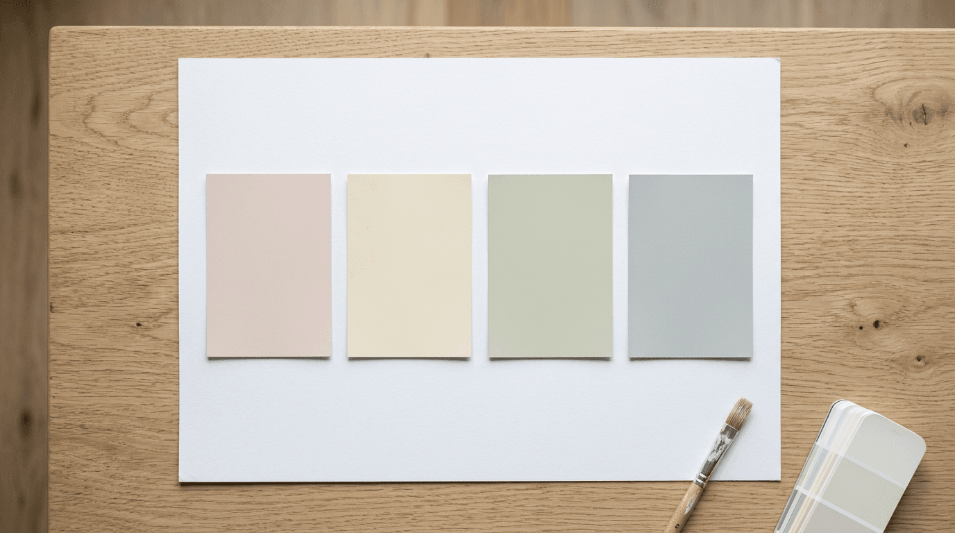
Every neutral has a bias hiding underneath it. Two greys that look identical on a fan deck turn out one blue-grey and one green-grey once they're up. Beige swings pink, yellow or grey depending on the mix. Whites swing warm or cold.
That hidden bias is what clashes, not the shade you actually chose. A pink-leaning beige beside a green-leaning grey is the most common ugly pairing we're called in to fix, and neither shade is at fault on its own. They're just arguing about which direction warm means.
Fastest test in the world: hold both candidate cards against a sheet of white printer paper. Against true white, the bias jumps out immediately. Do it before you buy anything.
The second undertone nobody checks is the floor. Your tiles or wood have a bias too, and unlike the walls, you can't repaint them. A yellow-toned vitrified tile quietly pulls every cool grey in the room towards green.
The 60-30-10 Rule, and Why 50-50 Looks Wrong
The reason a designed room looks settled is proportion, not shade choice.
- 60% dominant — usually three walls plus the ceiling.
- 30% secondary — the fourth wall, or the curtains, sofa and rug together.
- 10% accent — cushions, a chair, art, a strip of something braver than the rest.
Split a room evenly between two shades and it reads as undecided. Your eye wants a clear main tone and a clear supporting one, in that hierarchy. This single rule of thumb explains why a colour combination works in a magazine and collapses when copied at equal weight.
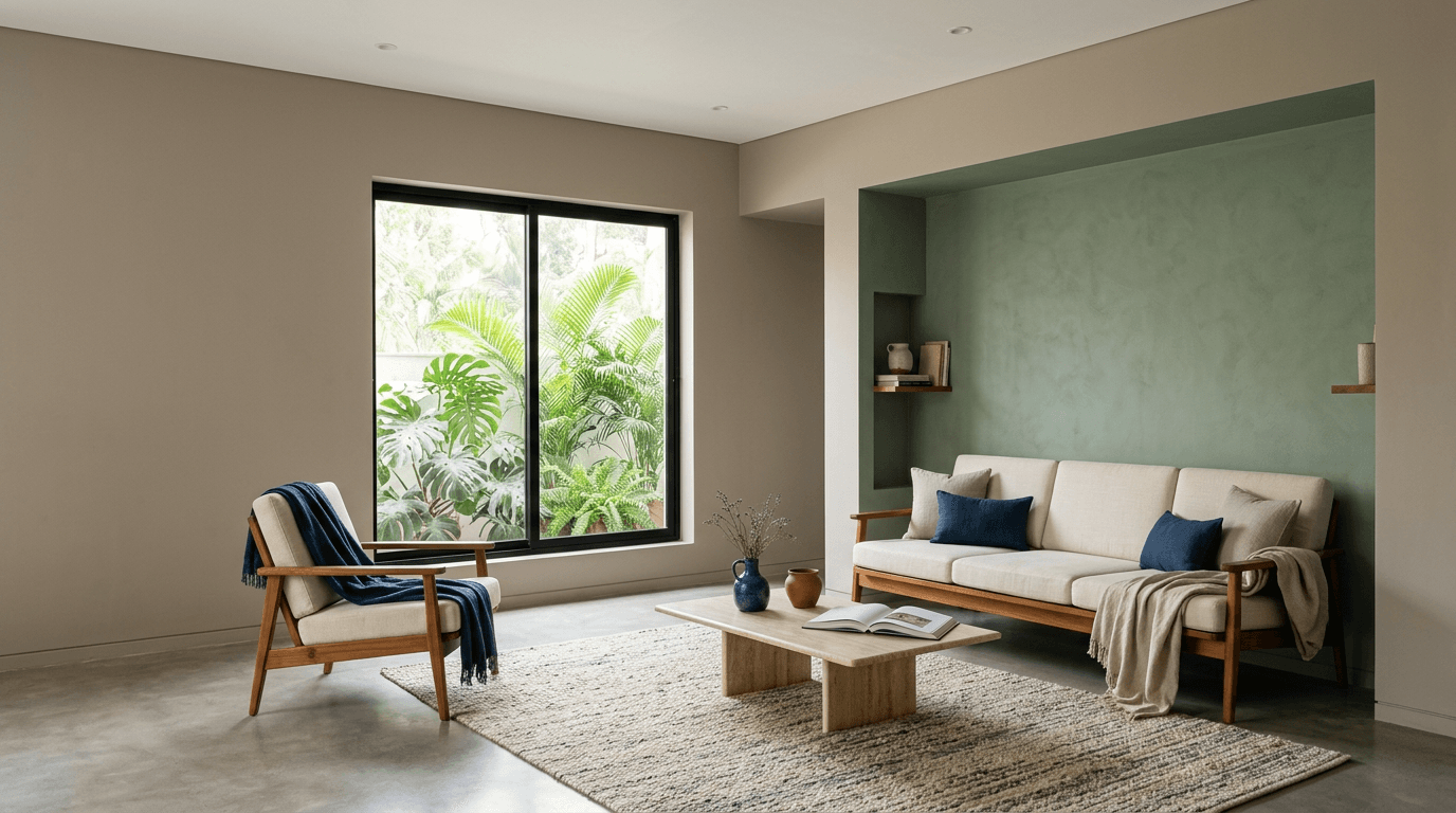
It also gives you a cheap way to be adventurous. Deep teal is a big commitment on 60% of a room. On 10%, as a chair and two cushions, it's a weekend decision.
How Daylight Changes a Wall Colour: Natural Light by Direction
Direction matters more than people expect, and it's the one variable fixed for the life of the house. India sits in the northern hemisphere, so the same orientation logic used by British and American colour editors applies directly here — with one adjustment. Our daylight is stronger and warmer for more of the year, so every shade lands a step brighter than the swatch promises.
| Room faces | The light you get | What the walls want |
|---|---|---|
| North | Soft, even, slightly cool; no direct sun at all | Warm undertones — cream, oat, warm greige. Cool greys go flat and dreary here |
| South | Bright and warm through most of the day | Handles cooler and deeper wall colours well. Warm shades intensify, so go a step softer |
| East | Warm early, cooler by afternoon | Mid-tone neutrals are safest. Check your sample in the afternoon, not at breakfast |
| West | Neutral mornings, strong warm glare by evening | Deep and cool tones hold up. Warm oranges and yellows can turn aggressive at 5pm |
The practical version: paint an A3 patch on two different walls of the room, not one. A north wall and a west wall in the same room can make one shade look like two.
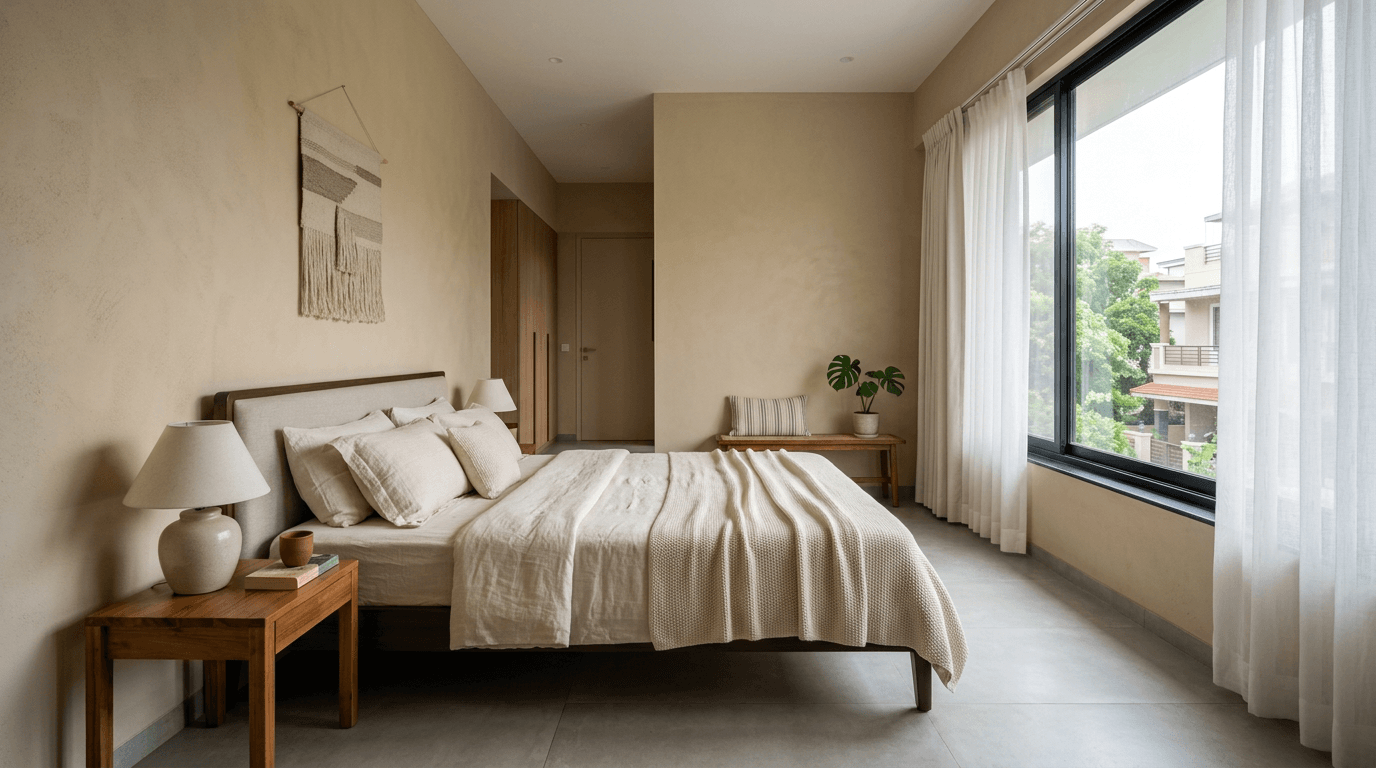
What Tubelight and LED Do to Wall Colours After Dark
This is the check almost everyone skips, and in homes across India it matters more than anywhere else, because most rooms switch from strong daylight to LED tubes and panels in one step.
- Cool white, around 6500K. Drains the warmth out of creams and makes beige look slightly dirty. Fine over a kitchen counter, harsh across living rooms.
- Neutral white, around 4000K. The safest all-round choice when you want the daytime and night-time versions of a room to broadly match.
- Warm white, around 2700K. Pushes greys towards brown and makes greens muddier. Lovely in bedrooms, unforgiving on a cool scheme.
If your evening lighting is cool white and your shortlist is warm, you have effectively chosen two rooms — one for 11am, one for 9pm, and you'll only like one of them. Our home lighting design guide goes properly into temperature and layering.
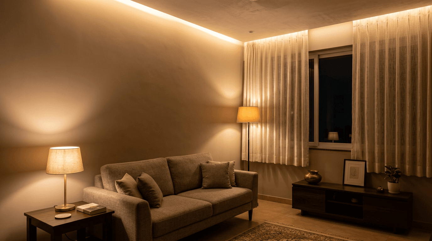
Contrast and Depth, Not Just Hue
Two shades can share a hue family and still fight, because contrast is about how light or dark they are, not what colour they are.
A useful shortcut: pick your two tones at least two or three steps apart on the same brand strip. Adjacent steps read as a mistake — as if someone ran out of paint mid-job. Three steps apart reads intentional. Six steps apart reads dramatic, and needs a room bright enough to carry it.
That's the whole reason a white wall colour combination with charcoal works so reliably: maximum depth difference, zero undertone argument.
Warmth, Calm and Energy: What a Wall Colour Does to a Mood
Warm tones (clay, terracotta, ochre, warm cream) advance visually and make a large space feel more sociable. Cool tones (sage, misty blue, greyed lavender) recede and read as calm, which is why they dominate bedroom briefs. Depth matters as much as hue: a deep tone anywhere lowers the perceived energy of a room, warm or cool.
This is where most of the folklore lives, so treat it lightly. Red does not make people angry and blue does not make them productive. What tones reliably do is change apparent distance and apparent brightness, and those two effects are enough to explain most of what people mean when they say a space seems welcoming or unwelcoming.
Practical version: if a space is used for talking, keep it warm. If it's used for resting, keep it cool or deep. If it's used for working, keep it neutral and let the lighting do the work.
Where an Accent Wall Earns Its Place
An accent wall works when the room already has a focal point — the bed head, the sofa, the television, a niche. Painting the wall the eye already goes to strengthens what's there. Painting a random wall creates a second focal point and the room stops making sense.
On one Hyderabad apartment for a client's retired parents, the brief was "cozy, simple yet bold", and the grandmother wanted a memory wall plus her own sentimental bed refurbished rather than replaced. Both of those decided where the bolder tone went. That's usually how it should work — the object comes first, the shade follows.
Palette, Colour Scheme and Undertone: The Words We Use
Palette, or colour palette. Every tone in the room, including furniture and fabric — not just what's on the walls. A room can have two wall shades and still carry a six-tone palette.
Colour scheme. The plan for how those tones get distributed. Two rooms can share a palette and end up with completely different schemes.
Value. How light or dark a tone is, independent of hue. Contrast is a question of value, which is why a photograph in black and white tells you more about a pairing than the colour version does.
Colour drenching. Walls, ceiling and trim in a single shade, with no contrast lines anywhere.
Accent wall. The one surface carrying the boldest tone in the room.
Interior colour combination versus home colour combination. The first is one room solved on its own. The second is a home colour plan that runs across every space and reads as continuous. That's a genuinely different exercise, and we've split it out into the house colour combination guide.
Everything on this page is about paint. Fabric, art and home decor do the last 10% of the work, and that decor layer is far easier to change than a wall.
Best Wall Colour Combination for Each Room: The Quick Table
Steal this if you want a shortcut. Every pairing below is one we've specified on real projects, and each is a defensible answer to "what's the best colour combination for this room?" There is rarely one right wall colour combination for a space — only ones that suit the light you happen to have. Treat these as wall colour combination ideas to test, not as instructions.
| Room | Main wall | Accent | Feel |
|---|---|---|---|
| Master bedroom | Warm taupe | Sage green | Quiet, restful |
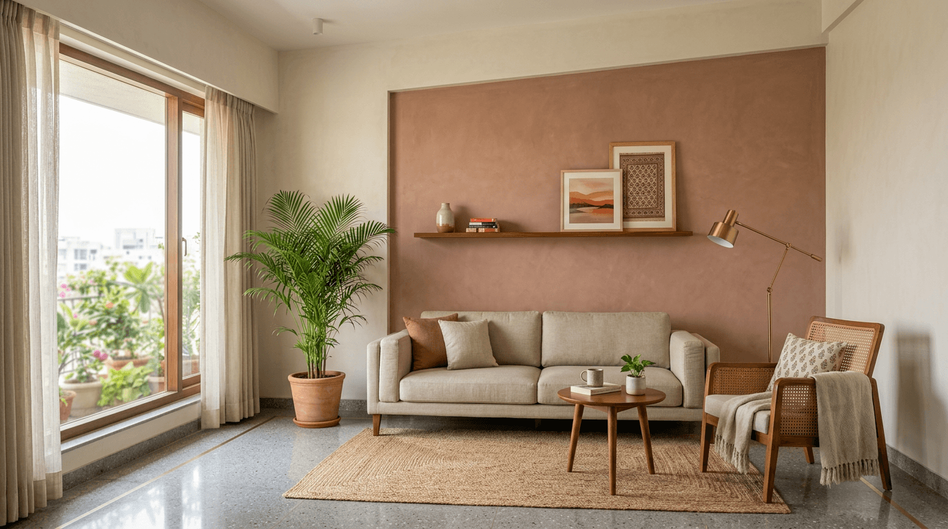
| Living room | Creamy white | Terracotta | Warm, modern Indian |
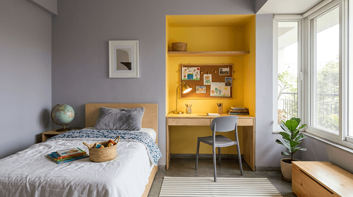
| Kids room | Soft lavender | Sunny yellow | Playful, awake |
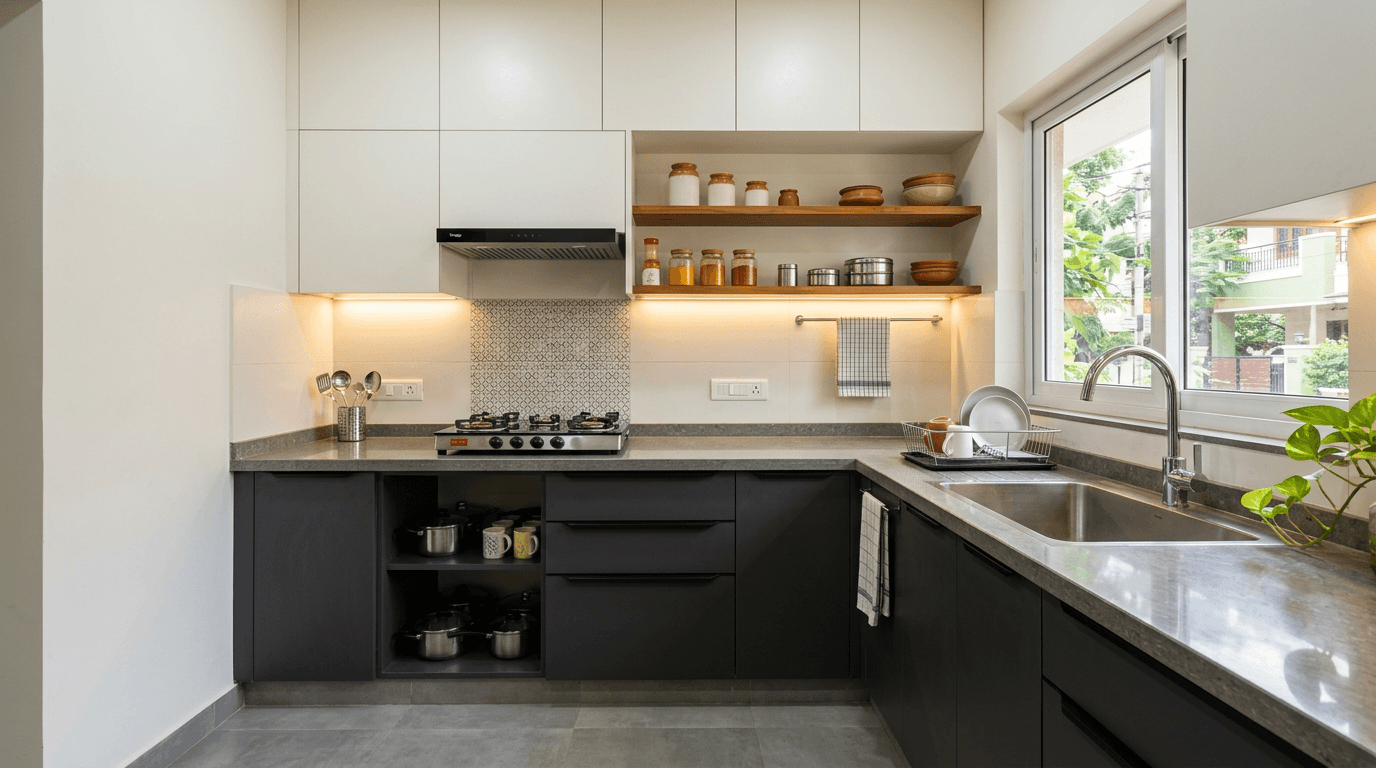
| Kitchen | Off-white | Charcoal | Sharp, easy to wipe |
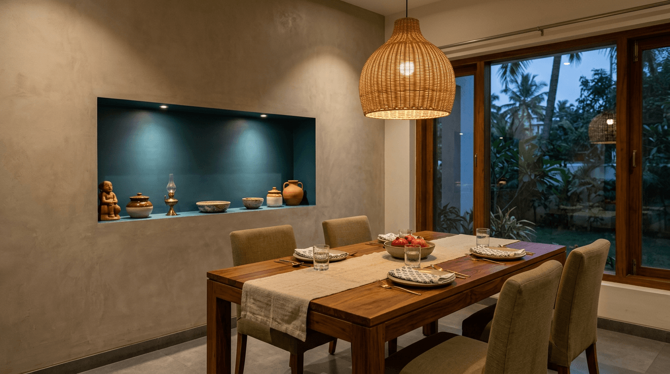
| Dining | Warm greige | Deep teal | Intimate, evening-friendly |
| Study | Pale sage | Walnut brown | Focused |
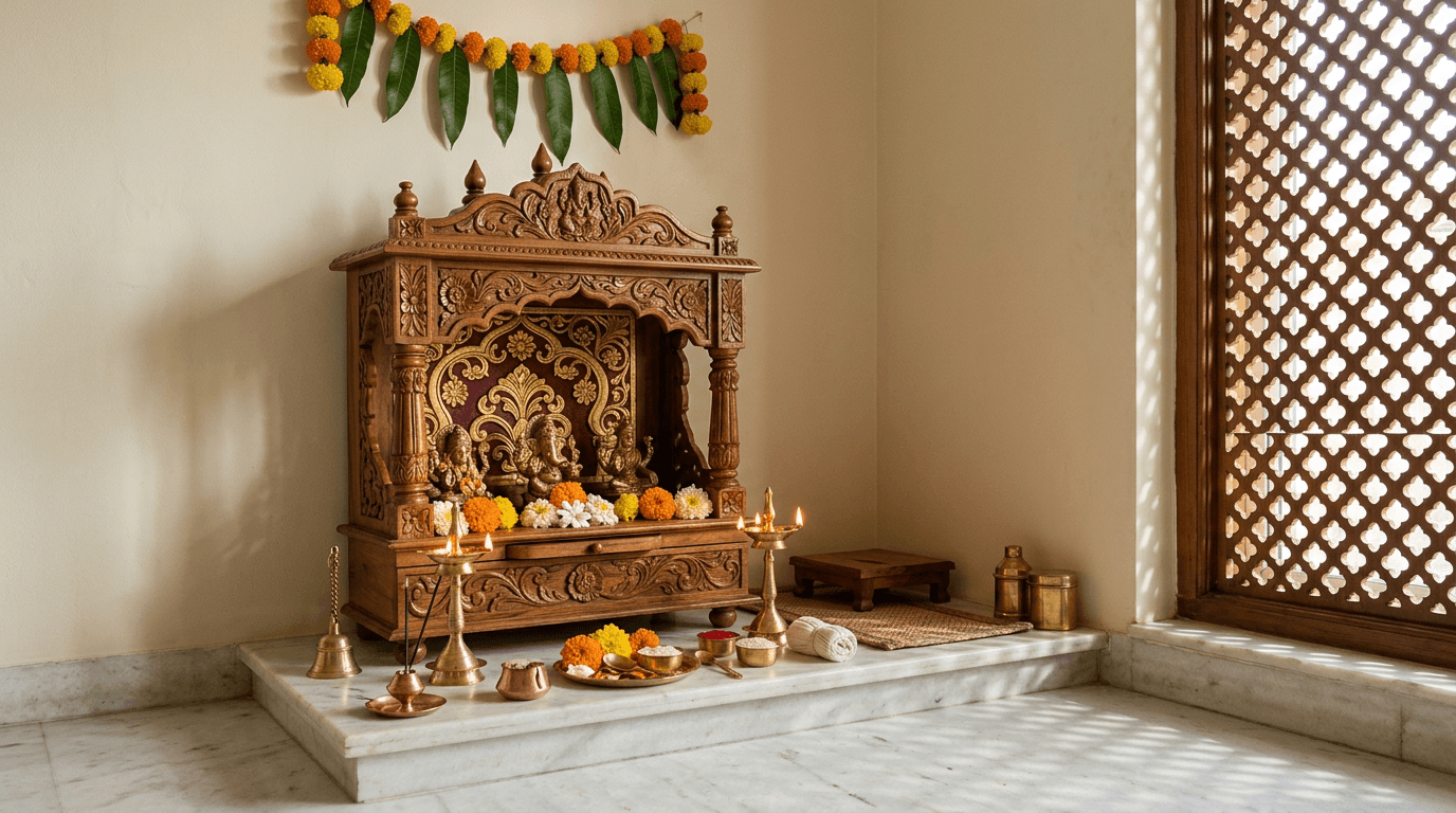
| Pooja room | Ivory | Marigold gold | Calm, ceremonial |
| Entryway | Sand | Black metal | Crisp first impression |
45 Colour Pairings, Room by Room, for 2026
Grouped by room. Each idea names the dominant tone first, then the accent, plus a note on where it earns its place. Nothing here needs specialist application — these are standard paint colours in any dealer's mixing machine. Each one is a straightforward wall paint colour combination: a dominant tone, a secondary, one accent. If you'd rather see paint colour combinations grouped by aesthetic than by room, the 2026 forecast further down does exactly that.
Living Rooms: Paint Colour Ideas for Walls (1–10)
Living rooms take the most abuse from light. They're usually the largest space in the flat, they carry the biggest windows, and they're the room every visitor forms an opinion in. Living room walls also hold the television, the sofa and most of the family's clutter, so a busy scheme ends up fighting everything already parked in front of it. Start conservative on the surfaces, be brave in the 10%.
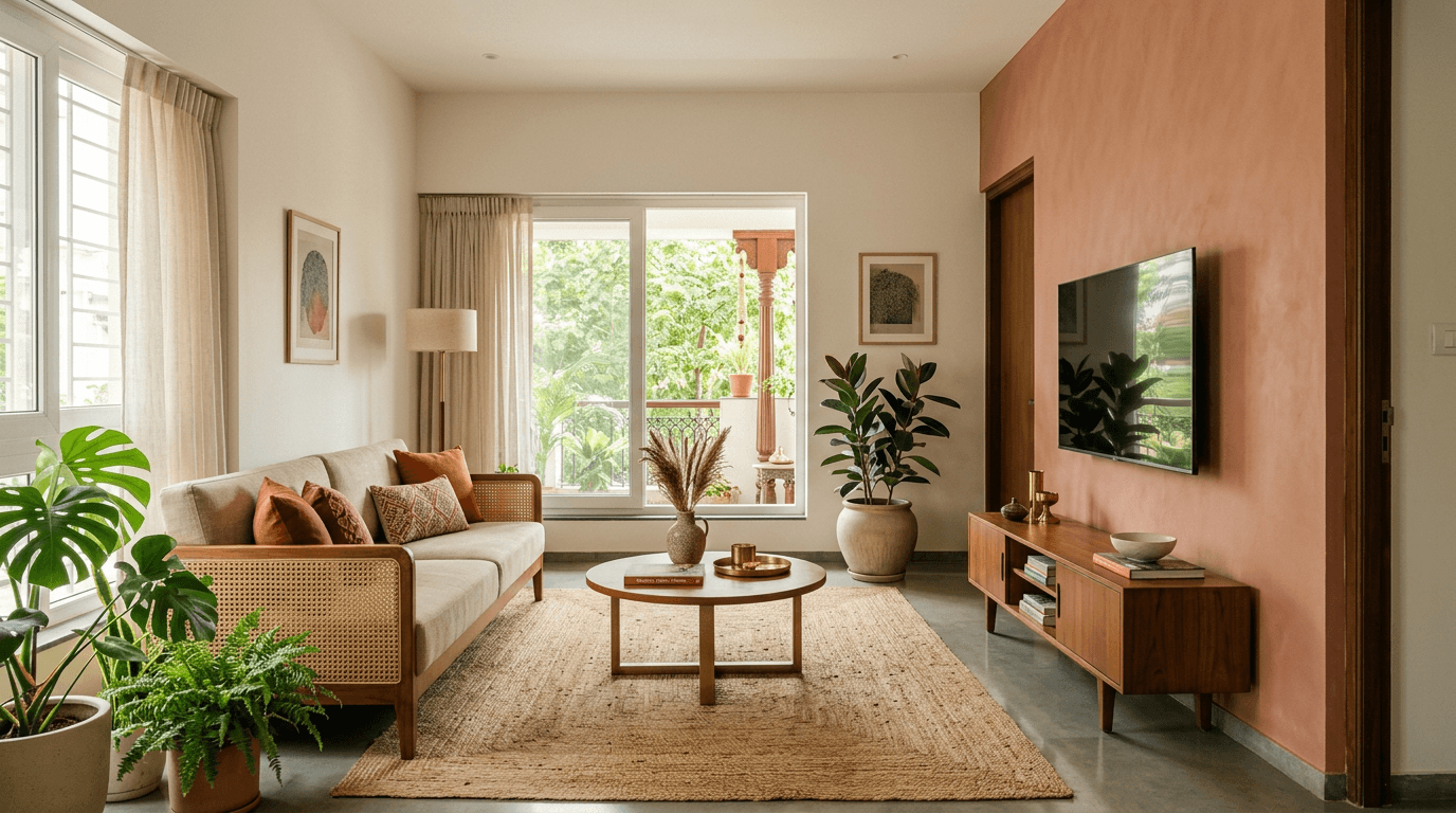
If you want one safe living room wall colour combination to fall back on, it's warm neutral walls with a single deeper tone behind the seating. That's the pairing that makes a living room feel finished rather than decorated.
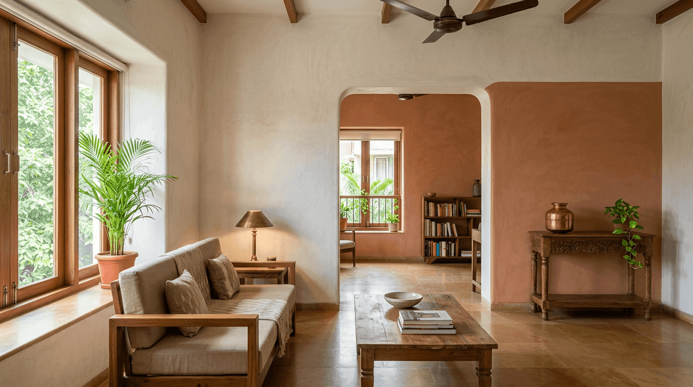
1. Creamy white + terracotta. The safest warm colour combination for living room walls going. Cream across three surfaces, terracotta behind the television. Reads modern Indian without trying.
2. Warm greige + sage green. Quiet and very current. Sage behind the sofa, greige elsewhere. This is the combination for living room schemes where nobody in the family agrees on anything.
3. Off-white + deep teal. Use it on a single wall only. High drama, low risk, easy to undo later.
4. Oat + walnut brown. Reads as wood-and-linen before you've bought a stick of furniture. If you need one more combination for the living room that won't date, this is it.
5. Soft grey + mustard. Grey needs a warm partner in Indian light or it flattens by afternoon. Mustard in cushions and a rug does it.
6. Ivory + olive. Olive is sage's calmer cousin. Excellent in rooms with plants, where a green wall would compete.
7. Warm white + charcoal. Charcoal below a dado line, warm white above. Practical in homes with children.
8. Pale sand + rust. Earthy, forgiving, hides the marks that living rooms collect.
9. Chalk white + ink blue. Crisp and slightly formal. Wants plenty of daylight to work.
10. Tonal beige on beige. Three shades of the same family, no contrast at all. Harder than it looks, and stunning when it lands.
If it's the hall wall specifically that's worrying you, our hall colour combination gallery goes deeper, and the full space guide is living room interior design.
Bedroom Wall Colour Combinations (11–19)
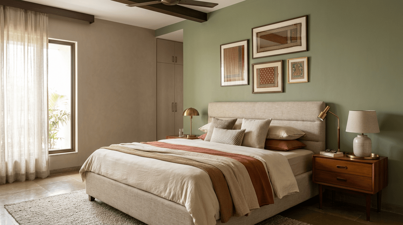
Bedrooms are the one place you can go darker safely, because you mostly use them when it's dark anyway. Depth here buys rest. Our rule of thumb for any colour combination for bedroom walls: one step deeper than you'd choose for a living room, and one step warmer than you think you want.
11. Warm taupe + sage. The most requested restful pairing in our briefs, year after year.
12. Blush + warm white. Soft without tipping into a nursery. Keep the blush greyed, not sweet.
13. Deep moss + cream. Rich, and far calmer in the room than it sounds on paper.
14. Oat + terracotta behind the headboard. Warmth exactly where you look least.
15. Misty blue + ivory. Cool and lovely, but only in a bright room. A north-facing bedroom will make this sulk.
16. Mushroom grey + brass. The brass does the warming, so the wall doesn't have to.
17. Charcoal + soft white. Dark bedrooms sleep beautifully when there's decent daylight to balance them.
18. Greyed lavender + off-white. Quiet rather than childish, provided the lavender has grey in it.
19. Cream drenched. Walls, ceiling and trim in one shade. No lines anywhere. Deeply restful.
A full gallery of two colour combination options for the bedroom sits in bedroom colour combinations, and the room-planning guide is bedroom interior design.
Kitchen Wall Colour Combinations (20–25)
Kitchens want a wipeable finish and a tolerance for grease, steam and turmeric. Everything here assumes a soft-sheen or semi-gloss surface on the working walls.
20. Off-white + charcoal lowers. Dirt-forgiving where it counts, bright where you need to see.
21. Warm white + olive shutters. The current favourite in our project briefs.
22. Pale grey + walnut. Wood keeps grey from feeling clinical.
23. Ivory + deep blue island. Formal, and beautifully lit by 4000K undercabinet strips.
24. Sand + white subway tiling. Old reliable. Slightly warmer than the all-white version.
25. Cream + brushed steel. For anyone who genuinely cooks.
Cabinet-level pairings and shutter finishes live in kitchen colour combination and modular kitchen design.
Kids Room Walls and Study Corners (26–31)
The trap here is choosing for a six-year-old who will be eleven in five years. Put the bold shade where it's cheap to change.
26. Soft lavender + sunny yellow. Playful without being loud.
27. Mint + white. Fresh, gender-neutral, ages well.
28. Sky blue + warm grey. The grey stops it looking like a hospital.
29. Pale sage + a walnut study unit. Our default for teenagers who need to concentrate.
30. Warm white + one coral wall. The bright colour is confined to a single repaintable surface.
31. Butter yellow + off-white. Cheerful in a room that gets little sun.
Dining and Entryway Interior Wall Ideas (32–37)
Dining rooms are used at night more than at noon, so choose under evening light. Entryways are seen for four seconds and remembered for longer than that.
32. Warm greige + deep teal. Intimate under a pendant, unremarkable in daylight — which is exactly right for a dining space.
33. Ivory + burgundy. Old-fashioned in the best way.
34. Sand + black metal. Entryway default. Hard-wearing near the door.
35. Olive + cream panelling. Half-height panelling in cream, olive above.
36. Clay + warm white. Warm without going orange.
37. Off-white + a mirrored panel. For narrow entries that need borrowed light rather than a bolder shade.
Pooja Room, Bathroom and Balcony (38–45)
38. Ivory + marigold gold. Traditional, warm, and quietly ceremonial.
39. Sandalwood cream + teak. Works when the mandir joinery is already wood.
40. White + brass. Minimal, and the brass carries all the character.
41. Pale grey + white tiling. Bathroom default. Keep the grey warm.
42. Sage + terrazzo. Speckled floor, plain wall, no argument.
43. Warm white + green planting. On a balcony, the plants are the accent. Paint stays neutral.
44. Terracotta + jute. Earthy balcony scheme that survives sun and rain splash.
45. Off-white + cane screens. For balconies that need shade more than they need drama.
The pooja room examples above come up in almost every brief we take. On a villa project in Adibatla, a couple living in Australia and their parents needed one home to hold two tastes at once — the younger couple's modern preferences and the older couple's vernacular ones — plus a dedicated puja and meditation space that the builder's plan hadn't allowed for. The way through was tonal: one neutral base running across the villa, with each generation's preference expressed in the accents and the joinery finish rather than in competing wall colours.
The 2026 Colour Forecast: Trending Wall Ideas Worth Following
Trends matter less than light does, but a few are genuinely shifting what we spec into living rooms and bedrooms this year. Note that a paint color trending in American magazines often arrives here a season late and a shade warmer, which is usually an improvement.
- Colour drenching. Walls, ceiling and trim in one shade. Enveloping in bedrooms, and it hides awkward ceiling junctions in flats.
- Warm earthy neutrals. Clay, oat, sand and warm greige have replaced cool grey as the default modern wall treatment.
- Sage and olive. Now the standard "safe" alternative to grey rather than the adventurous choice.
- Saturated jewel accents. Deep teal, burgundy and ink blue on a single surface.
- Warm whites over stark whites. Brilliant white is receding fast in home interiors.
The honest caveat: a trend is a starting point, not a decision. The most popular wall shade of 2026 will still look wrong in a north-facing room if its undertone fights the light. If you want something that outlasts the cycle, a warm neutral base with changeable accents is close to timeless. A rich colour on one surface over a quiet base is still the most reliable way to land a unique combination without gambling the entire flat on it.
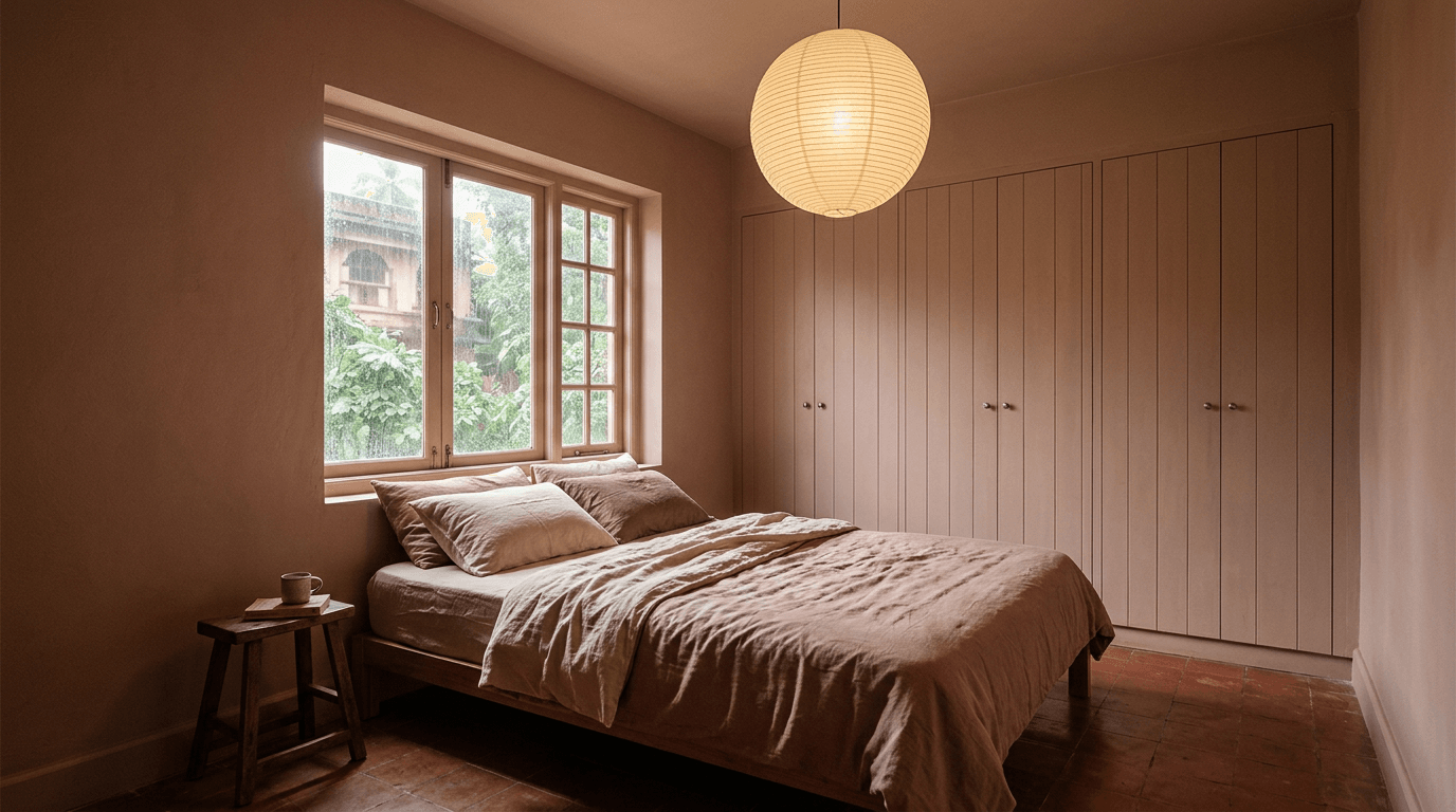
Colour Combination for Walls in a Small Room
Light, warm-toned walls with low contrast between wall, ceiling and trim make the room feel bigger. Light reflectance matters more than the shade itself. Painting the ceiling in the same light tone as the room walls removes the visual line where the space stops, so the eye reads one volume instead of a box.
Three tactics that work in genuinely small spaces:
Keep contrast low. Skip the dark accent wall in a small room. It shortens the space rather than adding depth, whatever the internet says. Save drama for a room with something to spare.
Take the wall tone onto the woodwork. Skirting, door frames and window trim in the wall shade rather than white. Every contrast line you delete makes the entire room read larger.
Use sheen instead of shade. A soft-sheen finish bounces more light than matt without changing the tone at all. In a space with very little natural light, that alone can be worth more than switching shades.
Warm your greys. If you're set on grey in a compact space, a light grey with a warm bias survives. A cool one turns the room into a stationery cupboard.
The whole exercise is making a small space read as continuous rather than large — you can't add square feet with paint, but you can delete the lines that tell the eye where the room ends.
We renovated a 560 sft studio apartment in Tarnaka where the brief was maximum storage and easy maintenance in a very small footprint, without the place feeling congested. The colour work there was almost invisible on purpose: one pale tone across everything, storage joinery in the same family, and all the interest pushed into texture and lighting. If you want the shortest version of small-room advice, that's it.
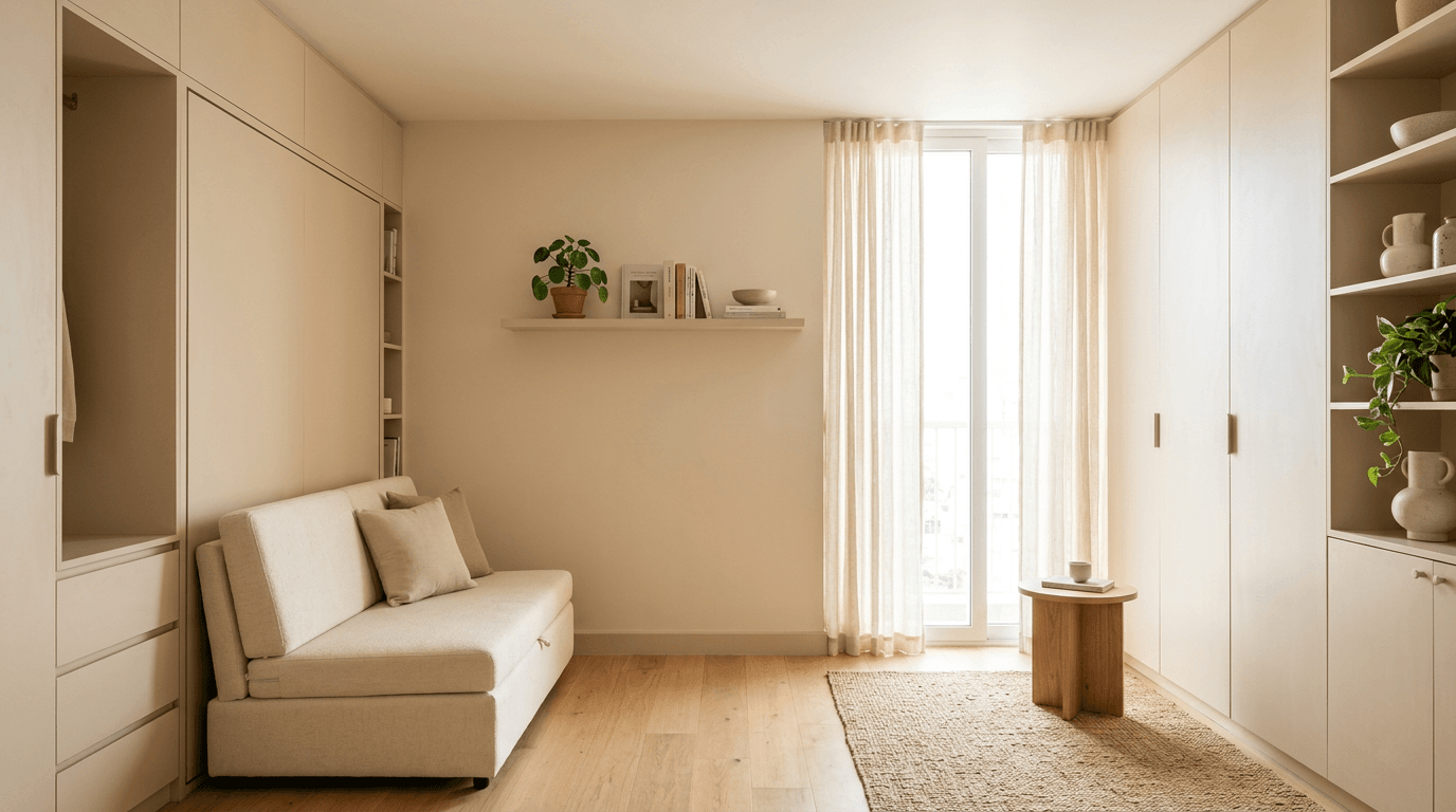
Paint Colours and Finish: What Sheen Does to a Wall Colour
Sheen changes a shade as much as the shade itself does. A matt ink blue and a satin ink blue are, on the wall, two different colours.
| Finish | Where it belongs | The trade-off |
|---|---|---|
| Matt | Bedrooms, ceilings | Deepest, richest tone; hides wall defects; marks easily |
| Soft sheen / satin | Living and dining areas | Best all-round for family homes; wipes down |
| Semi-gloss | Kitchen splash zones, doors, trim | Toughest and most washable; shows every plaster flaw |
| Texture / distemper | Feature surfaces only | Different rules entirely — see our painting guide |
One rule we hold to: never put a high-sheen finish on a badly plastered interior wall. Sheen is a spotlight for defects. If the surface is poor, matt is not a compromise, it's the correct answer. Most home wall surfaces in older flats are a lot less flat than they look under a coat of putty.
Vastu-Friendly Wall Colours for Indian Homes
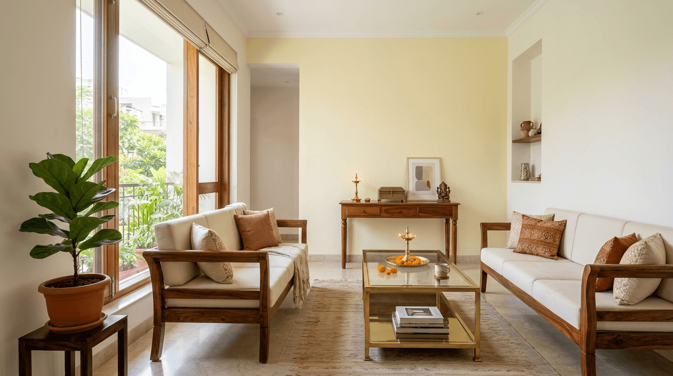
Off-white, soft beige, light yellow and pastel green are the traditional Vastu recommendations for living areas — tones associated with peace and clear conversation. Bedrooms lean earthy and muted. Our vastu shastra for home guide covers the direction-by-direction rules properly.
We plan vastu into layouts on nearly every project, so this comes up constantly, and it rarely conflicts with good colour work. The traditional recommendations are warm, mid-toned and light-reflective — which happens to be exactly what most Indian rooms need for the light they receive. Where a conflict does appear, it's usually about intensity rather than hue, and softening the shade by two steps resolves it.
Mistakes That Wreck a Perfect Wall Colour Combination
1. Choosing From a Phone Screen
Screens are backlit and colour-shifted, and every listing photo has been edited. Nothing chosen on a phone survives contact with a wall unchanged.
2. Sampling on a Patch the Size of a Postcard
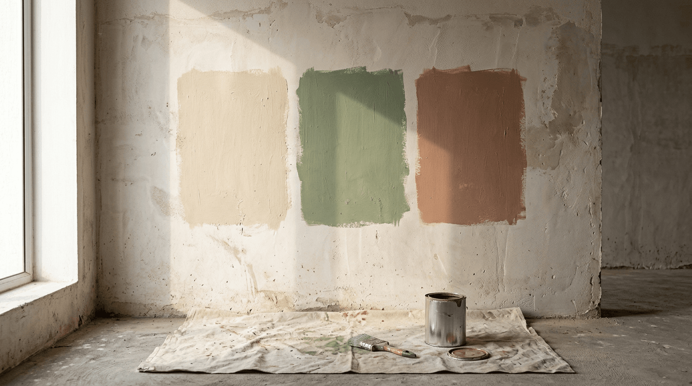
Paint an A3 area minimum, on two different walls, and live with it for two days.
3. Ignoring What You Already Own
The floor, the granite counter, the existing wardrobe shutters all have undertones, none of them are getting repainted.
4. Painting Over Damp
On a 30-year-old apartment building in Hyderabad, the residents brought us in after working on a flat inside it; we had to solve the seepage and waterproofing, along with flooring, plumbing and electrical, before the repainting could mean anything. Paint over damp and it's the paint that fails, not your shade choice.
5. Too Many Accent Walls
One per room. Two competing focal points cancel each other out.
6. Forgetting Who Else Lives in the House
In one Hyderabad apartment we designed for a client's retired parents, the brief was "cozy, simple yet bold", and the grandmother wanted a memory wall and her own sentimental bed refurbished rather than replaced. The scheme had to be built around those two objects. Start from what the family refuses to give up, not from a mood board.
7. Choosing Bravely for a Rental
For a large apartment at My Home Bhooja that the owner intended to let out, the brief was explicit: universally acceptable shades and finishes, timeless, easy to maintain. That's the right instinct for any home you won't live in yourself.
What Does a Home Paint Job Actually Cost?
Cost is driven by four things, and the shade is not one of them:
- The condition of the surface. On old walls, putty, primer and crack repair usually dominate the bill. New walls cost far less to prepare.
- The grade of paint and its finish. Washable soft-sheen products sit above basic emulsions; texture and specialist finishes sit above both.
- The number of coats. Deep and saturated shades commonly need an extra coat over a tinted primer to look solid, which affects both material and labour.
- Your city's labour rates and the wall area. Two identical flats in different cities do not cost the same to paint.
Custom paint tinting, a shade mixed to order rather than pulled off the standard chart, usually adds to both the cost and the lead time, and it can't always be re-mixed exactly when you need a touch-up two years later. Not every wall in the house justifies it. In practice the perfect colour off a standard chart beats an approximate one mixed specially, because every home eventually needs a patch repair.
We don't publish flat rates, because they'd be wrong for most readers. Pricing depends on your city, the wall area and the specification. The sensible move is a walkthrough and a written estimate before anything is bought.
