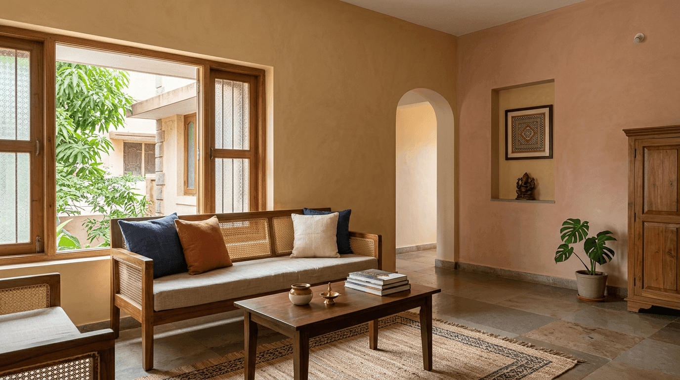
40 House Colour Combinations for 2026: Exterior Paint Ideas for Indian Houses
Written by Sindhu G, Principal Architect at Roomantic (SPA Delhi). Last updated August 2026.
Key Takeaways
- Pick the base first, then one accent tone and one trim tone. Three shades is the whole formula behind almost every exterior that looks designed rather than decided at the shop counter.
- Your fixed materials decide more than your taste does. Roof tile, stone cladding, window grilles and the main gate are already coloured, and the paint has to join them.
- Light bases survive Indian sun better than dark ones. Deep charcoals and reds fade fastest on south and west walls, so keep them for shaded pockets, plinths and joinery.
- Fix the wall before you fix the shade. Seepage, salt patches and loose plaster will ruin an expensive finish inside one monsoon.
A house colour combination is a base shade covering roughly 70% of the facade, one accent for recessed masses or feature bands, and one trim tone for grilles, railings and the main gate. Cream with brown, white with charcoal, and grey with wood-tone are the three combinations that work on almost any Indian elevation.
Every project we hand over reaches the same awkward week. The structure is up, the plaster is cured, the grilles are in, and somebody has to walk into a paint shop and choose from a fan deck of 1,800 chips under tube light.
That is a terrible way to choose. Those chips are 30 mm wide, lit by a tube, and about to be scaled up onto 200 square metres of wall standing in full sun. Ask ten neighbours about house outside colour and nine will say cream, which is roughly how a whole street ends up looking like one long compound.
So this gallery is built the way we actually spec a facade: base, accent, trim, checked against the roof, the grilles and the direction the house faces. Forty combinations, grouped by style, each with a note on where it works and where it goes wrong. People search for this a dozen ways: "house colour combination", "home colour combination", "exterior colour combination", even "indian house colour combination outside". It is the same question every time. You will also see the American spelling, "color combination", on this page, because half the country searches it that way.
One boundary before we start. This page is about the whole house from the street: elevation, compound wall, gate, porch, and how that palette carries into the entry. Room-by-room interior schemes are a different problem with different rules, and we cover them separately in our room colour combination guide.
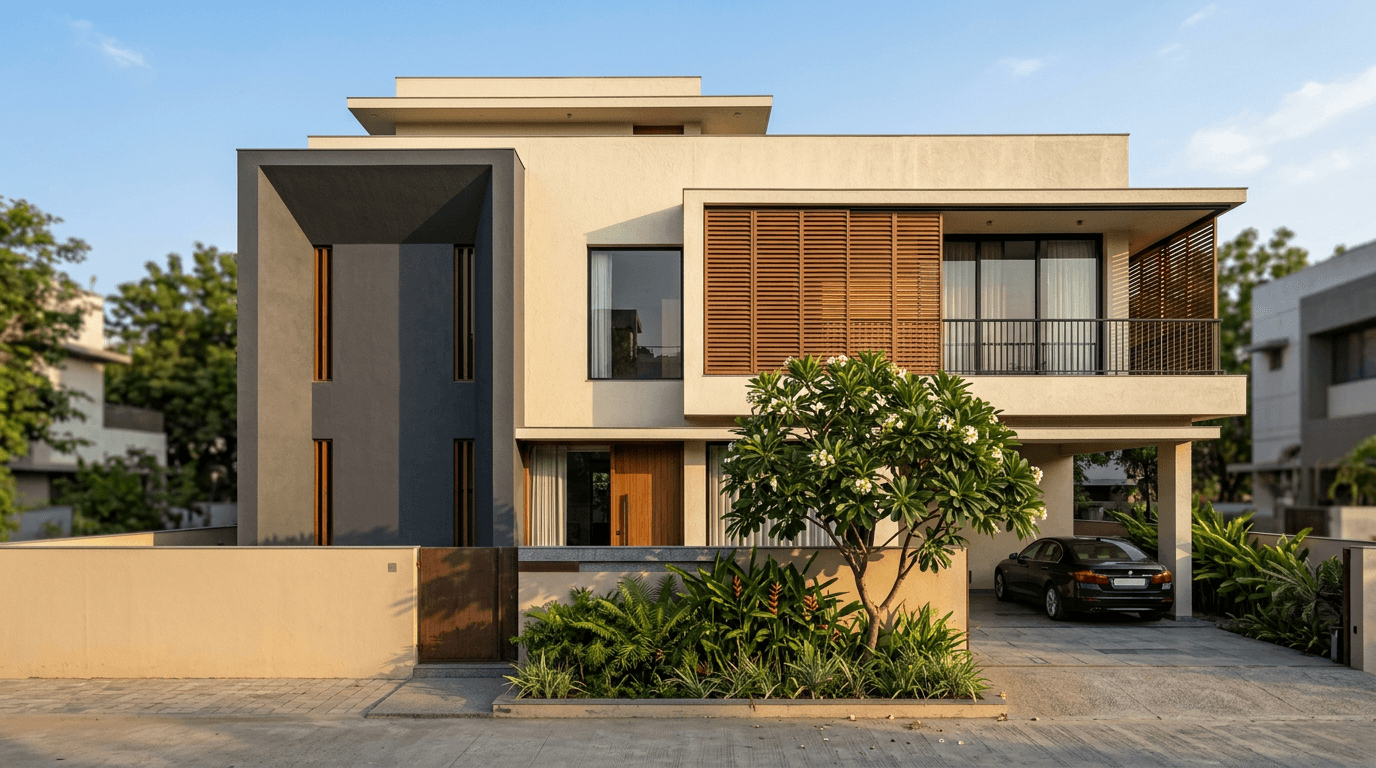
How Do You Choose the Right Exterior Colour Combination?
Start from what you cannot change. Roof tile, stone cladding, grilles and the main gate are already fixed shades, so build the palette around them. Then choose a light base for the bulk of the facade, one deeper accent for recessed masses, and one trim tone. Test a full square metre on the actual wall before you commit.
Five checks run on every elevation drawing that leaves our studio.
1. List the shades you are already stuck with. Mangalore tiles are terracotta. Kota is grey-green. Your grilles are probably black and your gate is probably brown. Count them, and the exterior wall paint colour combination gets much easier: you are not choosing three shades from scratch, you are choosing two that agree with four. Two neutral colours plus one accent colour is the entire colour palette on most houses we design.
2. Note which way the house faces. A south or west facade takes brutal afternoon sun for eight months. Deep tones on that side chalk and fade first. North-facing walls stay flat and grey most of the day, which is where a warmer base earns its money.
3. Match the era of the building. A flat-roofed contemporary box wants cool greys and crisp whites with black metal. A sloped tiled roof wants ochres, creams and oxide reds. Put the right colour on the wrong building and it reads like fancy dress. There is no perfect colour combination in the abstract, only the right combination for one building on one street.
4. Read the street. If four houses on your lane are cream, a cream house disappears. If they are all beige and yellow, one restrained white-and-charcoal elevation looks confident rather than loud. This is where a two-tone scheme earns its keep — the same shape reads as a different house.
5. Check your rules. Gated communities and many apartment associations restrict the palette; some heritage precincts do too. Ask before you buy 40 litres.
We learned point one the hard way on a repeat client's building. After finishing three flats inside a 30-year-old Hyderabad block, the residents asked us to take on the whole building — flooring, plumbing, seepage, waterproofing and a full repaint. The shade selection took an afternoon. The waterproofing and surface repair took weeks, and that is the part that decides whether the finish still looks right in year four.
That is the honest order of operations. Substrate, then protection, then colour.
Get the exterior colour scheme right and an ordinary building looks considered; get it wrong and no amount of cladding rescues the exterior look. Remember too that the wall colour is only half the job. Grilles, railings and the gate are the other half, and they were usually decided months earlier, which makes choosing a colour for home exteriors mostly an exercise in agreeing with things you did not choose.
40 House Colour Combinations With Photos
Each entry below gives a base, an accent, and a note on where it belongs. Photograph your own facade at noon and again at 5 pm before you shortlist — the same shade shifts dramatically between those two hours.
Modern Exterior Colour Combinations
Contemporary elevations are mostly flat planes, cantilevers and glass. Colour has to define the masses rather than decorate them, which is why these palettes stay tight: one light field, one dark block, one metal tone.
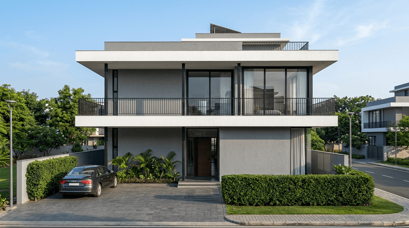
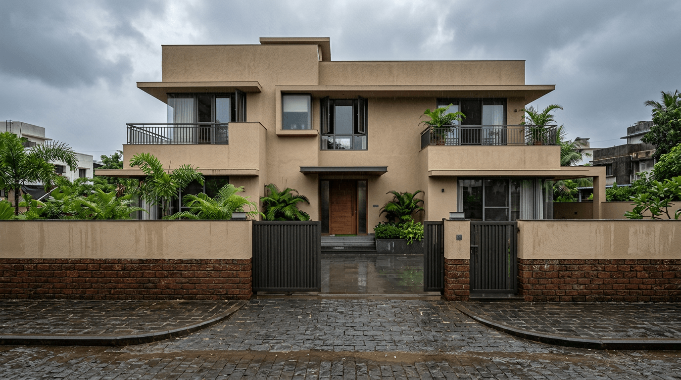
1. Cool grey with crisp white and matte black. The default modern facade for a reason. Grey on the main mass, white on the projecting slabs, black on railings and window frames. It photographs well and it hides road dust better than white alone.
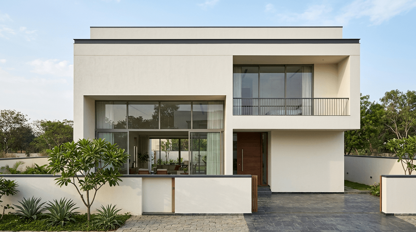
2. Off-white monolith with a charcoal parapet line. Almost the whole facade in a single off-white, with one dark band running along the parapet and the compound wall coping. Minimal effort, disproportionate effect.
3. Warm greige with a teak-tone louvre screen. Greige sits between grey and beige and forgives north light. Add a timber-tone screen over the balcony and the elevation gets warmth without going yellow.
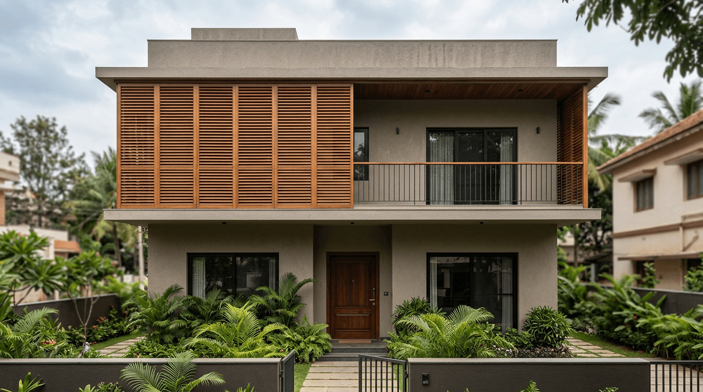
4. Slate base with a wood-grain cladding panel. Slate-tone render across the ground floor, a single wood-grain clad panel wrapping the stair tower. The cladding does the talking; everything else stays quiet.
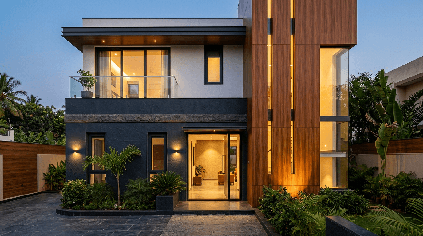
5. White with black-framed windows. The Scandinavian-modern look adapted for India: brilliant white walls, deep black frames, black gate. A crisp white exterior needs annual washing near a main road, and it is worth it.
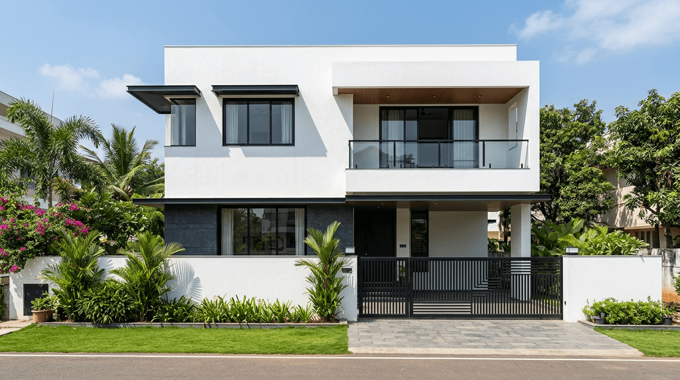
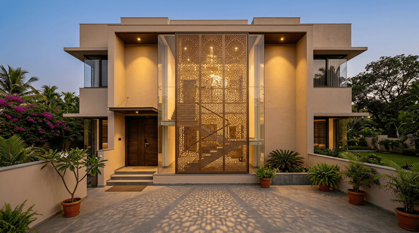
6. Champagne beige with a bronze CNC jali panel. A warm neutral base with one perforated metal screen in bronze over the staircase glazing. The screen throws patterns across the porch by evening. Pair it with the ideas in our jali and CNC cutting designs gallery.
House Colours for Traditional Indian Homes and Vastu-Friendly Schemes
Older homes here were painted with whatever was locally available: lime, ochre, oxide. Those pigments still look correct on sloped roofs and columned porches, and they age gracefully instead of looking tired.
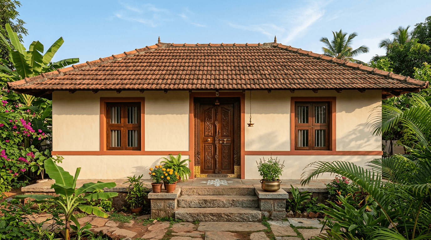
7. Cream base with a terracotta band. Cream across the walls, a terracotta band at sill level, terracotta repeated on the roof tile. The oldest safe pairing in South India.
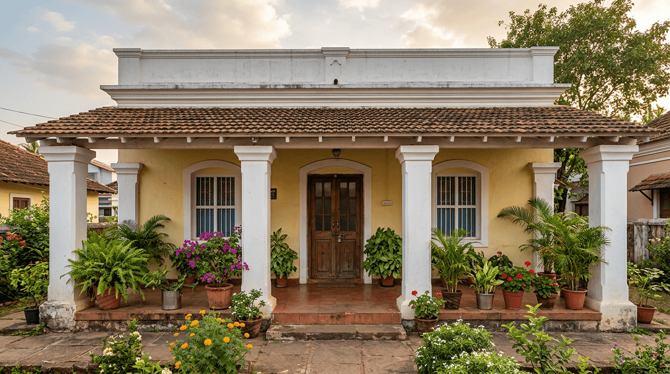
8. Light yellow with white columns. Yellow walls and white columns is the classic small-town elevation, and it still looks generous. Keep the yellow pale; the saturated version turns municipal fast.
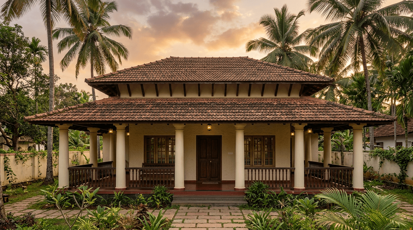
9. Ivory with a Kerala-red tile roof. When the roof is that assertive, the wall should not compete. Ivory, and let the tile carry the elevation.

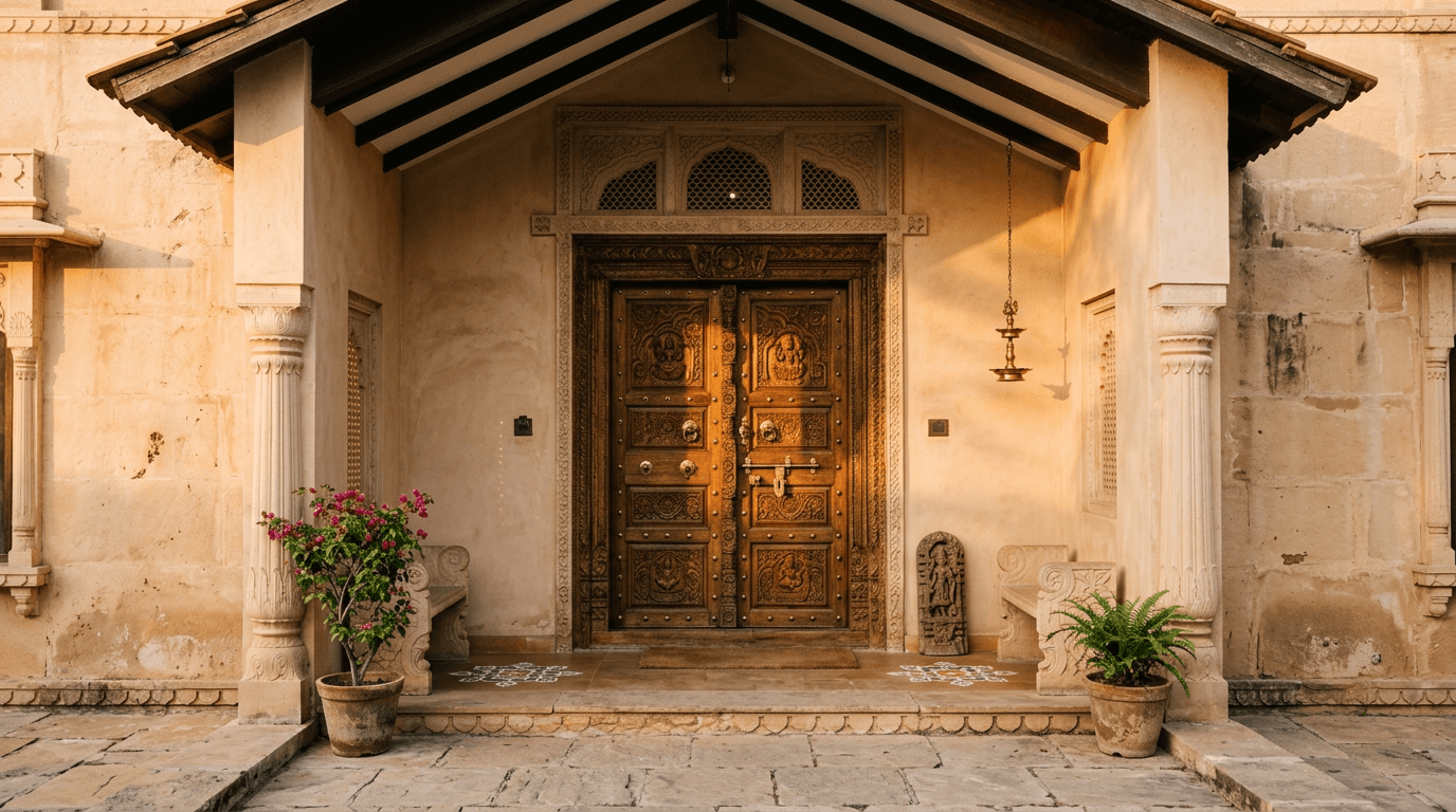
10. Pale sandstone with a carved teak door. A sandy neutral base makes carved timber look expensive. This is the palette for a house whose front door is the best thing about it — see our main door and gate designs for the door itself.
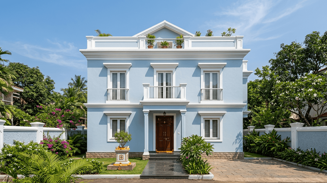
11. Light blue with white trim. Vastu guidance commonly favours light blues, creams and pale yellows for the north and east faces, and this pairing is genuinely cooling to look at in a hot climate.
12. Mustard ochre with oxide green joinery. Borrowed from Chettinad and Goan houses. The ochre is warm, the green shutters are cool, and together they look like somewhere with a history.
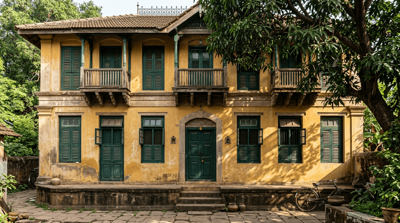
Two-Tone Outside Colour Combination Ideas
Two-tone schemes exist to break a big blank facade into readable parts. The rule we use: the darker tone goes on the recessed or smaller mass, never on the biggest sunlit plane.
13. White with a charcoal split mass. Half the elevation white, the projecting bedroom block charcoal. Instantly sculptural, and it hides the awkward proportion most G+1 fronts have.
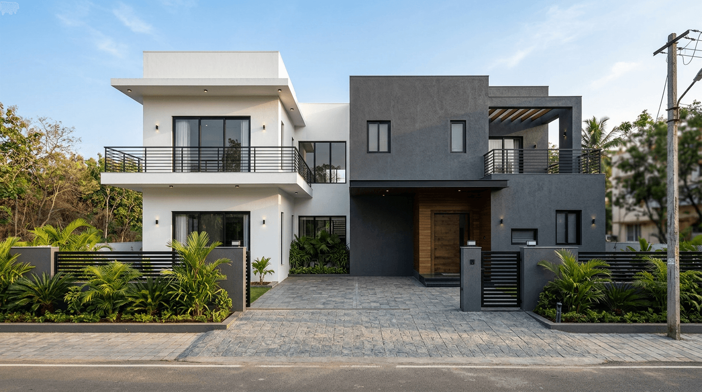
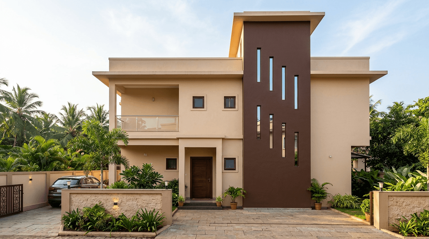
14. Beige body with a brown vertical strip. A tall brown strip up the staircase wall, beige everywhere else. Vertical emphasis makes a squat house look taller.
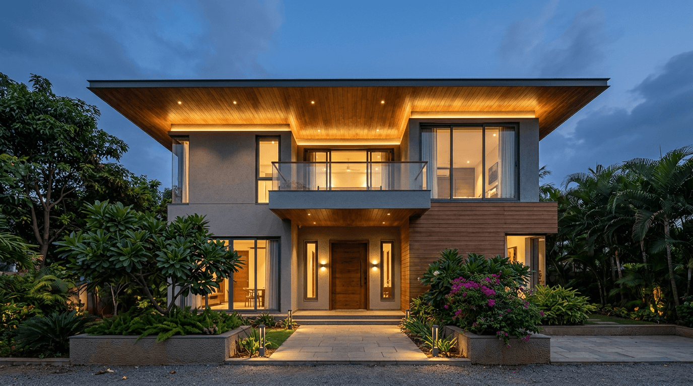
15. Grey with a wood-grain balcony soffit. Grey walls, and the underside of the balcony finished in a wood tone. Nobody expects the soffit to be the accent, which is exactly why it works.
16. Ivory over olive green. Olive on the ground floor, ivory above. Ground-floor walls take the splash, the scuffs and the dog, so putting the deeper tone low is practical as well as good-looking.
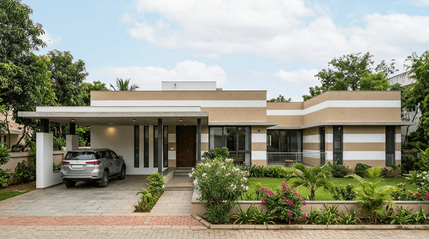
17. Sand and white horizontal banding. Wide alternating bands across the facade. It suits long, low houses and it visually widens a narrow plot frontage.
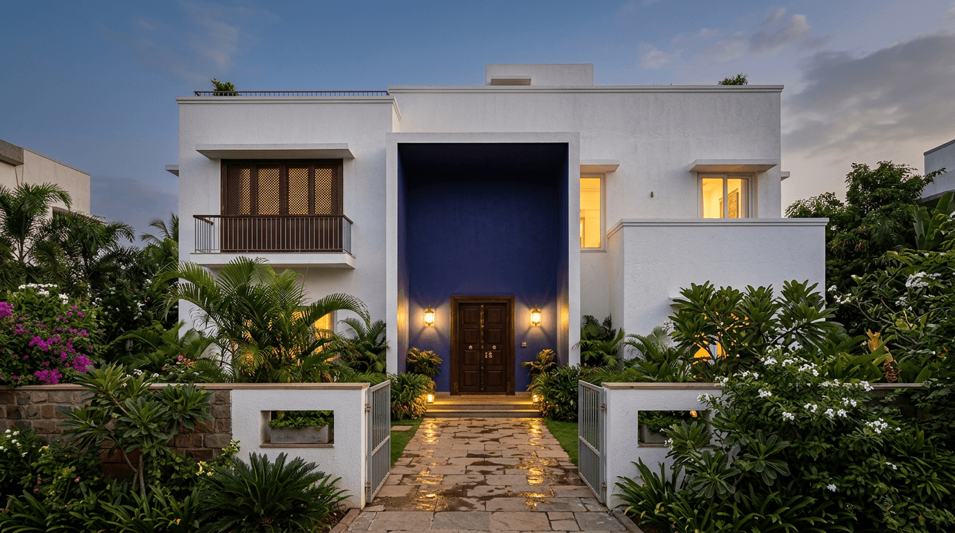
18. Deep blue accent box on white. One recessed volume around the entrance in deep blue, the rest white. It marks the door from the gate, which is the one thing a visitor needs to find.
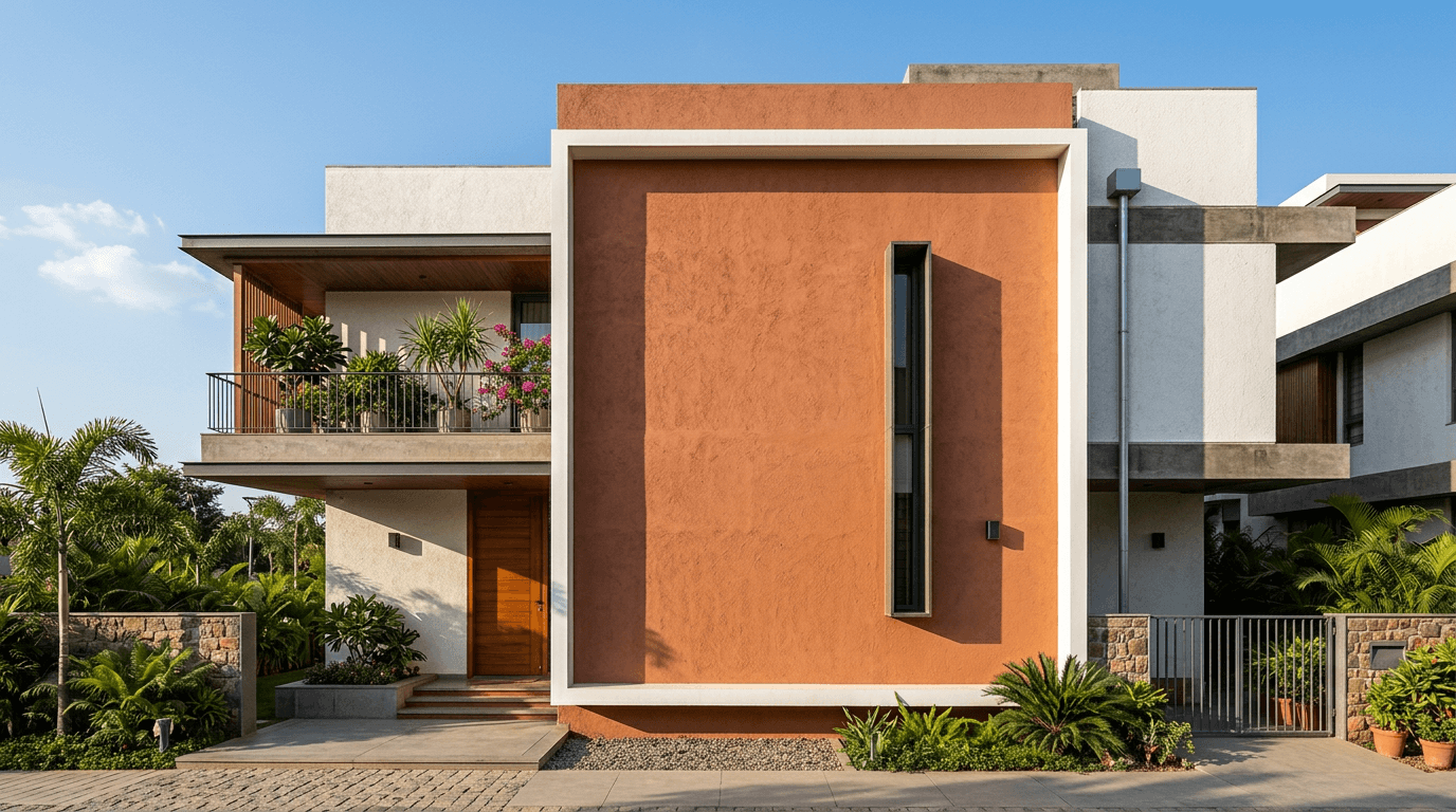
19. Terracotta feature plane inside a white frame. A single terracotta plane, framed on all four sides by a white projecting border. Cheap to do, and it gives an ordinary facade a focal point.
Small House Colours: Simple Two-Tone Ideas
Small elevations get worse, not better, with more shades. Two is usually plenty: an Indian simple house looks best when the base does the work and the front door does the talking. Everything below is achievable with a base, a trim and one bright object.
20. All white with a bright front door. The cheapest way to look intentional. White everywhere, and the door in a single strong tone — bottle green, oxblood, cobalt.
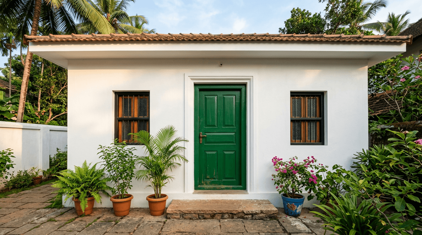
21. Cream body with white trim. The safest scheme in the country, and there is no shame in it. Cream colour hides dust, white trim keeps it from looking flat, and it never dates.
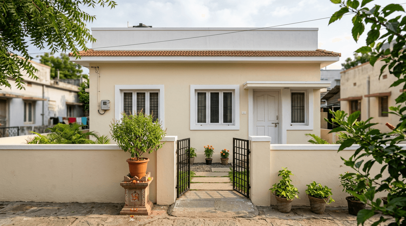
22. Grey base with one accent balcony. Everything grey except the balcony parapet, which gets a warm tone. One decision, one litre, done.
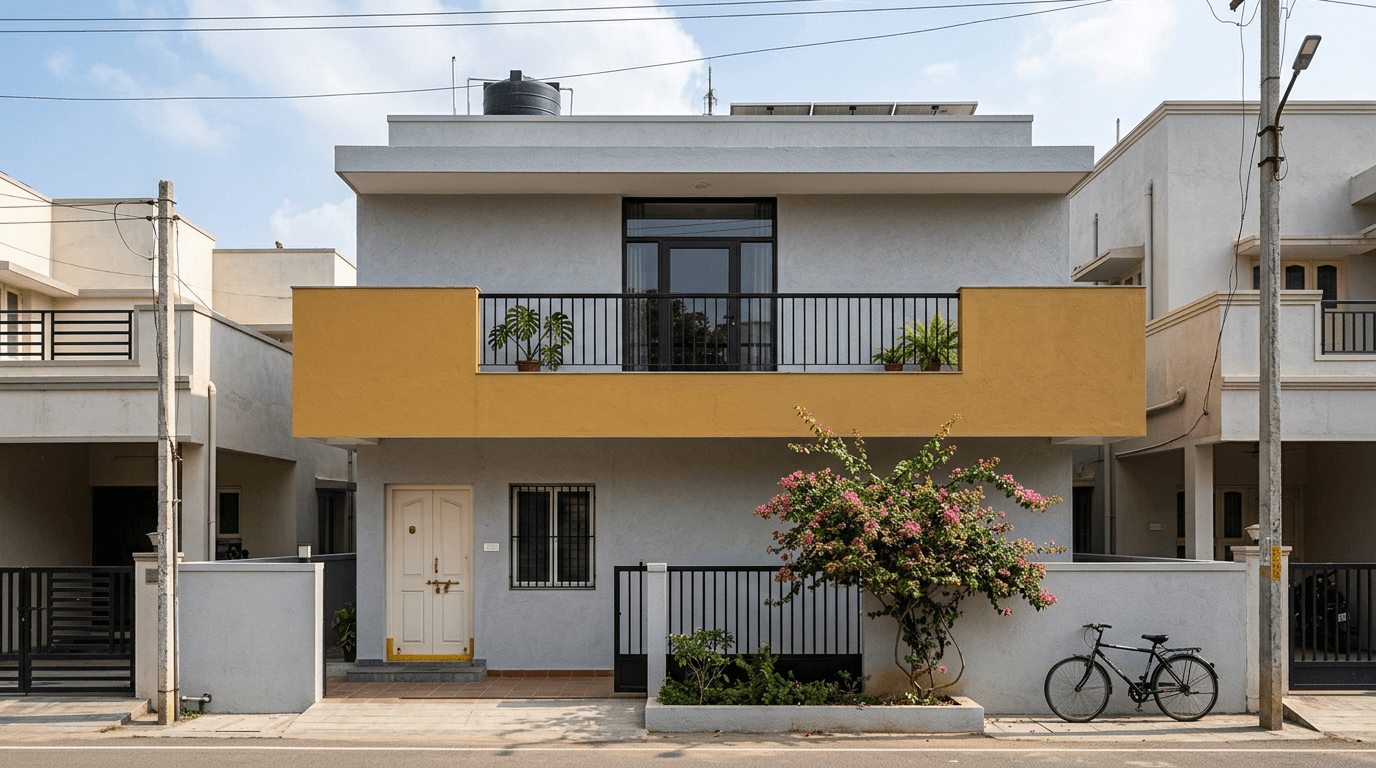
23. Peach with white for a G+1. Peach reads warm and welcoming, and it holds up better than pink under sun. Keep the trim white so it stays adult.
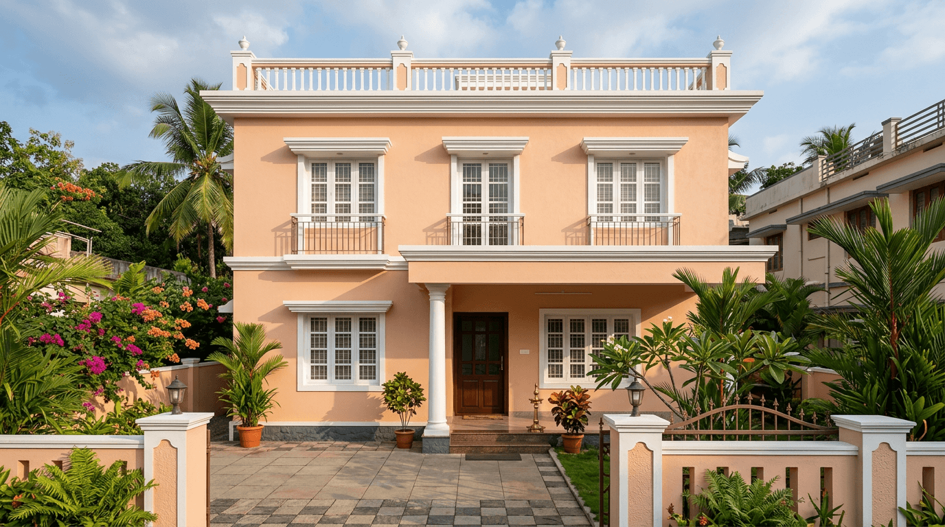
24. Light sage with white. Sage is the quiet trend of the last two years and it sits beautifully against greenery. It also disguises the algae streaking that plagues shaded walls in high-rainfall towns.
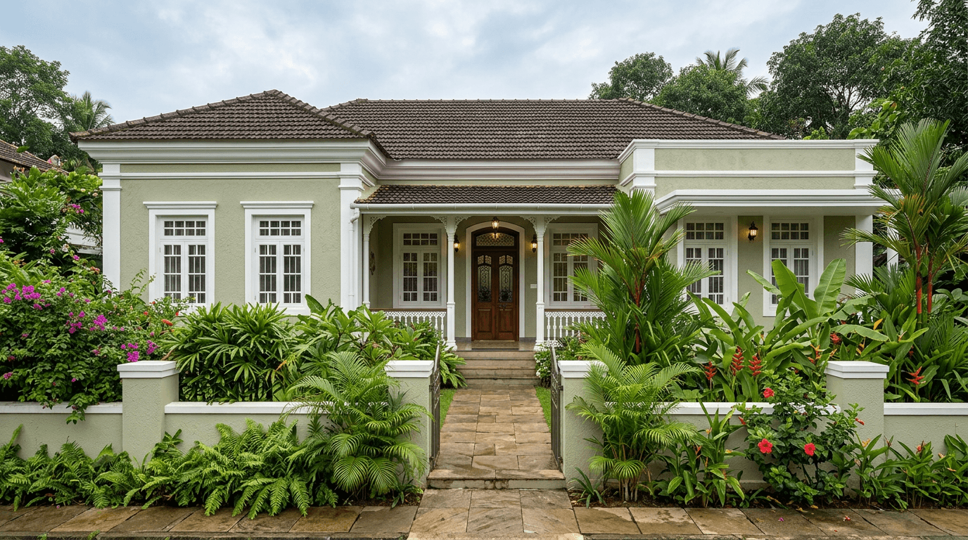
25. Sand with a brick-look lower band. A brick-effect or stone-clad band along the bottom metre takes the splash-back and the dust line, and it means you repaint less often. Our stone cladding guide covers the material options.
Village, Farmhouse and Sloped-Roof House Colours
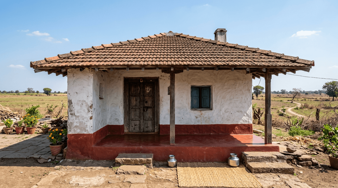
Rural elevations have a different job. They sit in open land, they are seen from a distance, and they are usually built with what is available nearby. Our village house design gallery covers the forms; this is about the finish.
26. Whitewash with an oxide red plinth. Lime-washed walls with a deep red oxide skirting. It is traditional, it is cheap, and the oxide band hides exactly the splash zone that gets dirty in the rains.
27. Cream with a Mangalore tile roof. The default for coastal Karnataka and Kerala farmhouses. Cream walls, terracotta tile, dark timber rafters.
28. Yellow ochre with green joinery. The most common village pairing across the Deccan, and it looks correct against dry countryside in a way that grey never will.
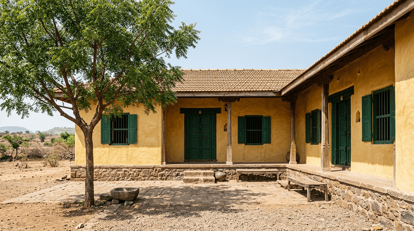
29. Natural lime plaster with a stone base. No pigment at all above the plinth. Local stone below, raw lime above, and the material does the work. It weathers into something better than it started.
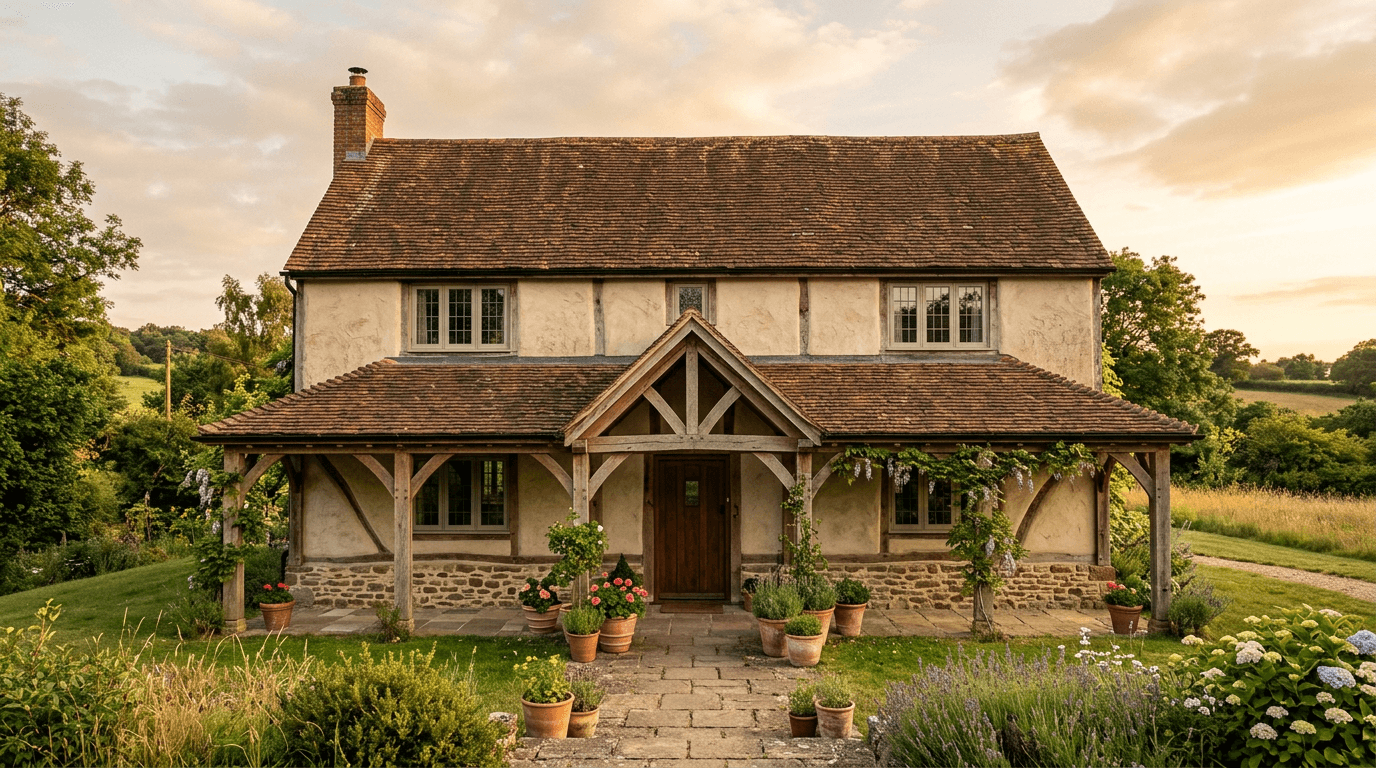
30. Earth tones with a sloped tiled roof. We used this thinking on a courtyard farmhouse in Srikakulam, where the client had moved abroad and wanted the nostalgic sloped-roof house he grew up around, with a social front yard and a kitchen garden behind. When the roof tile is the loudest element, the walls stay in the same earth family and half a tone lighter. More roof options sit in our roof design guide.
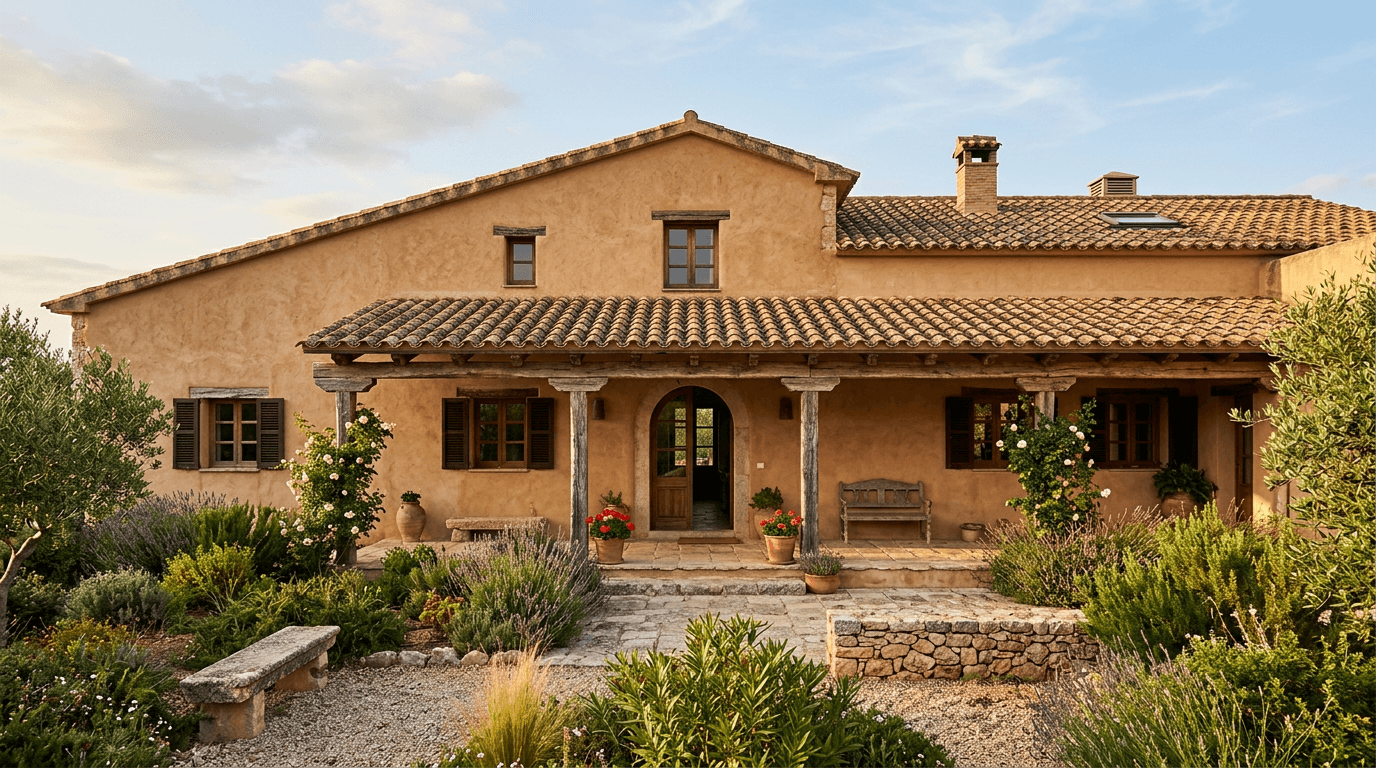
Climate-Led Exterior Colour Choices: Coastal, Hill and Dusty Cities
This is the group most galleries skip, and it is the one that decides how your facade looks in year three rather than week one.
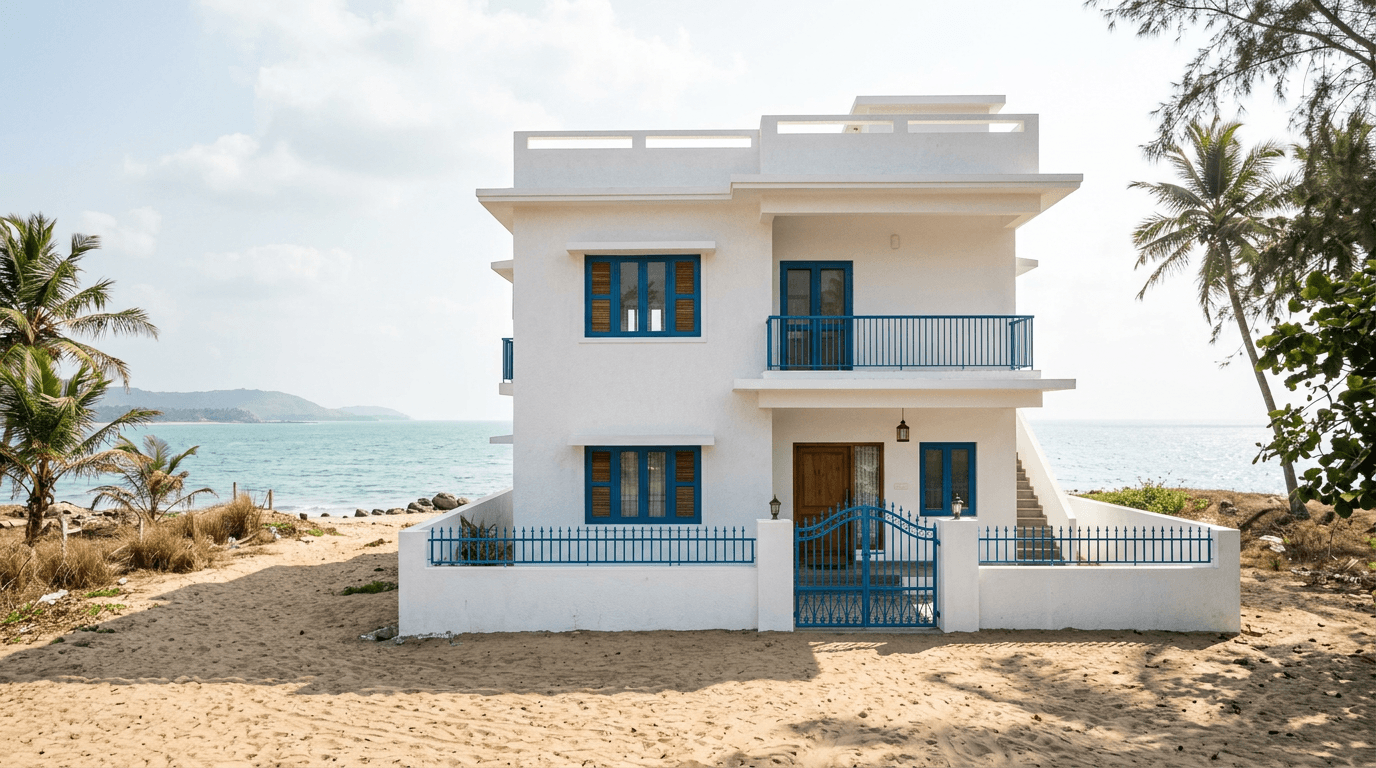
31. Coastal white with marine blue. Salt-laden air is brutal on finishes. Light bases stay looking clean longer, and the blue trim is a coastal convention that has survived for a reason. We design regularly in Machilipatnam, close enough to the coast that this is a live constraint.
32. Hill ochre with dark timber. On hillside houses the elevation is seen against forest and mist, so a warm ochre body with dark timber balconies reads clearly. We renovated a four-generation ancestral home on a Darjeeling slope, and the lesson there was that hill houses need warmth to stop looking cold nine months of the year.
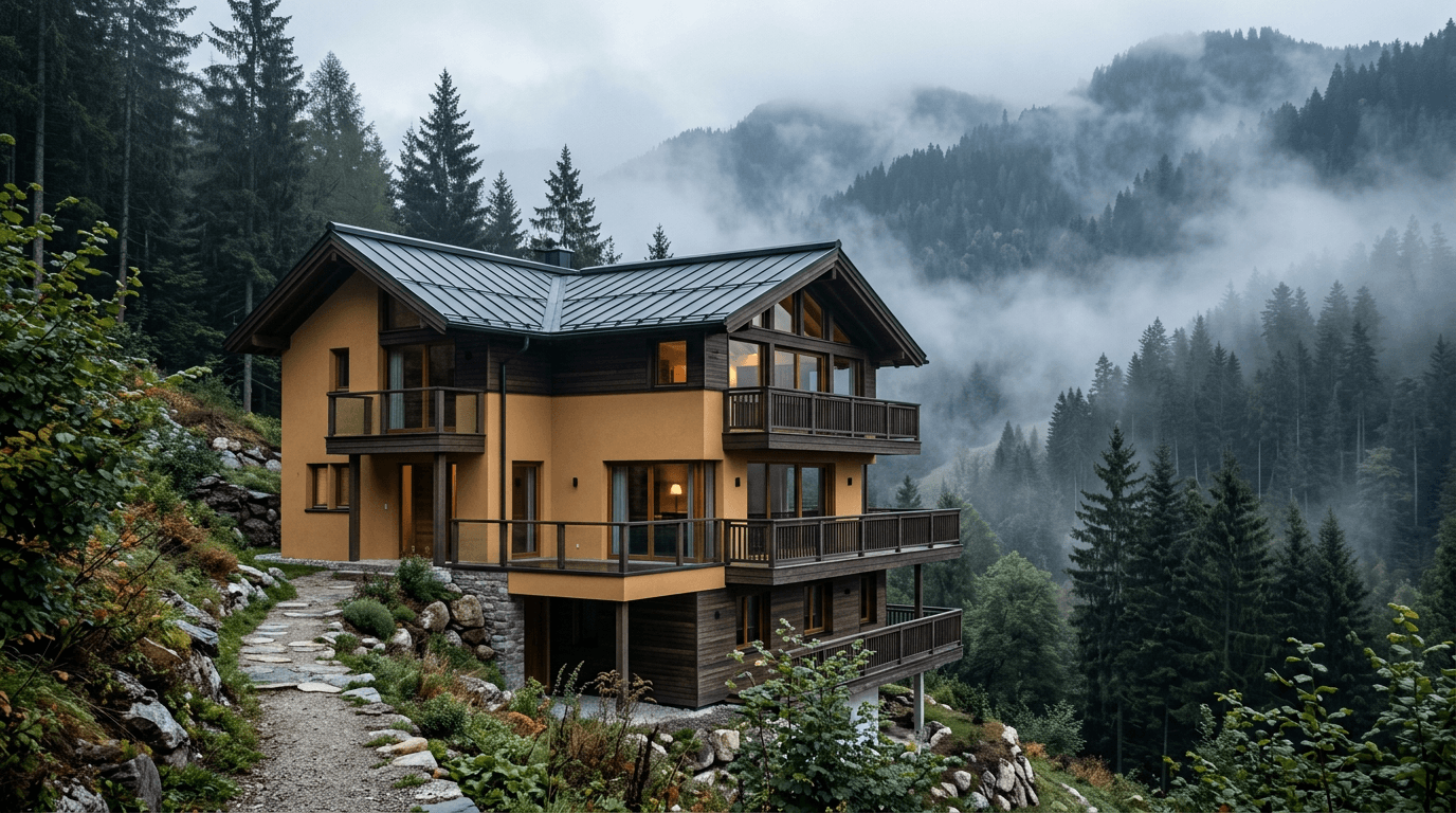
33. Mid-tone greige with a dark plinth for dusty streets. Houses on main roads collect a grey film at car-bumper height. A mid-tone body with a deliberately dark lower band means the dirt lands where it does not show.
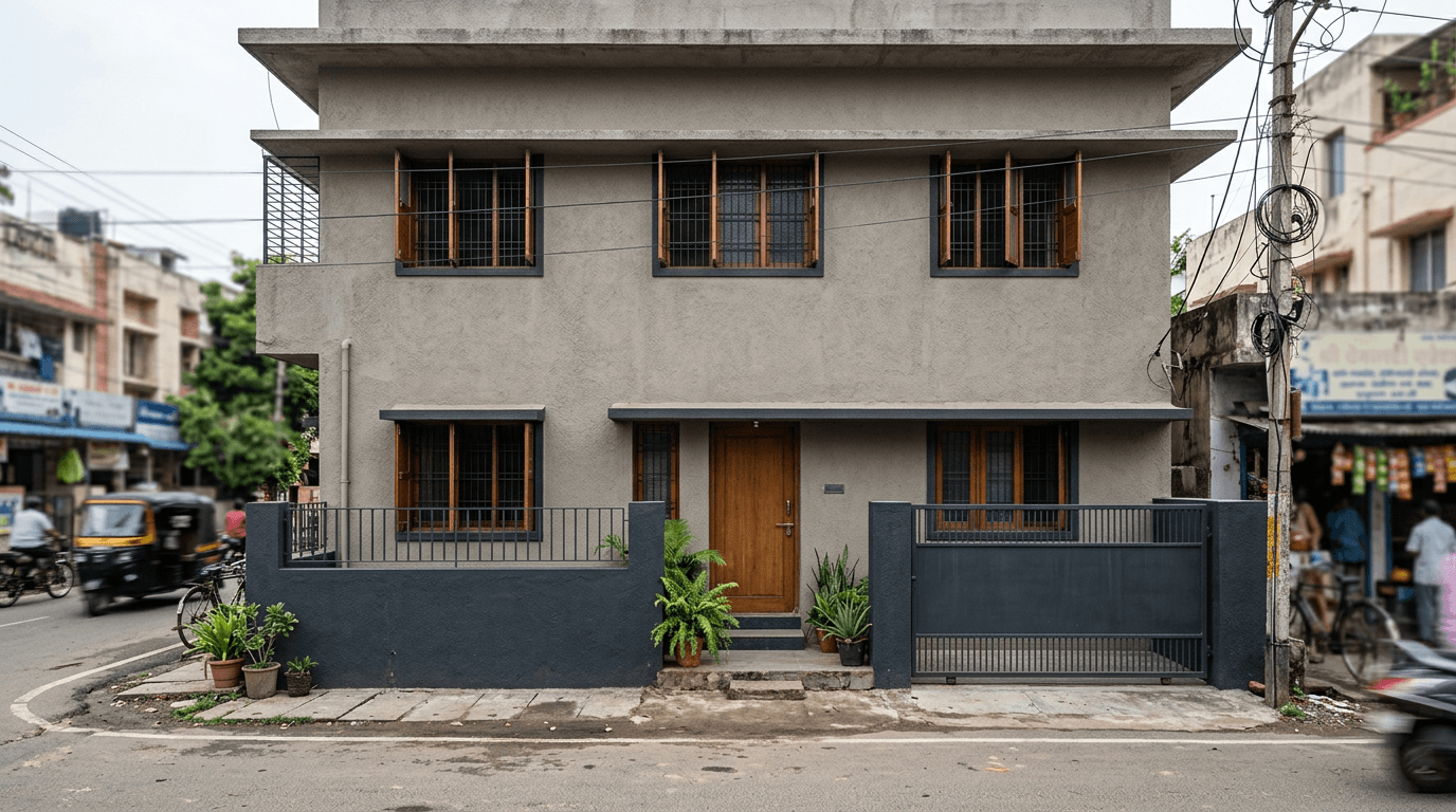
34. Reflective ivory for a west-facing wall. Light finishes reflect more solar radiation than dark ones and stay measurably cooler to the touch, which matters on the wall that takes the 4 pm sun. Some manufacturers now sell cool-roof and heat-reflective systems for exactly this face.
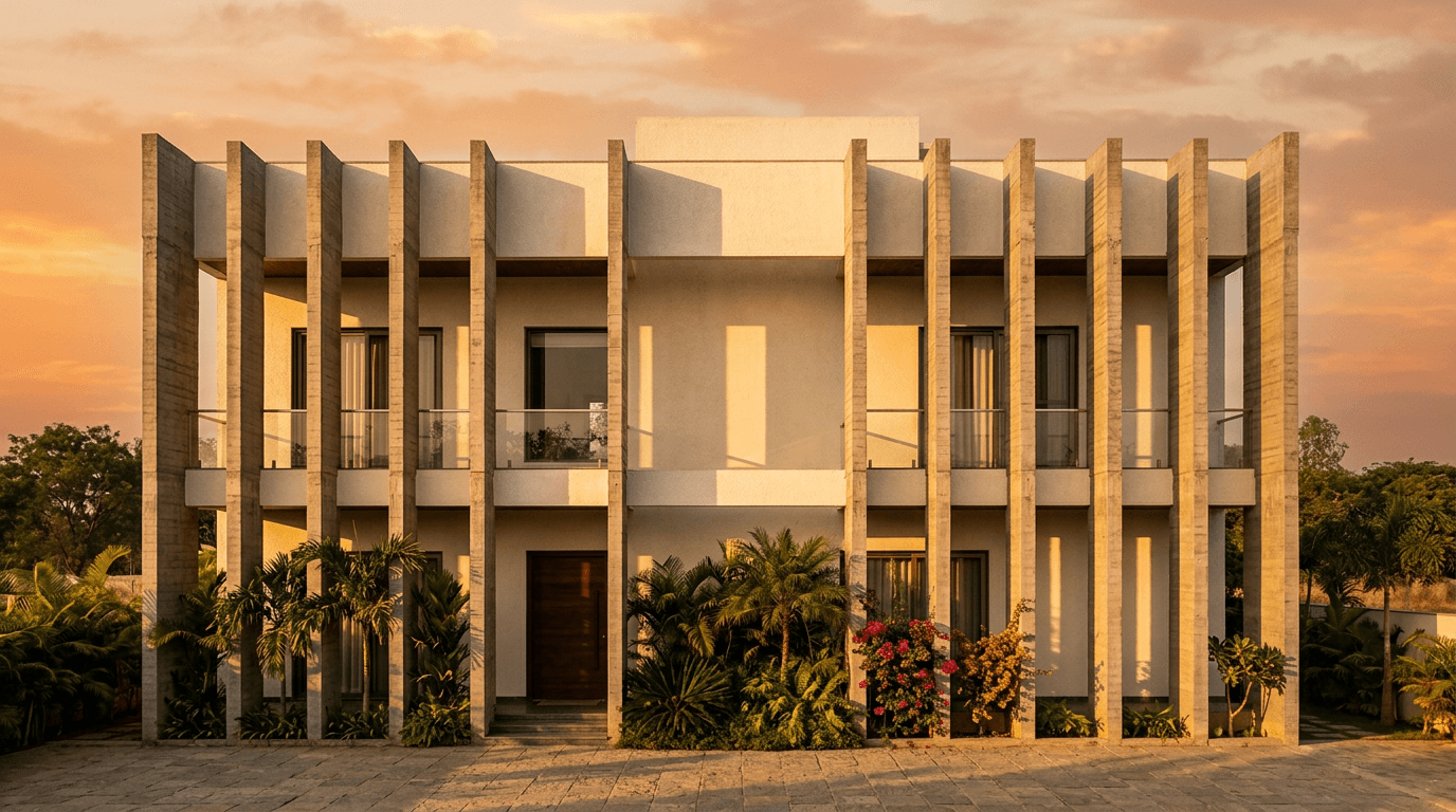
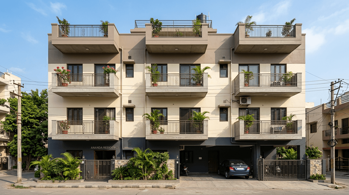
35. Three-tone banding for an apartment block. On a multi-family building, one flat shade across four floors looks institutional. Band it: a heavier tone at the base, the lightest tone in the middle, and a mid tone at the parapet.
Whole-House Flow: Carrying the Exterior Colour Inside
The palette does not stop at the front wall. The gate, the compound wall, the porch ceiling and the first three metres inside the door are all part of the same first impression.
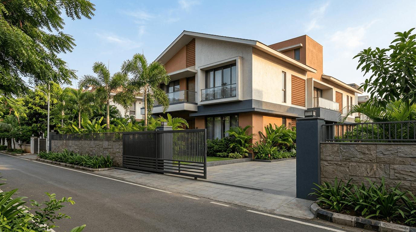
36. Compound wall matched to the plinth band. Repeat the plinth tone on the boundary wall and gate pillars. It ties the plot together and makes a small site read as one composition.
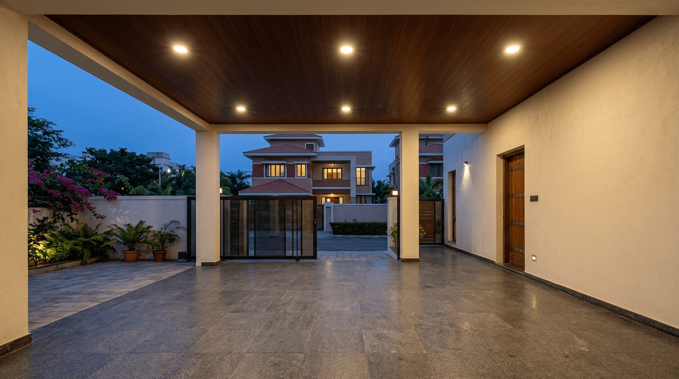
37. Porch ceiling in the accent tone. The porch soffit is the one surface a visitor stands directly under. Take the accent there — a wood tone or a deep shade — and the entrance suddenly feels designed.
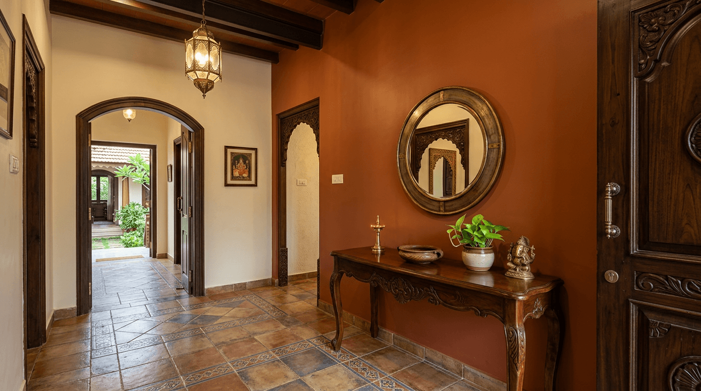
38. Foyer picking up the facade accent. One wall inside the entrance in the facade's accent shade. It is the cheapest possible continuity trick and it makes the transition from street to hall feel deliberate.
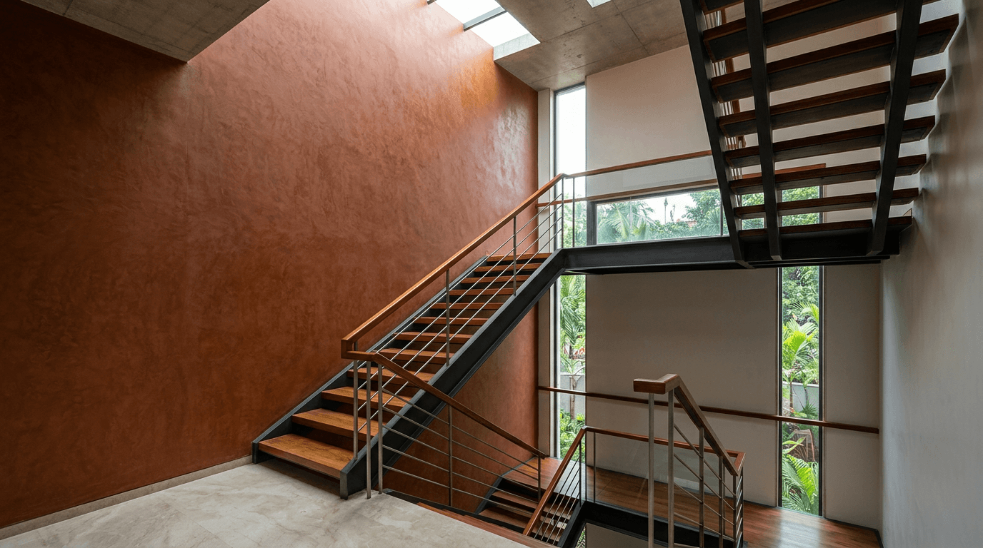
39. Stairwell as the vertical spine. In a three-storey house the stair is the only space you see at every level, so we treat it as the spine that repeats the facade tone floor after floor. On a triplex we designed in Metuguda, built over a parking level with a rental unit, that spine was what stopped the interiors from feeling like three unrelated flats stacked up.
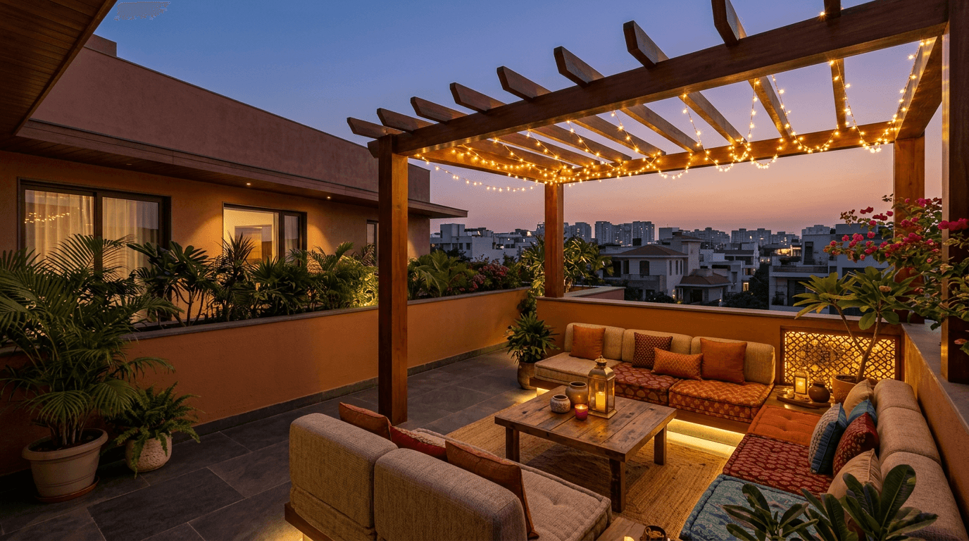
40. Terrace tying back to the front. Terraces get treated as leftovers. Give the parapet and the pergola the facade's own tones and the roof becomes part of the house rather than a service area.
Exterior Colour Chart by Architectural Style
Take a photo of this to the shop. It is the same table we sketch on a napkin when a client asks what goes with what.
| Architectural style | Base | Accent | Trim, grille and gate |
|---|---|---|---|
| Modern minimalist | Cool grey | Crisp white | Matte black |
| Contemporary warm | Warm greige | Teak wood-tone | Bronze or dark brown |
| Traditional, sloped roof | Warm ochre or cream | Terracotta | Teak brown |
| Kerala / coastal tropical | Ivory | Red clay tile | Dark timber |
| Contemporary coastal | Soft sage green | Beige | Charcoal grey |
| Village and farmhouse | Lime white | Oxide red plinth | Bottle green |
| Small home, tight budget | Cream | White | One bright door shade |
| Apartment block | Light neutral field | Two banding tones | Mid grey railings |
Read it as a starting point, not a rule. A deeper trim tone against a light base adds charm to the exterior for the price of two litres, which is the best-value move on the whole chart. The base column is where 70% of the wall goes, the accent column covers recessed masses and bands, and the last column is everything metal.
Popular Colour Combinations at a Glance
These are the exterior house colour combinations we specify most often — or exterior color combinations, if that is how you searched. Any of them is a safe starting point.
- Cream and brown. The most requested color combination in our enquiries, and the one that suits the widest range of sloped-roof and columned elevations.
- White and charcoal. A modern color combination for flat-roofed houses with black grilles and large glazing.
- Warm greige and teak. The current favourite among exterior colour combinations for Indian homes: warm enough for our light, quiet enough to last a decade.
- Ivory and terracotta. A traditional color combination that follows the roof tile instead of fighting it.
- Sage green and beige. A softer color combination for houses that sit inside planting.
- Grey and white. The default urban color combination. Add a wood tone somewhere or it reads cold.
- Yellow ochre and green. A rural color combination borrowed from village houses across the Deccan.
- Blue and white. The coastal color combination, and the one that hides salt bloom best.
The house exterior colour that ages best on that list is almost always the lightest: a light colour hides dust, fade and patch repairs in a way deep tones never manage.
What Is Trending in 2026
Four shifts are showing up in the elevations we are asked to design this year.
Greige has replaced grey. Pure cool grey dominated 2020 to 2023 and now looks slightly dated. The warm-neutral version reads better against Indian light, which is yellower than the European light those palettes were developed under.
Earth and clay tones are back. Terracotta, muddy pinks and burnt sienna, usually as a single feature plane rather than the whole facade. Traditional pigments, contemporary geometry.
Sage and olive on residential exteriors. Green used to be a joinery colour here. Now it turns up as a body tone, and it works because it agrees with planting.
Material is doing the accenting. On a modern house the third element is increasingly a material rather than a shade, and contemporary homes now get a wood-look cladding panel, a stone band or a metal screen instead. Colour comes from the material, which weathers rather than fades. That is a genuinely better long-term bet than a bold third paint tone.
What is fading: high-gloss finishes on large planes, all-over dark charcoal facades in hot cities, and the multi-shade elevation with five tones fighting for attention.
Exterior Wall Paint Finishes That Actually Matter in India
Shade selection gets all the attention. The product line matters at least as much, because it decides whether that shade still exists in year five.
Silicone exterior emulsion is the premium tier: silicone-modified binders shed water and resist alkali and UV better than standard acrylic emulsion. It is the one upgrade we argue for on south and west faces.
Dust-guard finishes use a low-tack, tighter surface film so airborne grime rinses off in rain rather than embedding. On a main-road plot it is the difference between washing the facade annually and repainting it early.
Cool-roof and heat-reflective systems carry high solar reflectance, and the relevant industry measure is the Solar Reflectance Index. Worth specifying on terrace slabs and west walls in hot-dry cities.
Textured and sand-finish coatings look excellent and hold dirt in every groove. Use them on protected surfaces, not on the wall facing the road.
Indian home exteriors also take a harder beating than the climates several of these products were originally developed for. Indian climates deliver high UV for most of the year, rain in concentrated bursts, and dust in between. Worth knowing where things actually fail. Exterior house paint rarely gives way in the middle of a wall — it goes at the parapet coping, the junctions and the plinth, because that is where water sits. So the exterior paint colour you pick matters less than the system under it. Ask your contractor which product line he has quoted, and whether it is suitable for Indian coastal or high-rainfall conditions if that is where you are building.
Two rules that matter more than the tin. First, primer and putty are not optional on a new plaster surface — the finish coat is only as good as what is under it. Second, weather-resistant does not mean waterproof: a wall with active seepage needs the leak solved first. On that 30-year-old Hyderabad building we repainted, the waterproofing was the actual project and the repaint was the visible part.
One thing worth saying before the money section: a full exterior home repaint is still the cheapest large change you can make to a house. Nothing else transforms your home's exterior for so little. If you want the interior equivalent of this section, the technique side lives in our wall painting design guide.
What Drives the Cost of Painting a House Exterior
We do not publish rate cards, because exterior painting rates swing hard by city, by height, and by how bad the existing surface is. A quote that arrives without a site visit is a guess. What you can do is understand what you are actually paying for, so you can read a quotation properly.
Surface preparation. Scraping, crack filling, and treating salt or fungal patches. On an old building this can cost more than the finish coat, and it is the line contractors quietly drop to look cheaper.
Primer and putty. Exterior putty and a proper primer coat. Skipping them is the single most common way a repaint fails within two years.
Number of coats. Two finish coats over primer is standard. Deep and bright tones often need three, because they have less opacity — a real budget factor when choosing a saturated shade.
Product tier. Standard acrylic, premium acrylic, or silicone emulsion. The gap between tiers is large and it maps directly to repaint frequency.
Access. Height, scaffolding, cradle work on a tall narrow plot, and whether the painters can reach the rear wall at all. A triplex costs more per square metre than a single-storey house of the same footprint.
Add-on works. Waterproofing, crack stitching, texture bands, cladding. These are separate scopes, and they should appear as separate lines.
Ask for the quotation split those six ways. If a contractor cannot itemise it, that itself is information. For a project-specific estimate on a design-build scheme, our team quotes after seeing the site — pricing genuinely depends on your city, plot and specification.
Mistakes We See Most Often
Choosing from a 30 mm chip. Colour intensifies as area grows. Buy sample pots, paint a full square metre on the actual wall, and look at it at three different hours before deciding.
Ignoring what is already fixed. A beautiful grey palette dies the moment you remember the roof is terracotta and the grilles are brown.
Dark tones on the biggest sunlit plane. They fade unevenly, they push heat into the rooms behind, and they show every repair patch.
Too many tones. A paint combination of three is a scheme. Five is a swatch card stapled to a building. If every mass is different, nothing is emphasised.
Painting over a damp wall. The finish will blister, and you will blame the paint.
Forgetting the compound wall and gate. They are the first things seen from the street and the last things anyone budgets for. Home outside colour decisions have to include the boundary, or the plot reads as two separate projects.
Treating it as four decisions. Outside house painting colour, texture, primer and the gate finish routinely get chosen by four different people on the same site. The painting colour combinations that survive are the ones decided together, on one drawing.
Matching the neighbour exactly. We designed a group of eight near-identical villas on a trapezoidal plot in Machilipatnam, and the question the developer kept coming back to was how to keep them from reading as one repeated building. When the form repeats, the finish is the only thing left to differentiate.
How Long an Exterior Scheme Lasts
Premium exterior emulsions carry manufacturer warranties measured in years rather than months, and the specific number is printed on the pack — read that rather than trusting a general figure, because the range across product tiers is wide.
Real-world life depends on four things: which direction the wall faces, whether water is getting into it, how much airborne dust and pollution it collects, and whether the surface was prepared properly in the first place. South and west faces will always tire first. Sheltered north walls can look fine long after.
A light annual wash-down does more for longevity than most people expect. Hose the facade at the end of monsoon, check the plinth and parapet junctions for hairline cracks, and touch up early. Repainting one elevation at year five is far cheaper than repainting four at year seven.
