Written by Karthik M, Chief Designer at Roomantic. IIT Guwahati Design alumnus focused on interiors, 3D visualization, and design-build workflows.
Key Takeaways
- The safest bedroom colour combination for most Indian homes is a light base plus one deeper accent behind the headboard.
- Light wall colours make a compact bedroom feel larger. Deep bedroom colours make large rooms feel calmer and more expensive.
- Test every colour combination as a 2x2 ft patch on your actual bedroom wall, in morning and night light, before you buy paint.
- We've included hex codes for all 40 combinations so your painter or dealer can match them exactly.
When Mrs. Padmavathi bought her 2BHK in Hyderabad from a retired couple, almost nothing about the apartment matched her family's life. We reworked the kitchen, the storage, even a permanent wall painting the previous owners had left behind. And the question she asked most often during that project wasn't about carpentry at all. It was "what colour do we paint the bedroom?"
That question comes up in nearly every project we take. So this guide is our full answer: 40 bedroom colour combination ideas we'd actually recommend, colour combinations for bedroom walls of every size, with hex codes, photos, and honest notes on where each colour combination works and where it doesn't. (You'll notice we write "colour" while plenty of searchers type "color combination", "bedroom color", or even "bed room colour design". Same advice, different spellings.)
Why Bedroom Colour Is a Sleep and Space Decision
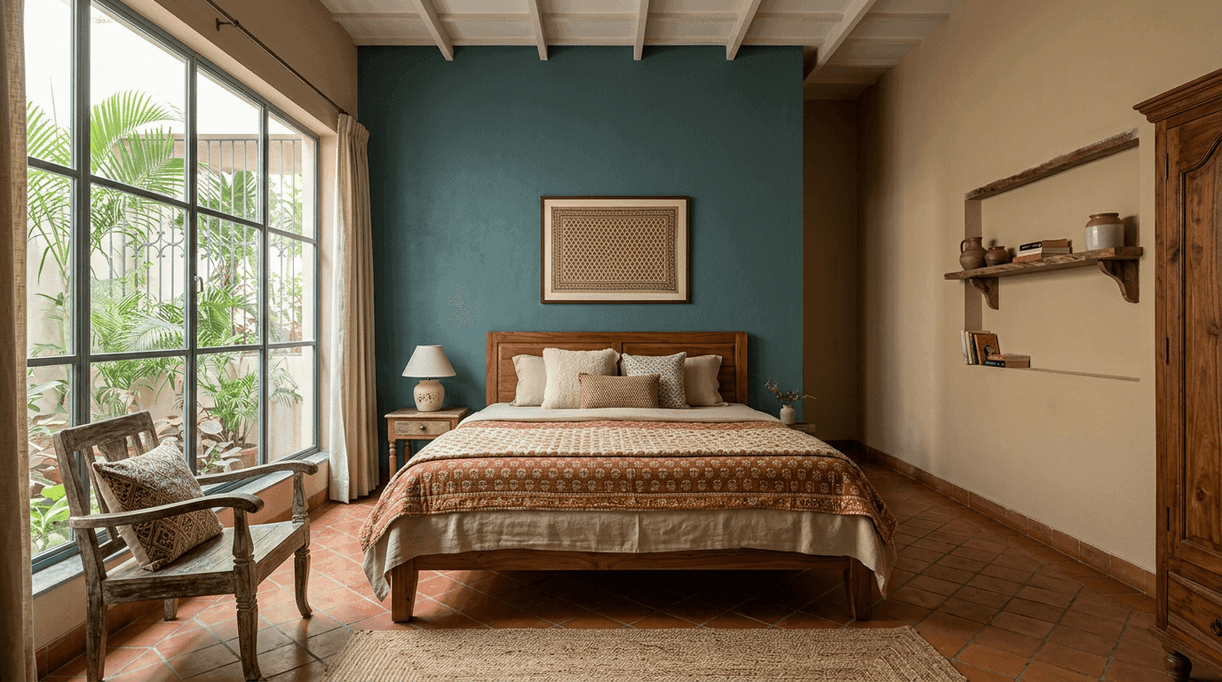
A bedroom wall colour does two jobs at once. It sets how the room feels at 11 pm when you're trying to wind down, and it changes how big the room reads in daylight. A bedroom that feels right at both hours is the whole brief. That's why choosing the best colour for bedroom walls deserves more thought than a five-minute scroll through a shade card.
Colour psychology research is fuzzier than paint ads suggest, but the practical patterns are consistent. Cool, muted wall colours (soft blues, greens, greys) lower visual stimulation, which is what you want in a sleep space. A calming colour earns its place in a bedroom the way a loud one earns its place in a gym. Saturated warm shades (bright red, orange, hot pink) push energy up. So we keep high-energy colour in accent doses rather than across all four bedroom walls.
Then there's light. A north-facing bedroom in an Indian apartment gets cool, even light all day, so warm colours stop it feeling gloomy. A west-facing bedroom cooks in the evening, and cool colours calm that down. Before you fall in love with a swatch, check which way your bedroom window faces. Half the "the colour looks different on my wall" complaints we hear come down to this.
Top Two Colour Combinations for Bedroom Walls
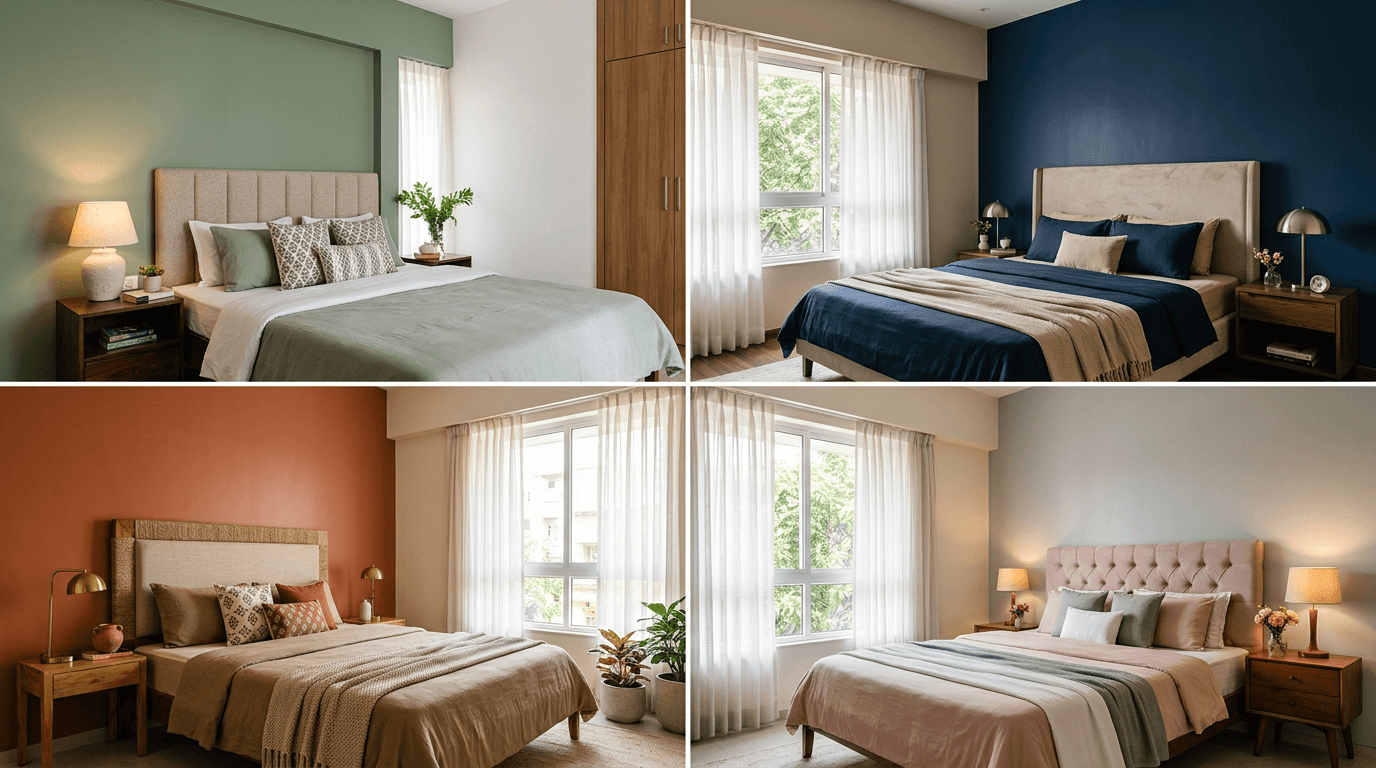
The best two colour combination for bedroom walls is a light neutral on three walls with one deeper accent wall behind the bed. Safe, proven pairings include mint green with white, blue with grey, brown with cream, peach with off-white, lavender with ivory, and sage green with beige.
Here are the six wall colour combinations we recommend most, with hex codes you can hand to your painter. When two colours share a wall, one should whisper and one should speak. The best colour combinations all respect that rule.
- Mint Green and White (#A5D6C4 + #FAFAF7). Fresh without being cold. Works in almost any light.
- Blue and Grey (#5B7C99 + #D9DDE1). Calm and slightly masculine. Great for west-facing rooms.
- Brown and Cream (#8B6F5C + #F5EFE4). Warm and grounded. Pairs beautifully with wooden furniture.
- Peach and Off-White (#F4C7AE + #FBF7F0). Soft morning-light feel. Flattering in tight rooms.
- Lavender and Ivory (#C3B3D6 + #FFFDF3). Gentle and restful. A quiet alternative to pink.
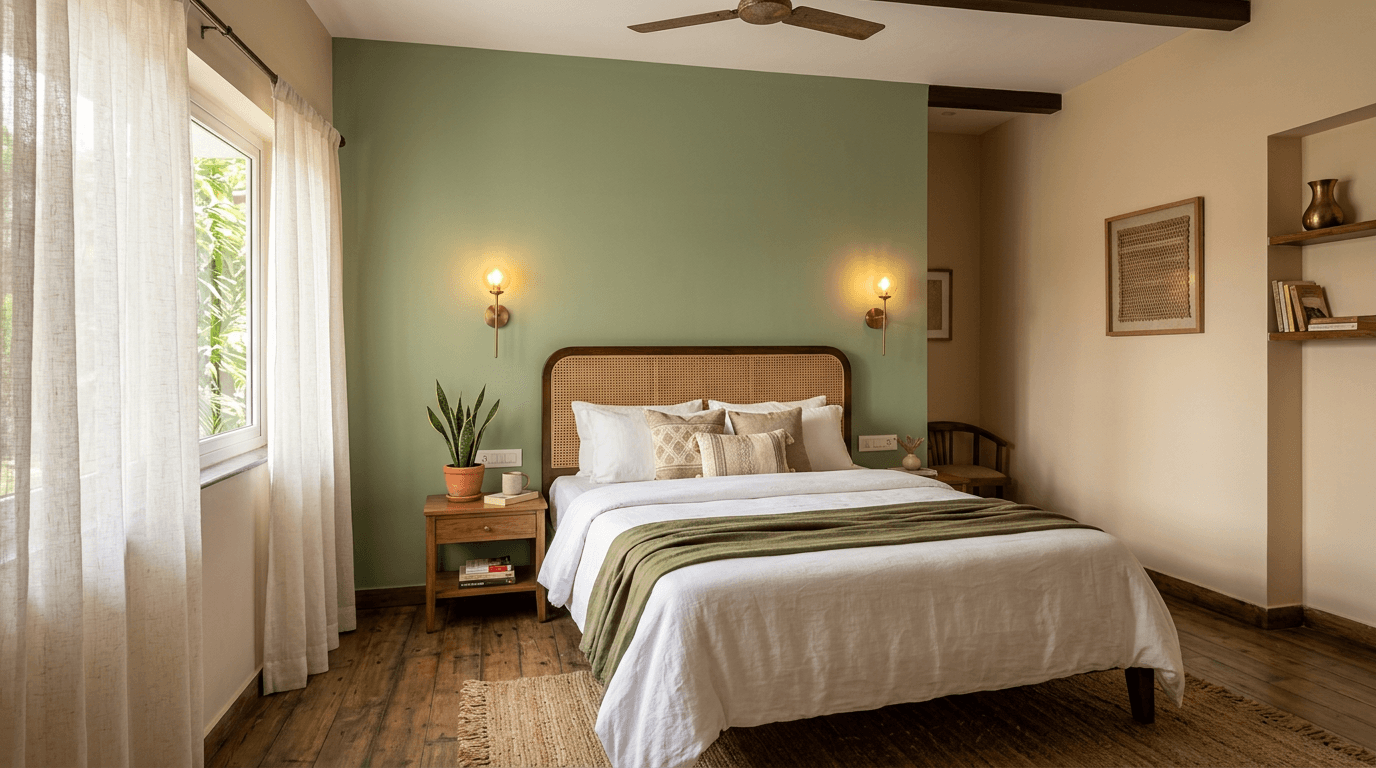
- Sage Green and Beige (#9CAF88 + #E8DFD0). The most-requested pairing in our projects right now, and arguably the single most dependable pairing on this list.
The 10 Most-Requested Bedroom Colour Combinations in Indian Homes
These are the colour combinations clients ask us for by name, from 2BHK apartments to villas. Numbered 7 to 16 so you can keep count toward the full 40 combinations for your bedroom.
- Grey and Blush Pink (#B8BCC2 + #EFC9C5). The most-searched bedroom color combination in our metros. The grey keeps it adult, the blush keeps it soft. A favourite for couples who can't agree.
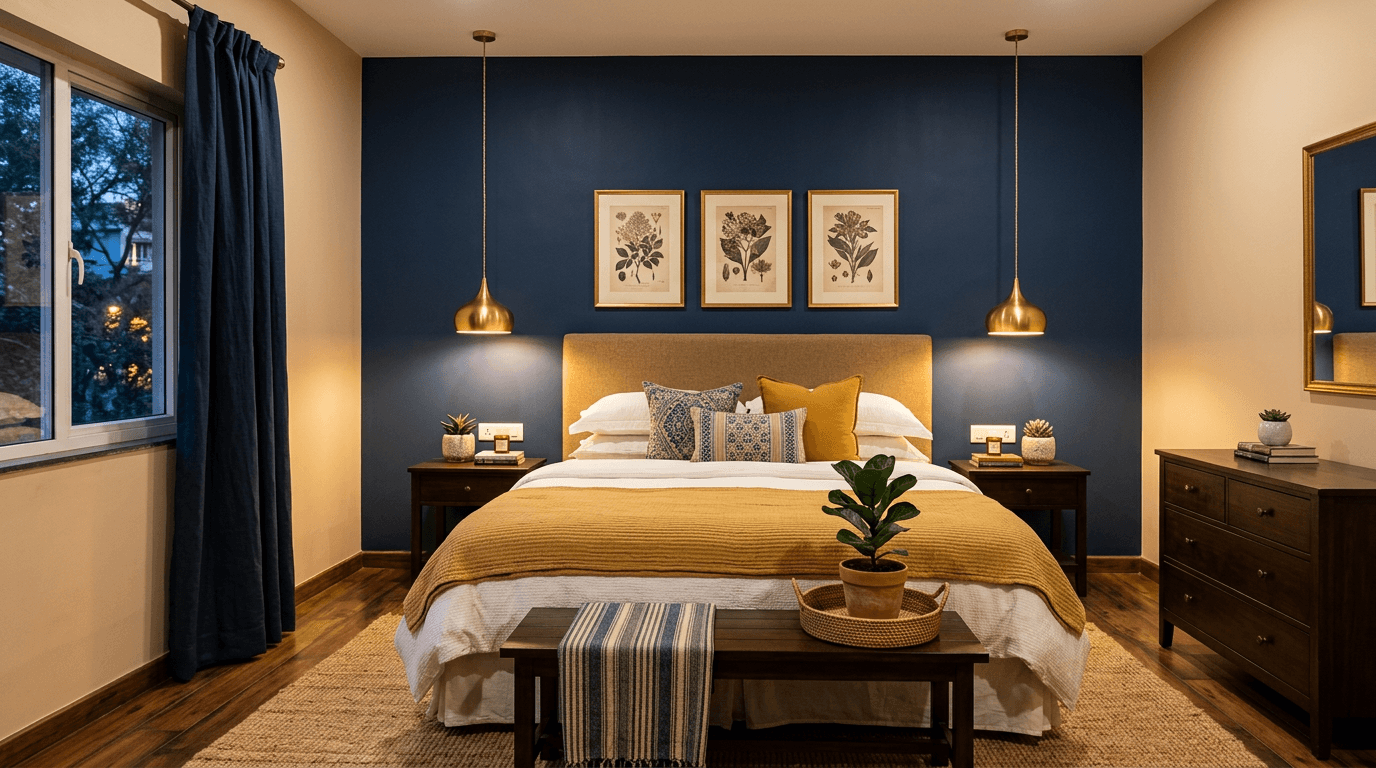
- Navy Blue and Warm Beige (#2E4057 + #E7DCC8). Deep navy behind the bed reads like a boutique hotel. Keep the other three walls light or the room shrinks.
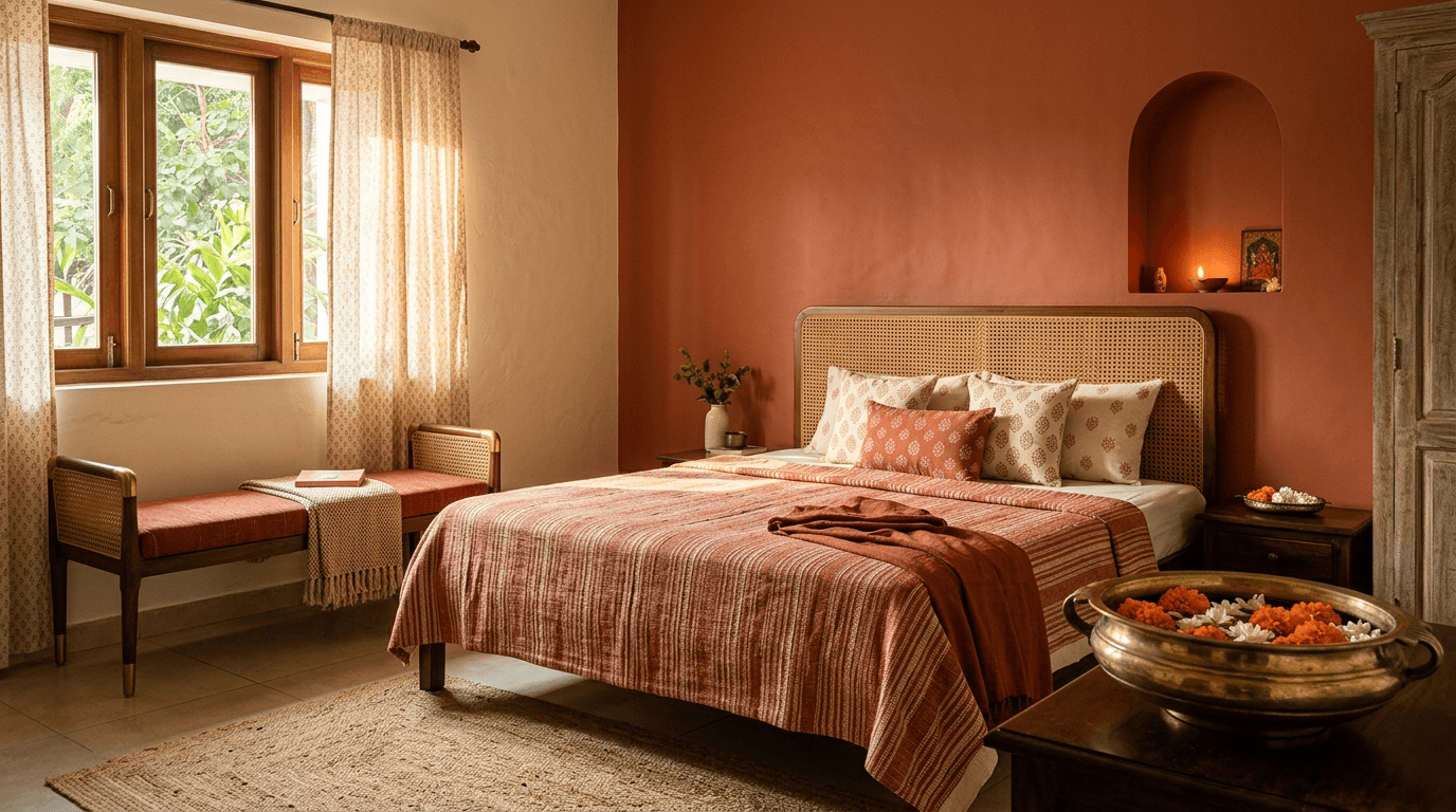
- Terracotta and Cream (#C36A4D + #F6EFE2). Earthy and very Indian. This colour combination brings warmth that flat whites never manage, and it's gorgeous with cane furniture and handloom textiles.
- Teal and Off-White (#2F6E75 + #FAF6EE). A color combination richer than plain blue. Handles bright tropical daylight well.
- Mustard and Grey (#D9A441 + #C9CCD1). A small mustard dose adds a pop of colour to an otherwise quiet grey room. Best as a half wall or niche, not all four walls.
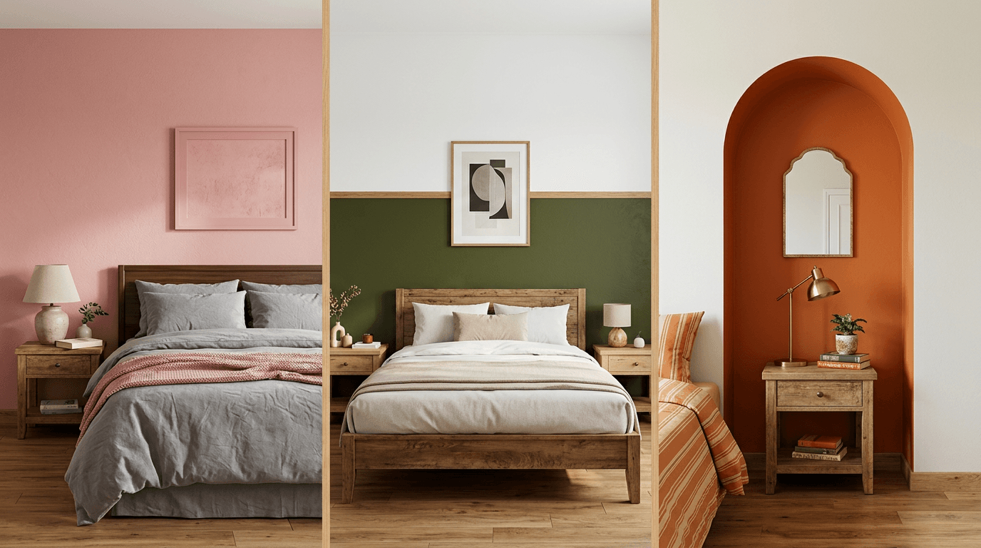
- Olive Green and Ivory (#7A7E52 + #FFFDF0). Muted, botanical, and very 2026. A colour like olive ages better than brighter greens.
- Dusty Rose and White (#D8A7A0 + #FBFBF8). Warmer than blush, less sugary than pink. This combination of pink undertones and clean white is lovely with light wood.
- Charcoal and Light Grey (#3C4043 + #DCDEE0). A monochromatic palette, meaning one colour family in different depths. Sleek, urban, and forgiving of wall imperfections.
- Powder Blue and Cream (#AFC8D8 + #F7F1E3). The classic normal bedroom colour upgrade. Familiar but never boring.
- Beige and Chocolate Brown (#DCCDB4 + #5A4232). Traditional, warm, and safe for joint-family homes where everyone must approve.
When we designed Hamsini's three-storey home for her joint family in Hyderabad, this was the real challenge. Five bedrooms, three generations, and completely different tastes: her parents, her in-laws, a teenage son who wanted a big study wall, and the couple themselves. One scheme per person, one family that still had to feel like one home. Combinations 14 to 16 did most of the heavy lifting for the elders' rooms precisely because they're calm and familiar. Nobody argues with beige and brown. People argue plenty about mustard.
Two Colour Combination for Bedroom Walls: Accent Formulas That Always Work
A two colour combination for bedroom walls nearly always follows one formula: 70 to 80 percent quiet base, 20 to 30 percent character colour. Get that ratio right and even bold two-colour pairings behave, because the two colours never compete at equal volume. This is also where a room colour combination for bedroom use differs from one for a living room. A hall can carry drama on every wall because you pass through it. You sleep facing your bedroom walls, so restraint pays. Colour combinations 17 to 24:
- Pink and Grey (#E8B4B8 + #9EA3A8). The pink two colour combination we recommend most. Grey stops the pink turning into a candy shop.
- Orange and Off-White (#E07B39 + #FAF5EC). The orange two colour combination for people who find beige boring. Burnt orange on one feature wall against off-white is energetic but controlled. Skip it in west-facing rooms that already run hot.
- Green and Yellow (#7FA86F + #F2D16B). Analogous colours, meaning neighbours on the colour wheel, so they blend without clashing. Keep the yellow pale.
- Purple and Grey (#6E5A8E + #D5D5DA). A color combination that goes moody without going gothic. Good for rooms with lots of daylight.
- Red and Beige (#A63A32 + #EFE6D5). A deep brick red, not fire-engine red, kept to the headboard side only. Adds a collected, layered look to your bedroom, and it's rich against brass and dark wood.
- Turquoise and White (#4FB3A9 + #FCFCFA). Coastal and crisp. This white colour combination is perfect for kids' and guest bedrooms.
- Coffee and Sky Blue (#6F5846 + #BDD7E7). Complementary-scheme logic: a warm and a cool balancing each other. Unusual, but it works.
- Black and White (#1E1E1E + #F8F8F8). Matte black behind the bed, white everywhere else. Only for disciplined minimalists. Clutter kills it instantly.
Which is the best wall for the accent? Behind the headboard, 90 percent of the time. The bed wall is the natural focal point, and you don't face it while falling asleep, so a strong colour there never overstimulates. The other options are a half-and-half horizontal split (dark below, light above) or a painted niche.
Royal and Luxury Bedroom Wall Colour Combinations
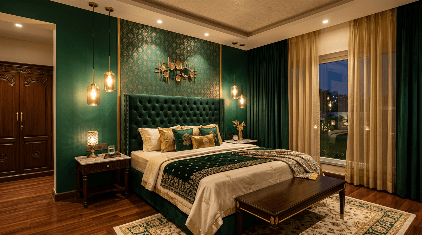
For one client's ultra-luxury six-bedroom Hyderabad home, complete with pool, bar, and party floor, the interiors brief was simple: it should feel like a suite, not a flat. Deep, saturated bedroom colours in rich colour combinations, warmed with metallics, are how you get there. Colour combinations 25 to 30:
- Emerald Green and Gold Accents (#1F5E4B + #C9A66B). The current king of luxury bedroom paint colors. Pair with brass lamps and walnut wood.
- Burgundy and Blush (#6E2639 + #E9C9C4). Wine-dark drama softened by a pale partner. Very forgiving with warm lighting.
- Navy and Champagne (#22344A + #E6D8BE). Tailored and quiet. The most masculine of the luxury set.
- Deep Teal and Copper Tones (#134E4E + #C77E52). A color combination cooler than emerald, warmer than navy. Stunning behind a velvet headboard.
- Aubergine and Warm Grey (#4A3350 + #C7C1BC). Unexpected and adult. Needs good lighting design to shine.
- Forest Green and Cream (#2C4A3B + #F4EDDE). Luxury that still feels natural. Our pick if you want a rich bedroom colour design without gloss.
One honest note. Deep wall paint shows roller marks and surface flaws more than light shades do. Budget for wall prep and a quality applicator, or the royal look arrives with visible patchiness.
Calm and Normal Bedroom Colours for Everyday Homes
Most briefs we get aren't dramatic. Mr. Manikantha and his wife wanted their 3BHK to be clean, low-maintenance, and spacious, with zero open shelves and nothing shouting for attention. For homes like that, the everyday colour combinations below are the answer. Colour combinations 31 to 35:
- White and Light Grey (#FBFBF9 + #D8D8D6). The default for a modern bedroom with minimalist bones. Texture in fabrics does the decorating.
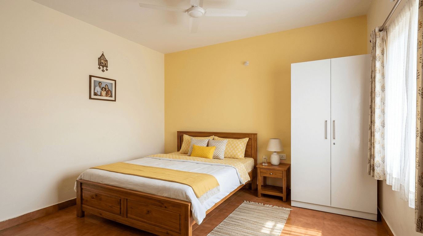
- Cream and Pale Yellow (#F8F2E2 + #F3E3B3). The classic normal bedroom colour scheme across the country, and there's a reason it survives every trend cycle. It's warm, bright, and cheap to touch up.
- Ivory and Soft Green (#FFFCF0 + #CBD9C0). Barely-there colour. Reads white until sunlight hits it.
- Light Grey and Lavender (#DEDEE2 + #D4CBE3). Pale grey and lavender is a quiet trend pairing that photographs beautifully. A colour combination that feels calm at night and fresh in the morning.
- Off-White and Sand (#FAF6EE + #E3D3B6). Two warm neutrals in one quiet color combination. Foolproof with any furniture you already own.
We also specify these wall colours for rental properties. Dr. Kirti Goud's 4,000 sft My Home Bhooja apartment was designed to rent, and a neutral, minimal palette was central to that. Quality tenants can picture their own life inside a neutral bedroom, and touch-ups between tenants are painless.
Bedroom Colour Combinations by Room Size
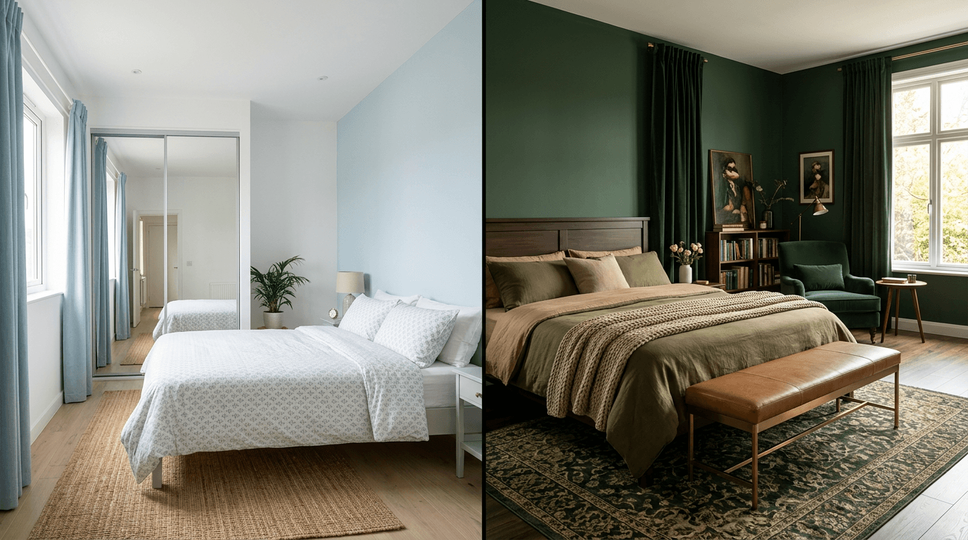
Light shades reflect more light, so a compact room feels bigger in pale colour combinations. Dark shades absorb light and pull walls visually closer, which makes big rooms cosier. Colour combinations 36 to 40 apply that directly.
For compact rooms (10x10 or tighter):
- All-White with Warm Wood Tones (#FCFCFA + wood accents). The maximum-space option, and proof that wood texture can replace colour entirely. Let the ceiling stay white too.
- Pale Blue and White (#CFE0EA + #FBFBF8). A cool color combination for bedroom walls that recedes, so the walls feel further away. Perfect for compact city flats.
- Soft Beige and White Vertical Duo (#EFE5D3 + #FCFAF4). Paint a vertical band or panel to draw the eye up and add height.
For large bedrooms:
- Deep Green and Tan (#33523E + #D9BC94). Fills volume so the room doesn't feel like a hall. This combination is perfect for creating a den-like, enveloping mood.
- Slate Blue and Warm White (#5A6B7F + #F7F3EA). Grown-up and serene. Our go-to master bedroom colour combination when there's a sitting corner to zone.
Mr. Sumit in Giridih went the other direction: we merged two cramped bedrooms and a bathroom into one generous master with a walk-in closet and study. Suddenly a room that needed space-stretching tricks could handle deeper colour. Your colour combination should follow your floor plan, not fight it.
For more layout-level tricks, see our guide to small bedroom designs and our master bedroom design ideas.
How to Choose the Right Colour Combination for Your Bedroom
With 40 colour combinations for bedroom walls on the table, picking the winner comes down to five questions we ask in every client meeting:
- Which direction does the window face? North-facing rooms want warm colour combinations for bedroom walls (peach, cream, terracotta). West and south-facing rooms cool down with blues, greens, and greys.
- Who sleeps here? A couple's room, a child's room, and grandparents' rooms carry different energy. Elders usually prefer familiar wall colours over trend shades.
- What already exists? Flooring, wardrobe, and curtains outlive paint. Choose the colour combination for a bedroom around them, not against them.
- What's the mood target? The best colour combination for bedroom sleep quality is rarely the flashiest one. Calmer schemes suit restless sleepers, warm ones fix cold light, deeper ones signal luxury. Name the bedroom atmosphere you want before naming the shade. That's how you choose the perfect colour instead of the loudest one.
- Will you still like it in five years? If unsure, put the risky colour on one wall and keep the base timeless.
Answer those five and the right bedroom wall colour combination usually picks itself. It's the fastest shortlisting route we know. Two finalists at most will survive.
Matching Wall Colour to Wardrobe, Flooring and Curtains
Bedroom walls never work alone. The fastest way to sanity-check a colour scheme is the 60-30-10 rule: about 60 percent dominant colour (walls), 30 percent secondary (wardrobe, curtains, bed), 10 percent accent (cushions, art, lamps).
A few pairings we keep returning to on site:
| If you have | Wall colours that work | Avoid |
|---|---|---|
| Dark wood wardrobe or flooring | Cream, sage, powder blue, warm white | More dark brown |
| White laminate wardrobe | Any deep accent: navy, emerald, terracotta | All-white everything |
| Grey tile flooring | Blush, lavender, mustard accents | Cool grey walls (flat, lifeless) |
| Yellow-beige marble | Warm whites, olive, terracotta | Stark blue-whites |
| Heavy printed curtains | Solid pale walls | A second pattern or strong colour |
For Mr. Pavan Kumar and Kavitha's first 2BHK, a newly married couple's home we still remember fondly, the contemporary minimal furniture came first and the wall colour palette was chosen to serve it. That order matters. Paint is the cheapest thing in the room to change, so let it adapt to the expensive things.
Paint Finish Guide: Matte, Satin or Texture?
The same bedroom paint colour looks different in different finishes, and finish decides maintenance too.
- Matte: Softest, most premium look. Hides wall imperfections. Hardest to wipe clean, so think twice with young kids.
- Satin or eggshell: A slight sheen, wipeable, slightly reflective so wall colours read a touch lighter. Our default bedroom paint choice.
- Texture: Reserved for one feature wall. Adds depth in monochromatic palettes, but it collects dust and costs more to redo.
If you're weighing textured and stencilled paint ideas seriously, our wall painting design guide covers those techniques wall by wall. And if wallpaper is on your shortlist instead of paint, treat it like permanent paint: same placement rules, same restraint.
Trending Bedroom Wall Colour Combinations for 2026
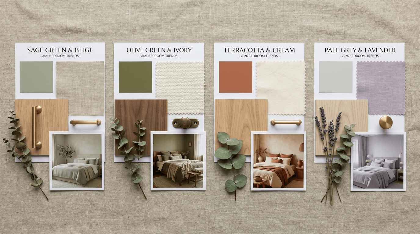
The wall pairings we're actually specifying in current projects, not just seeing on Pinterest: sage green with beige, olive with ivory, terracotta with cream, and the pale grey plus lavender pairing. The common thread this year is muted, nature-derived colour, and Pantone's annual colour direction has been pointing the same earthy way. Bright jewel tones are retreating to accents, and stark all-grey rooms are fading out after a long run. For bedroom walls in 2026, expect more clay, more sage, more sand, and far less high-gloss anything.
One caution from the design desk. A trend-led wall colour combination dates fastest on the biggest surface of the room. If you love a trend shade, put it on the feature wall and keep the base timeless. Repainting a single wall in three years is a weekend job. Repainting a whole room is not. That's how you transform your bedroom with the trend, not into a hostage of it.
How to Test a Colour Combination Before You Commit
Here's the process we walk every client through before a single wall gets painted:
- Shortlist two or three colour combinations for bedroom walls from this list.
- Get sample pots and paint a 2x2 ft patch of each on the actual bedroom wall. Two coats.
- Live with the patches for three days. Look at them at 7 am, midday, and 10 pm with your usual lights on.
- Hold your curtain fabric and bedsheet against each patch.
- Only then commit to the combination for your bedroom walls: order the full quantity and note the exact shade codes on your invoice for future touch-ups.
Screens lie about colour, which is why we render every Roomantic project in 3D and then still insist on physical patches. If you'd like a designer's eye on your specific room, light, and furniture, book a consultation and we'll build the palette around your actual floor plan. To create a bedroom that works as a whole, start broader with our complete bedroom interior design guide, browse bed designs to pair with your palette, or compare schemes across the house in our room colour combination guide.
