Key Takeaways
- A plus-minus POP design is plastered onto your existing slab, not hung below it. The "plus" is the raised band, the "minus" is the recessed groove. Nothing gets suspended, so you keep the height you already have.
- It is the right answer for low slabs. Most Indian apartments sit near 9.5 to 10 feet. A suspended false ceiling eats 4 to 6 inches of that. A plus-minus POP design costs you almost nothing in height.
- The fan stays safe. Because the plaster sits on structural concrete, the fan hook remains anchored in the slab itself.
- Restraint wins. One raised band, one groove, one warm light line. The most elaborate ones date fastest.
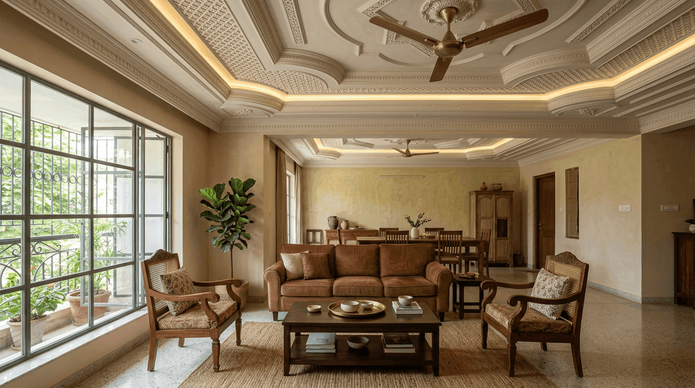
A new modern pop plus minus design is a plaster of paris relief applied directly to the roof slab, where raised "plus" sections and recessed "minus" grooves create depth without a suspended frame. It suits low-ceiling Indian homes, keeps the fan anchored in structural concrete, and works across hall, bedroom, entrance and dining ceilings.
This gallery collects 45 plus minus POP designs for 2026, grouped by room: hall, bedroom, entrance, children's rooms, dining, and large halls that need a double fan. Every one of these plus-minus POP designs is one we would actually draw. Think of it as the shortlist of design ideas in 2026 that survive contact with a real slab. You will also get the sizing rules, the fan clearances, and an honest account of what moves the price, because a photo alone has never helped anyone brief a contractor.
What Is a Plus Minus POP Design?
Search for a new modern pop plus-minus design and you will mostly find photos with no explanation. Ask ten contractors and you will get ten answers, most of them about how it looks. Here is the definition that matters when you are paying for it.
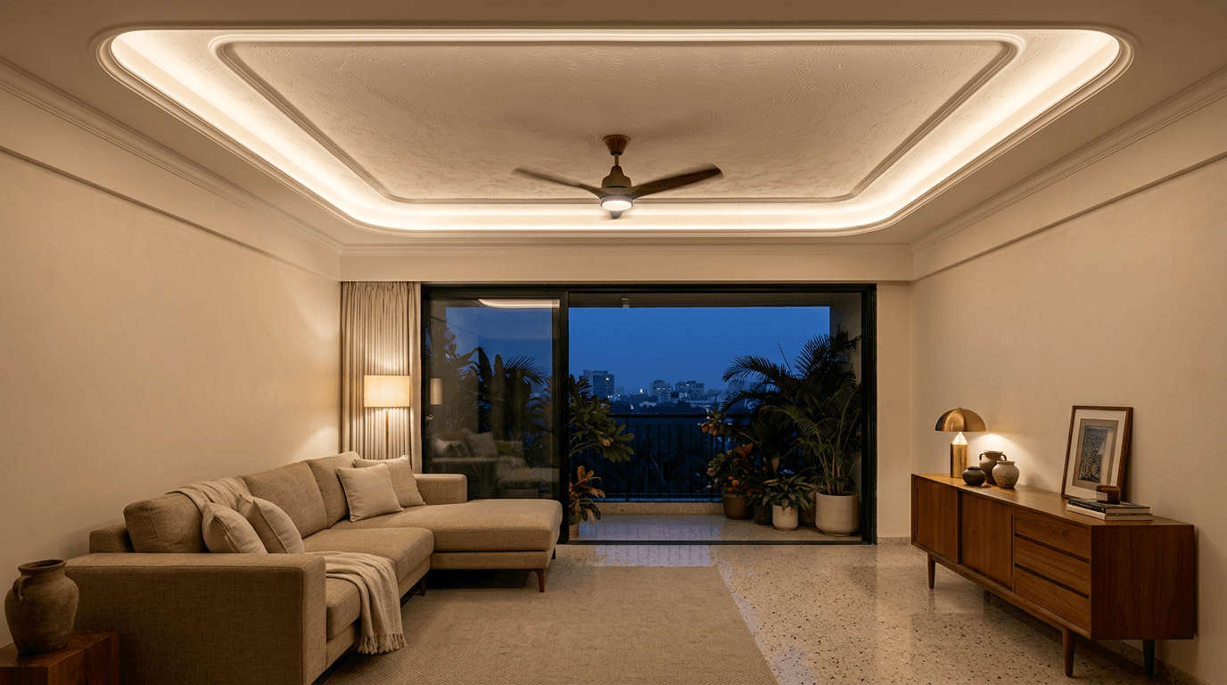
A plus minus POP design is a relief pattern built in POP on the underside of your concrete roof slab. Sections that project downward are the "plus", the elevated bands you notice first. Channels cut or formed into the plaster are the "minus". You will also see the same thing listed as a plus minus pop design for roof, or simply a POP design for roof, because in Indian usage the slab overhead is the roof of the room below. Together they read as a layered ceiling design, but structurally it is still just your slab with plaster on it.
That single fact is why this style refuses to die in Indian apartments. A suspended false ceiling needs a metal grid hung below the slab, and that grid takes away four to six inches of head height before the boards even go up. In a 9.5-foot apartment, you feel that. A plus-minus POP design gives you the same visual layering for a fraction of the height loss.
We ran into exactly this on Mr. Ramana Murthy's 560 sft studio apartment in Tarnaka. The brief was maximum storage, easy maintenance, minimal everything. In a home that size, every inch overhead is worth defending, and the honest recommendation is nearly always slab-applied plasterwork rather than a full dropped ceiling.
There is a trade-off, and you should hear it before you scroll. Because the plaster is bonded to the slab, it cannot hide a thicket of services the way a suspended ceiling can. Concealed ducting for a cassette AC, a plenum full of cabling, deep pipe runs: those still want a dropped ceiling design. A plus-minus design will happily conceal a light line and a slim conduit. It will not swallow a duct.
How a POP Plus Minus Ceiling Is Made
Five steps, in the order your contractor should follow them. If a quotation skips step one or step five, that is where your money is quietly leaking.
- Clean and prime the raw slab. Loose plaster, curing compound and dust all get removed. POP does not bond to a dirty roof.
- Mark the design grid in pencil and chalk line, working from the room's true centre and the fan point, not from a wall that may not be square.
- Build the plus sections. POP paste is applied in layers over chicken mesh or a plaster key, built up to the intended projection.
- Form the minus channels. Grooves are cut and finished while the plaster is still workable, then edges are trued with a straight edge.
- Cure, sand, prime, paint. POP needs to dry fully before primer. Rushing this step is the single most common cause of hairline cracks later.
One practical note we insist on: finalise the electrical layout before step two. Every concealed light line, every fan point, every speaker cut-out belongs on the drawing before a single gram of plaster is mixed. Retrofitting a groove around a wire you forgot is ugly work.
12 Plus Minus POP Designs for Hall
The hall is where this style earns its reputation. Living rooms are usually the largest slab in the home and the one guests read first. These twelve POP design options run from near-invisible to genuinely elaborate designs, and every one of them is a plus minus pop design for hall ceilings rather than a generic tray.
1. Single raised band with one recessed groove
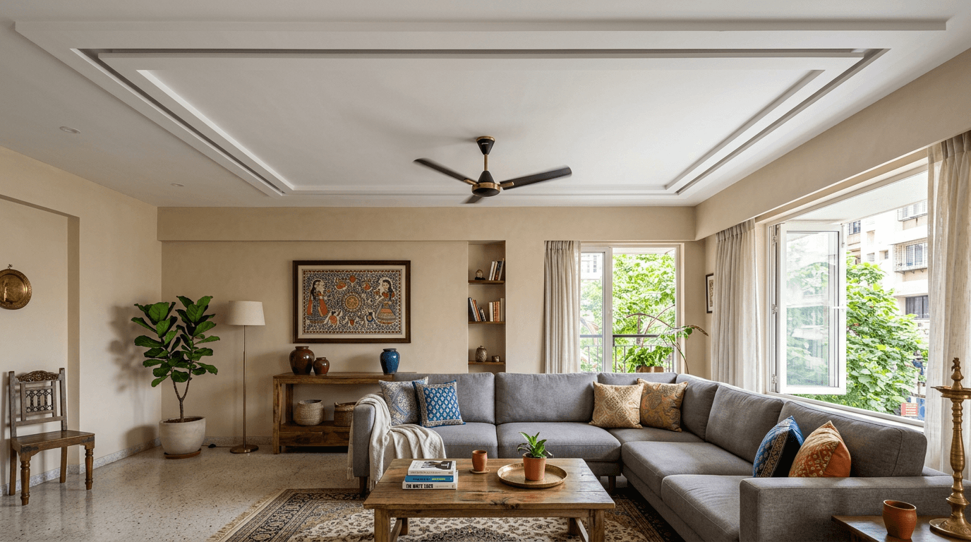
The default. One clean rectangle projecting about two inches, a slim channel inside it, centre left open at full height. It suits almost every hall proportion and never looks dated. If you want one safe POP design for hall ceilings, start here.
2. Double band with a concealed warm light line
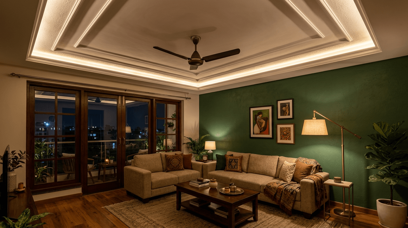
Two parallel raised bands with the groove between them carrying an LED strip. The light grazes the plaster and makes both edges read sharply after dark. It is the most requested POP design in our hall drawings.
3. Central raised rectangle with a border channel
The plus sits in the middle instead of at the edges, ringed by a recessed border. Good for square halls where a peripheral band would feel like a picture frame around nothing. A calm ceiling design for square living rooms.
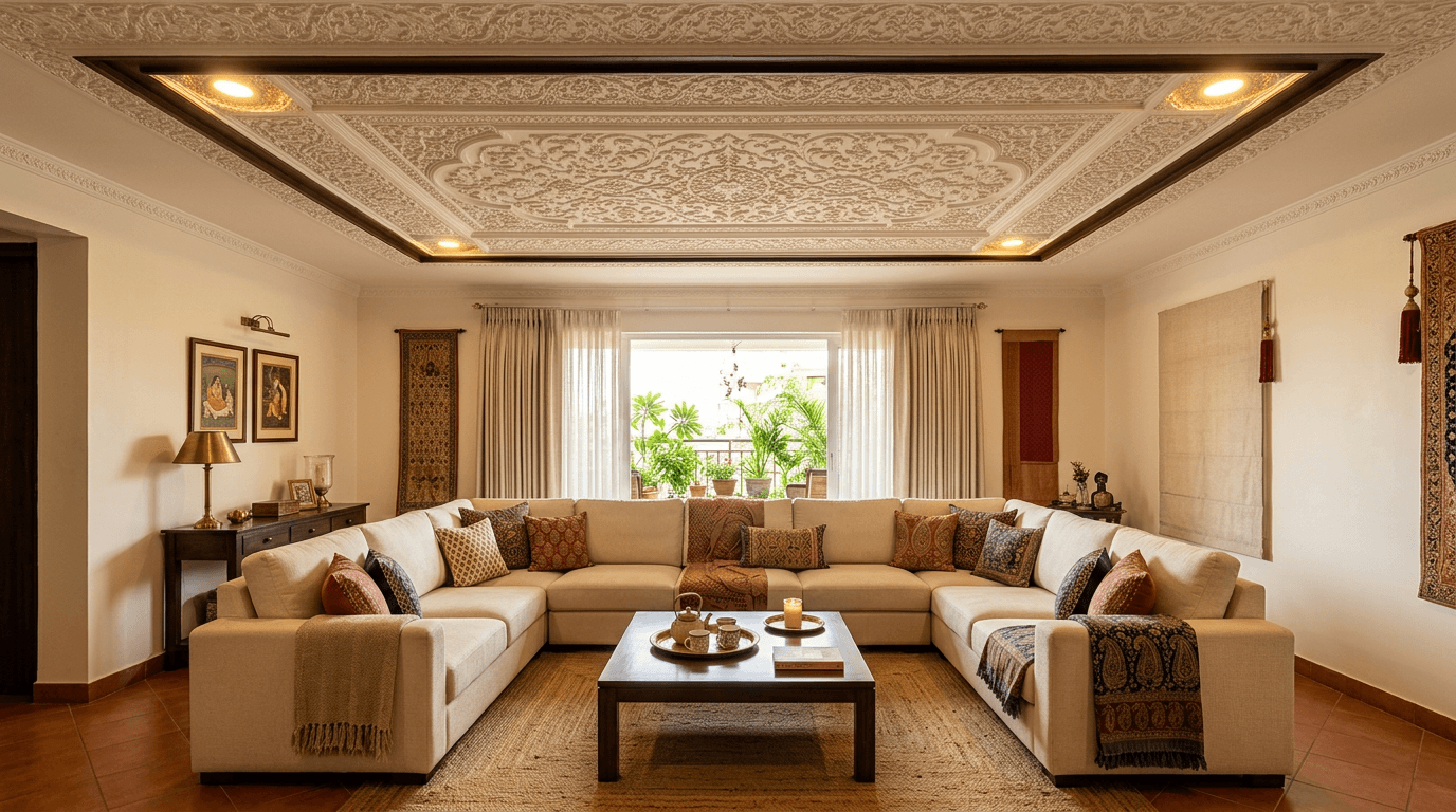
4. Diamond-shaped plus-minus pop design
A rotated square set in the centre, with grooves running out to the corners of the room. It is theatrical, and in a big hall with a plain floor it works beautifully.
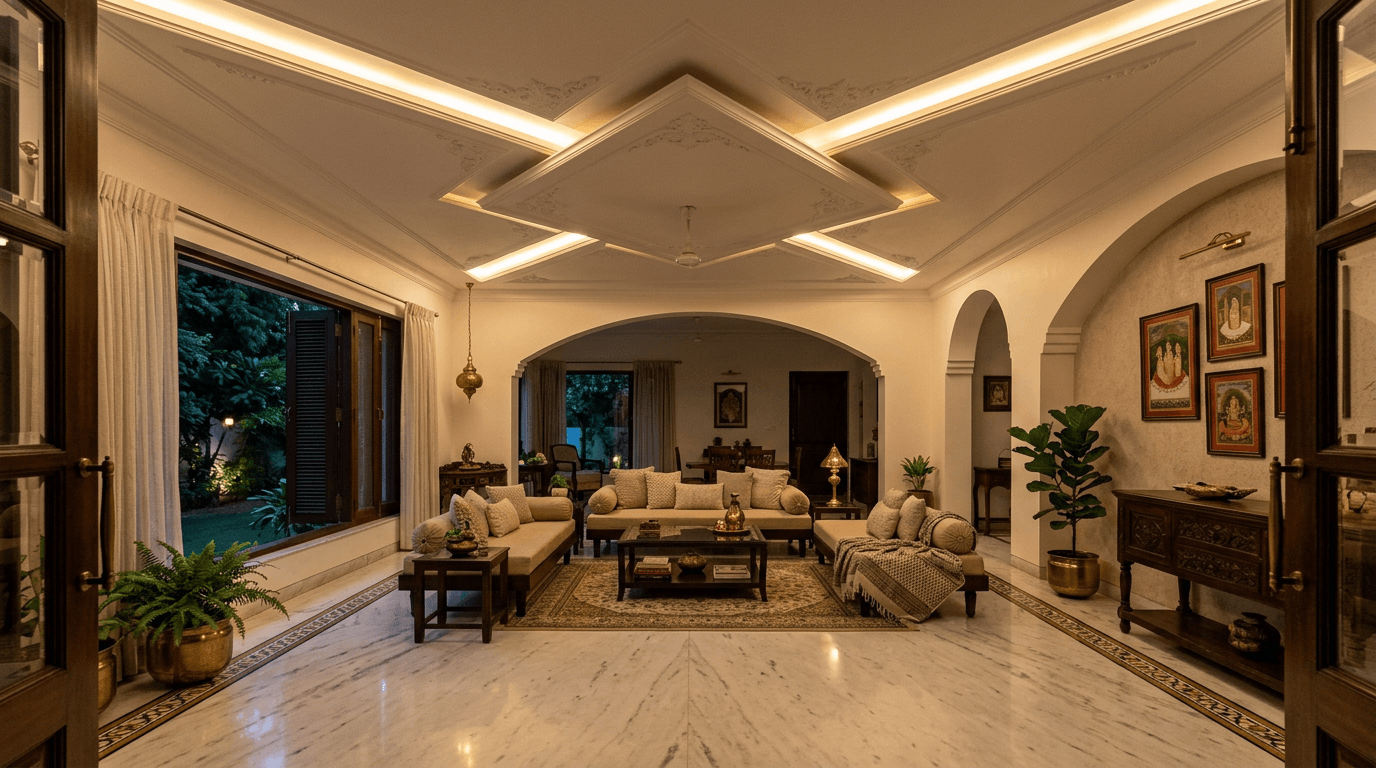
5. Four corner arms
Only the corners get treatment: four L-shaped raised brackets, nothing across the middle. The cheapest way to make a hall feel finished, and our standard suggestion for rental-grade work. As a normal POP design goes, nothing is faster.
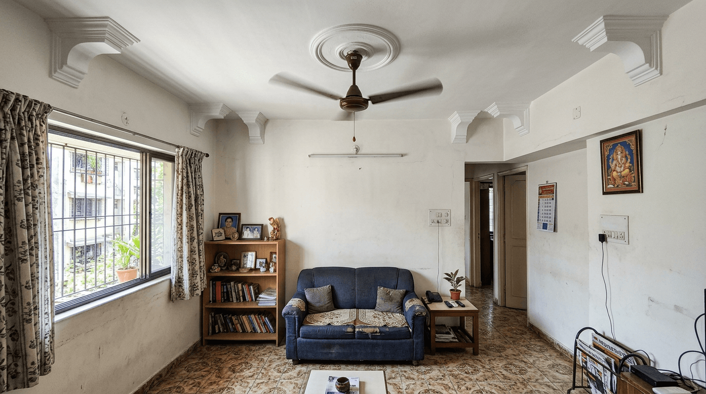
6. Curved plus with rounded ends
Same band, but the corners are radiused instead of mitred. Curved designs soften a hard-edged room, and POP handles curves far more gracefully than board does. Curved plus-minus pop design work is where a good plasterer earns the money.
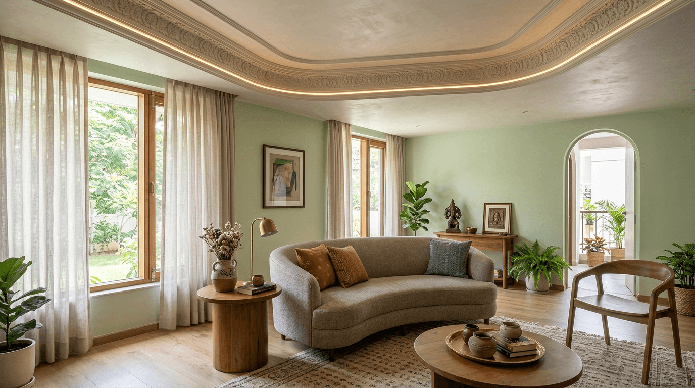
7. Two-tone groove
The raised sections stay white, the recessed channel is painted a deeper shade. No lighting, no extra plaster, just paint used with some nerve. This is a pop design with colour at its most restrained.
8. Ring around the fan point
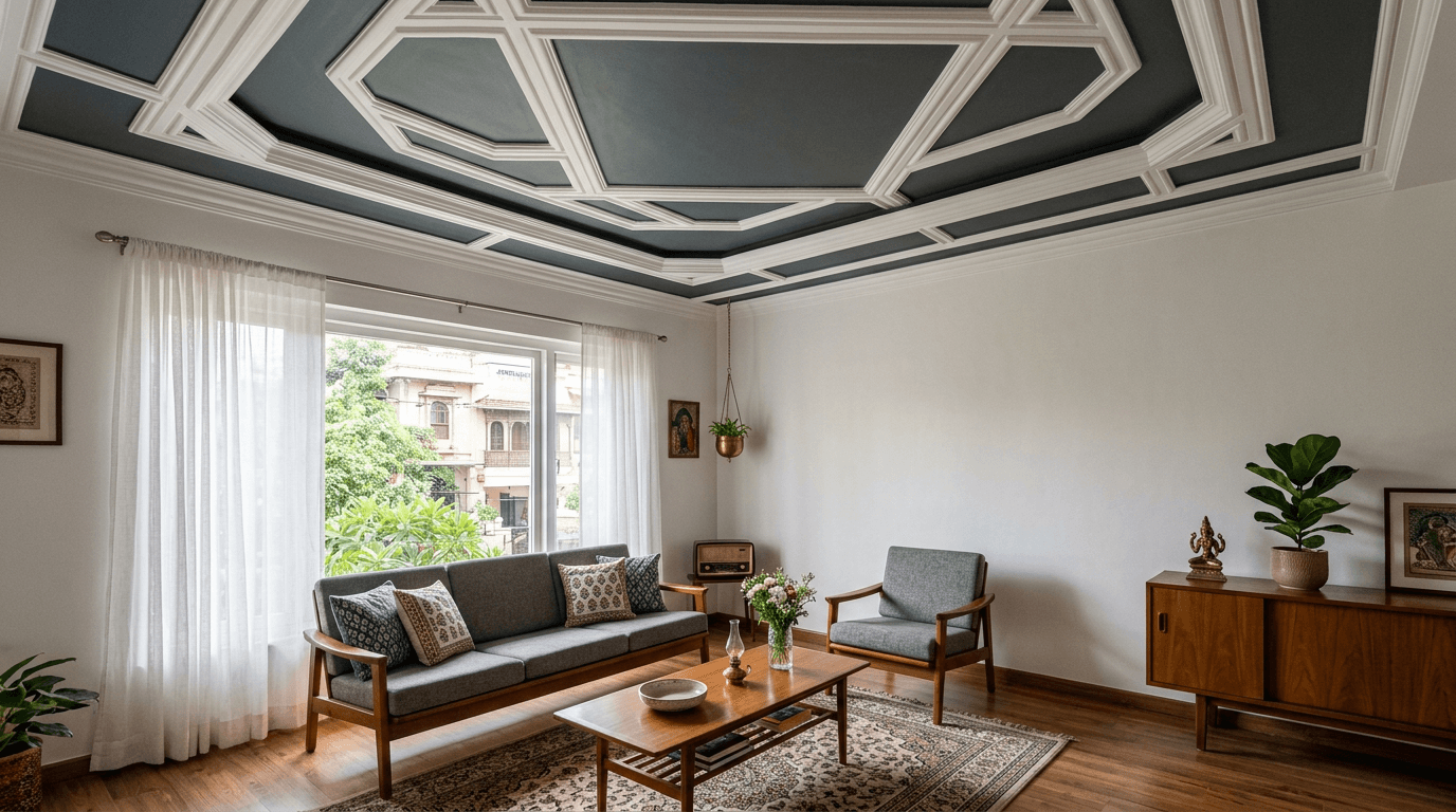
A raised circle centred on the fan hook, with a groove just outside it. It makes the fan look intentional instead of apologetic, which is a problem most hall ceilings never solve. A neat plus-minus pop design trick for a fan-centred room.
9. Stepped triple minus
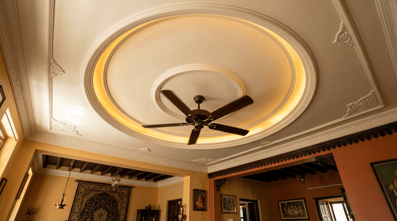
Three shallow grooves stacked at the perimeter, each only about half an inch deep. You get genuinely layered designs without losing real height. A stepped ceiling design at a fraction of the height cost.
10. Wall-to-ceiling continuous plus
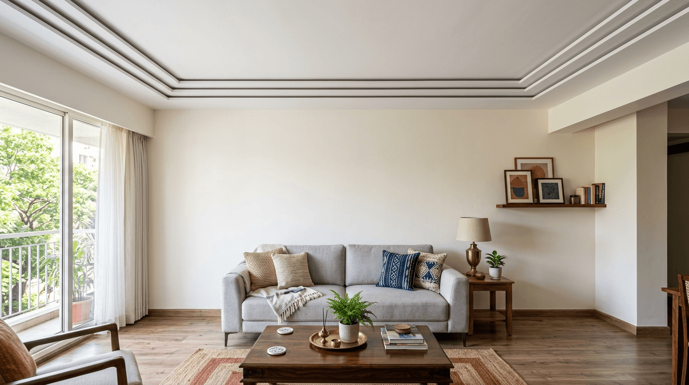
The raised band turns the corner and runs down the feature wall behind the television. It ties the two surfaces into one gesture and hides the wiring drop on the way. A bold ceiling design and a wiring solution in one move.
11. Grid of small recessed squares
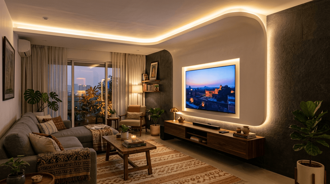
A field of shallow square minus panels, like a coffer without the depth. Best in long halls where a single band would look stranded. This patterned relief suits long rooms and open living rooms.
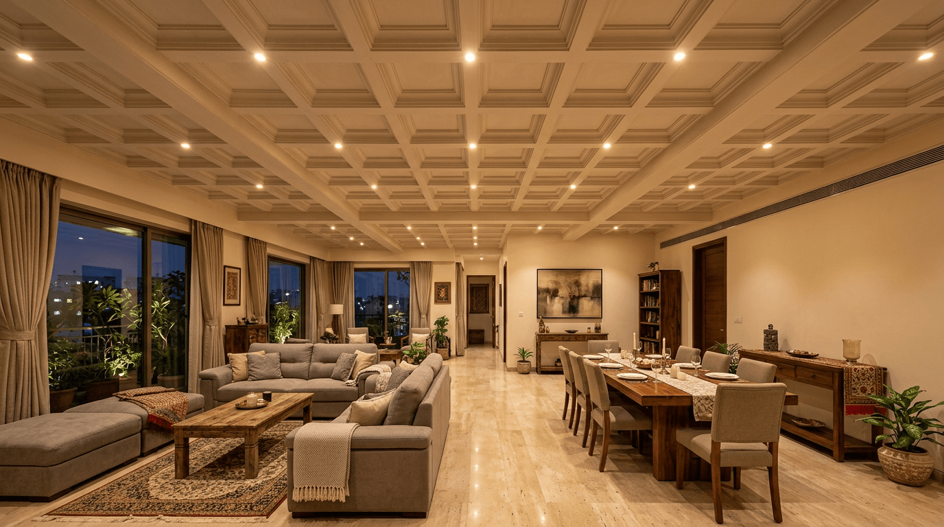
12. Asymmetric offset band
The band sits deliberately off-centre, aligned to the seating zone rather than the room. In a rectangular hall this reads more confident than a centred rectangle ever does. A modern plus-minus pop design that ignores the room's centre on purpose.
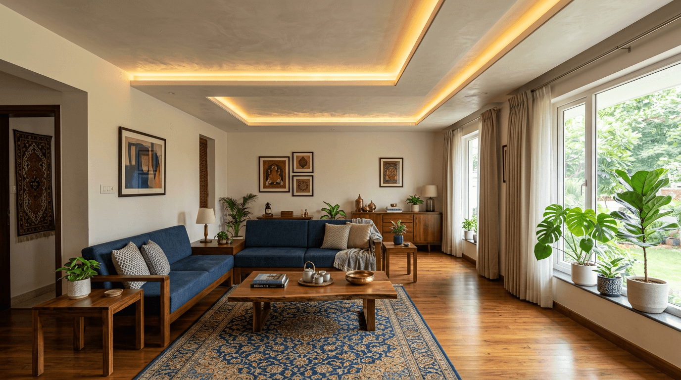
If you want the full range of hall ceilings beyond this style, our false ceiling designs for hall gallery covers gypsum, wood and cove-led options too.
10 Plus Minus POP Ceiling Designs for the Bedroom
The bedroom is read lying down, in the dark, from a pillow. That changes everything. Glare matters more than geometry here. Clients search for this as bedroom modern pop plus-minus design, and the honest answer is that the best plus-minus pop designs for bedrooms are quieter than anything you would do in the hall.
13. Bed-aligned raised rectangle
The plus mirrors the bed's footprint, directly above it. Nothing else. It frames where you sleep and makes the room read composed the moment you walk in. As bedroom plus-minus work goes, this is the whole idea in one move.
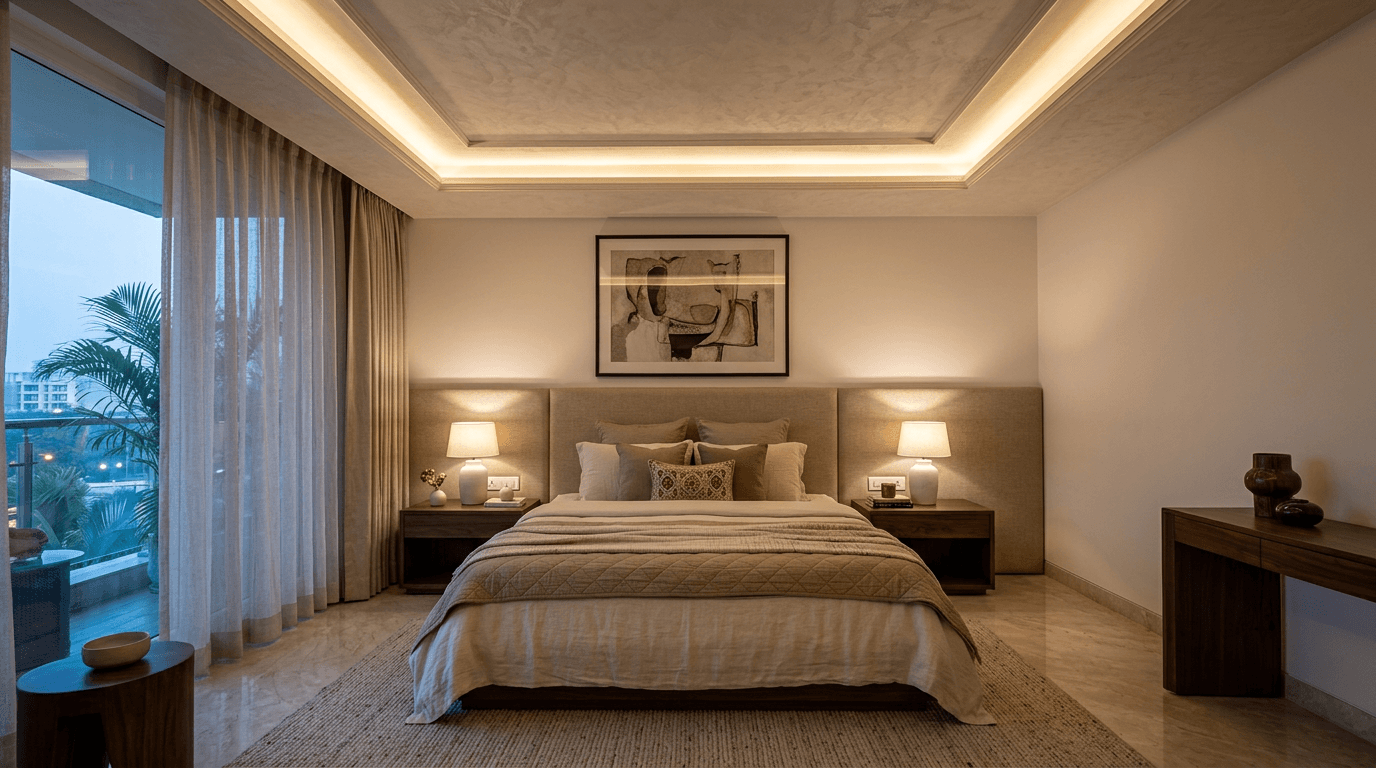
14. Headboard-side channel
A single recessed groove runs across the slab above the headboard wall, with a strip washing down the wall. No spot ever points at your face. A quiet POP design for light sleepers.
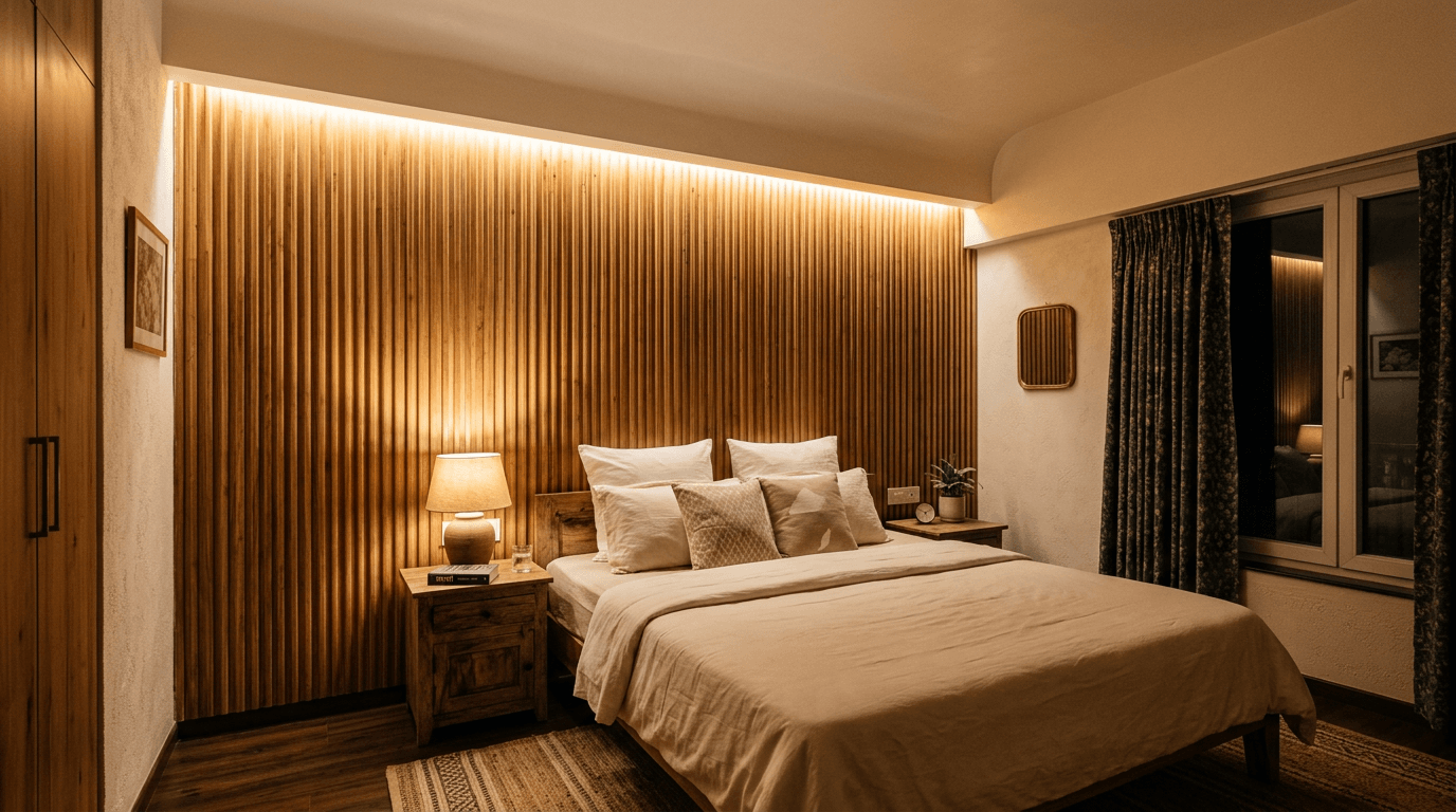
15. Slim single line
One groove, one strip, one metre from the wall. The most minimal design in this gallery, and a minus pop design for room sizes under 120 sq ft that we spec constantly.
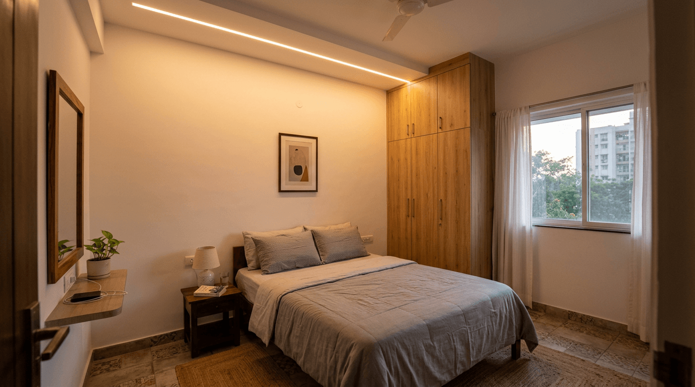
16. Rounded-corner frame with cove lighting
A perimeter plus with radiused corners and a continuous warm glow. It is the cosy option, and the glow does most of the work. This POP design leans entirely on the light.
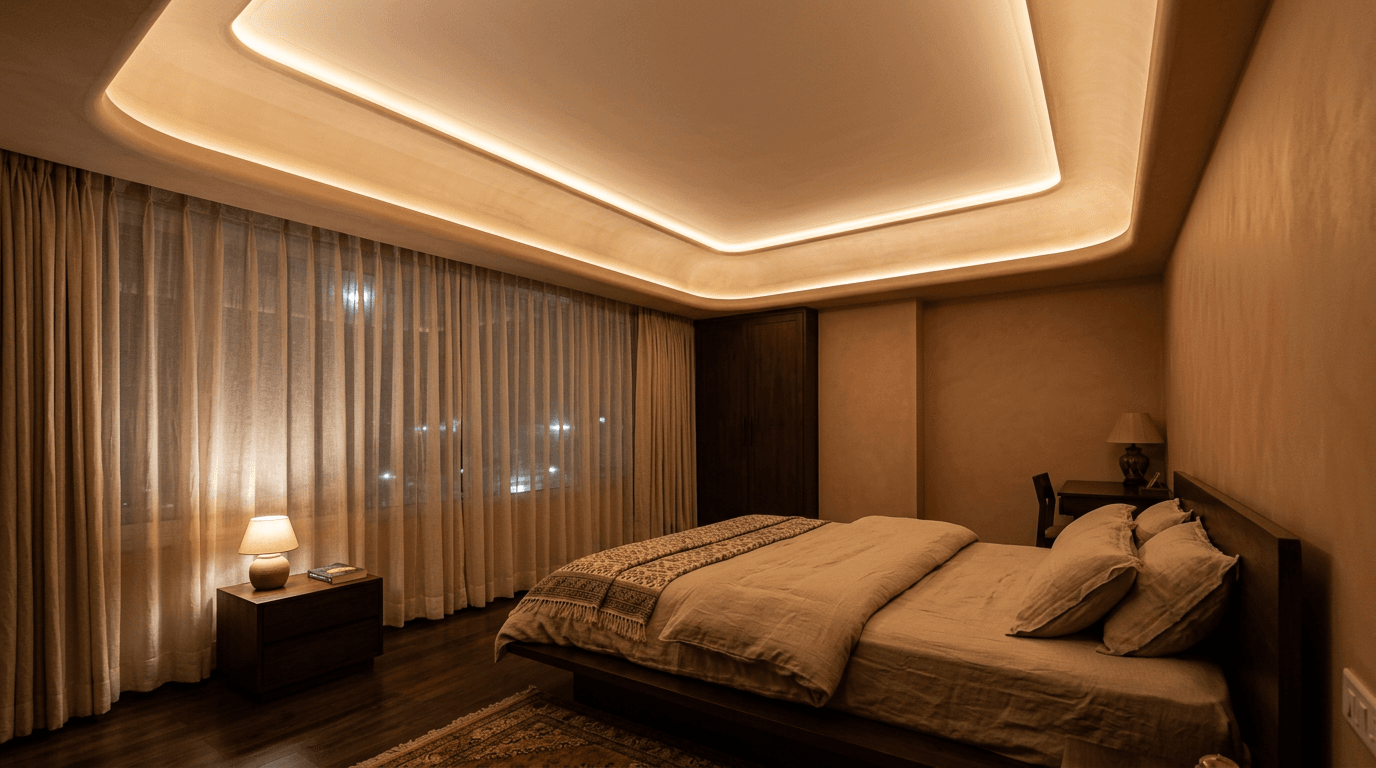
17. Lengthwise twin grooves
Two parallel channels running along the room's long axis. In a narrow room, lines that follow the length make the room read longer and calmer. A narrow-room ceiling design that stretches what you have.
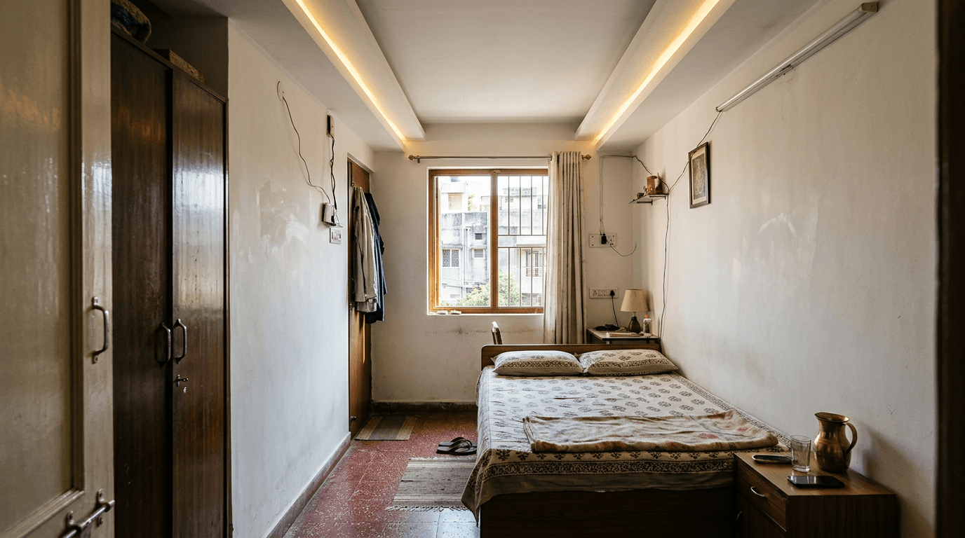
18. Wardrobe-side drop
The raised section covers only the wardrobe wall, concealing the loft line and the curtain pelmet together. The sleeping half of the slab stays untouched. Half a POP design, and often the smarter half.
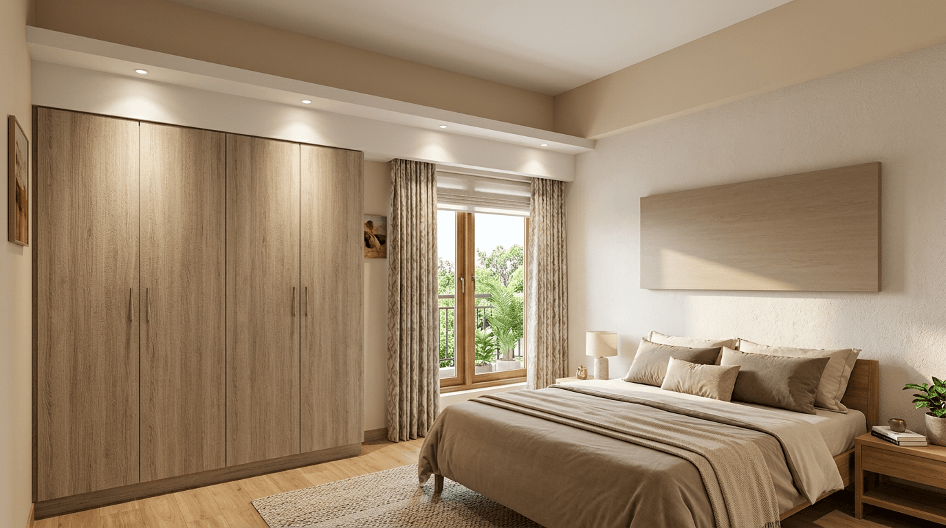
19. Circular plus over the bed
A raised disc centred on the bed, edged by a shallow groove. In a large master suite it gives you a stunning ceiling focal point without a chandelier.
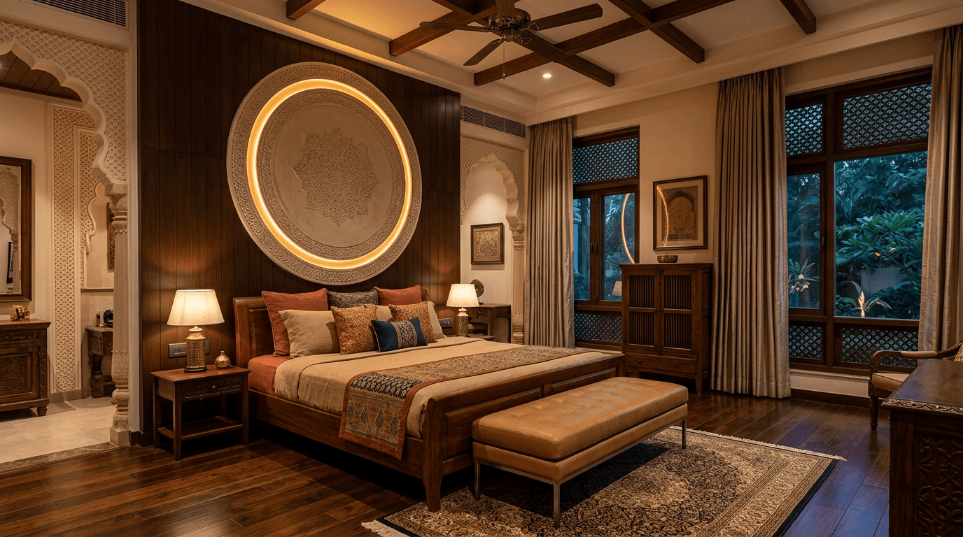
20. Twin lines with tunable white
Two grooves, both fitted with tunable strips. Cool in the morning, warm at night, both from the same fitting. Worth the extra wiring if you work from the room. Few pop plus-minus designs earn their keep quite this way.
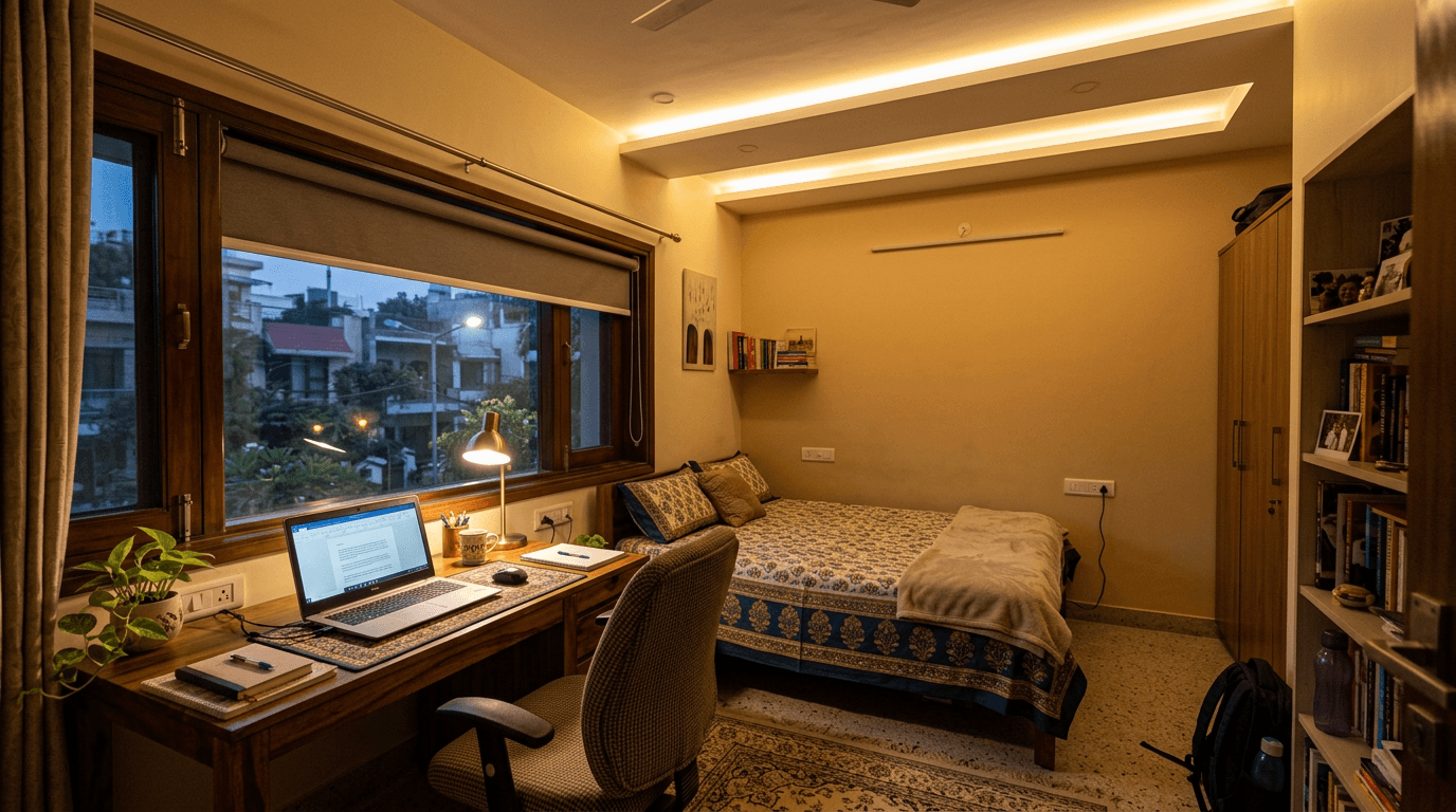
21. Plus frame with a textured centre
The raised frame stays crisp and white while the panel inside gets a fine lime-wash texture. Quiet contrast, no colour required. A unique design that costs nothing but attention.
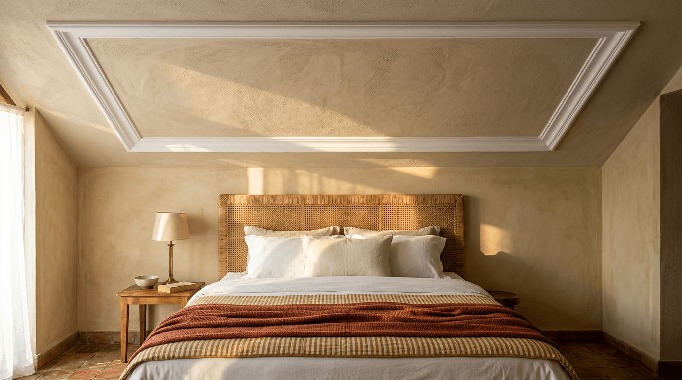
22. Low-slab minimal plus
For rooms under about nine feet: a raised band no more than an inch proud, no groove, no strip. It is barely there, and that is the point. On a low slab this plus-minus ceiling design is usually the only honest answer.

For bedroom ceilings beyond this technique, including gypsum trays and island designs, see our bedroom ceiling design gallery.
6 POP Plus Minus Designs for Porch
A porch ceiling lives outdoors in everything but name. Sun, driven rain, and in most Indian cities a fair amount of dust. POP is not a marine-grade material, so the rule here is simple: only use it where the soffit is genuinely sheltered, keep the relief shallow so water never sits in a groove, and use exterior-grade paint over it.
23. Simple entrance rectangle
One raised band over the entrance mat, sized to the door width. It signals the threshold and takes about a day of work. The simplest POP design for porch soffits we draw.

24. Edge channel with a hidden strip
A groove running along the outer edge of the sheltered soffit, lit from inside. At night the whole entrance glows without a single visible fitting. A pop ceiling design that only shows itself after dark.
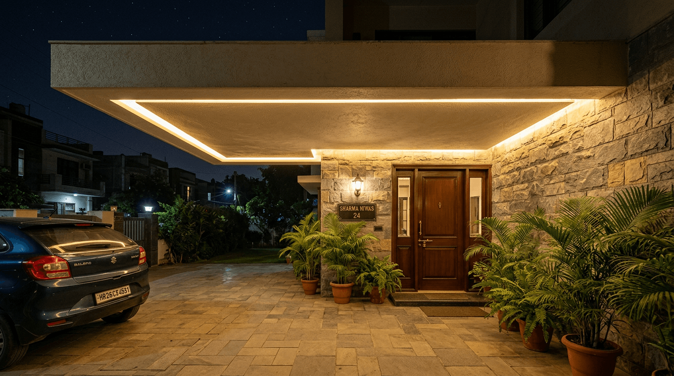
25. Wave form for a curved porch
The band follows the curve of the projecting slab. Curves are where plaster beats every board product, and a car canopy is usually curved.
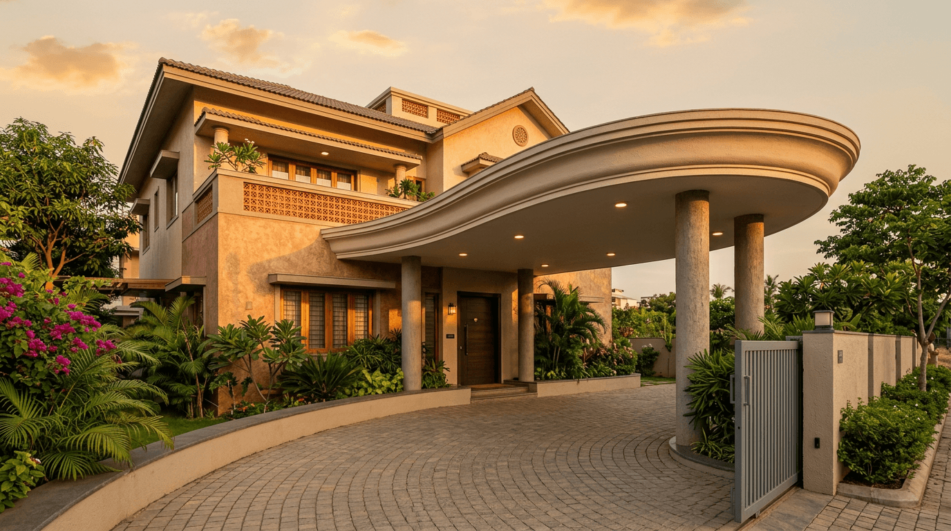
26. Wooden batten inserts
Raised plaster bands alternating with WPC or treated wood battens in the recessed sections. Warmth outdoors without exposing real timber to weather. It is the warmest POP design in this section.
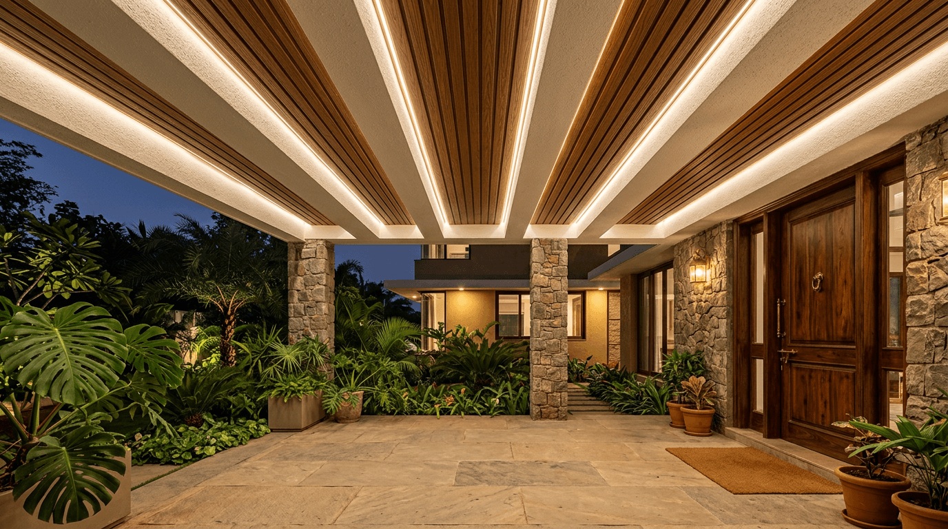
27. Long grid for a car canopy
A repeated rectangular grid running the length of a two-car entrance, with a light at every third module. It gives a long soffit rhythm instead of blankness.
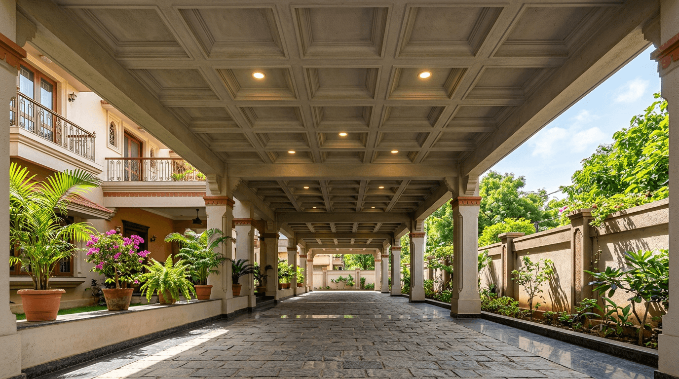
28. Compact plus with a pendant point
A small raised square around a single pendant drop. For narrow entrances where a full pattern would crowd the space. A compact ceiling design for a small threshold.
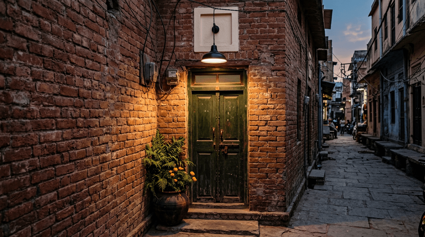
We used this restraint on Adit's farm house near Srikakulam, a traditional courtyard home for a family that had moved to Dubai and wanted the house to feel like the one they remembered. On a building like that, the entrance soffit should not shout.
6 Plus Minus Designs for Children's Rooms and Dining
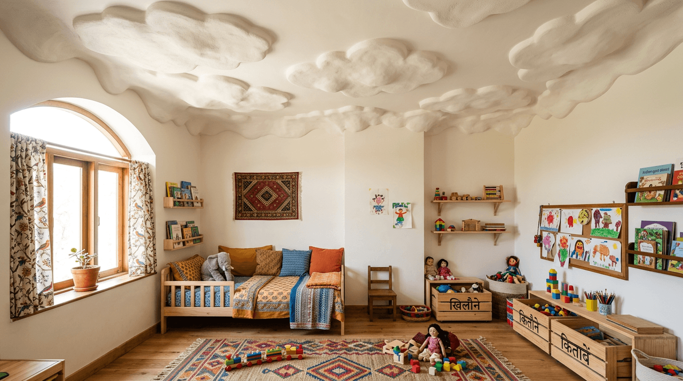
29. Cloud form for a kids room
Soft irregular raised shapes over the play zone, painted the same white as everything else so it never turns into a theme the child outgrows by nine. A kid's room POP design that survives growing up.
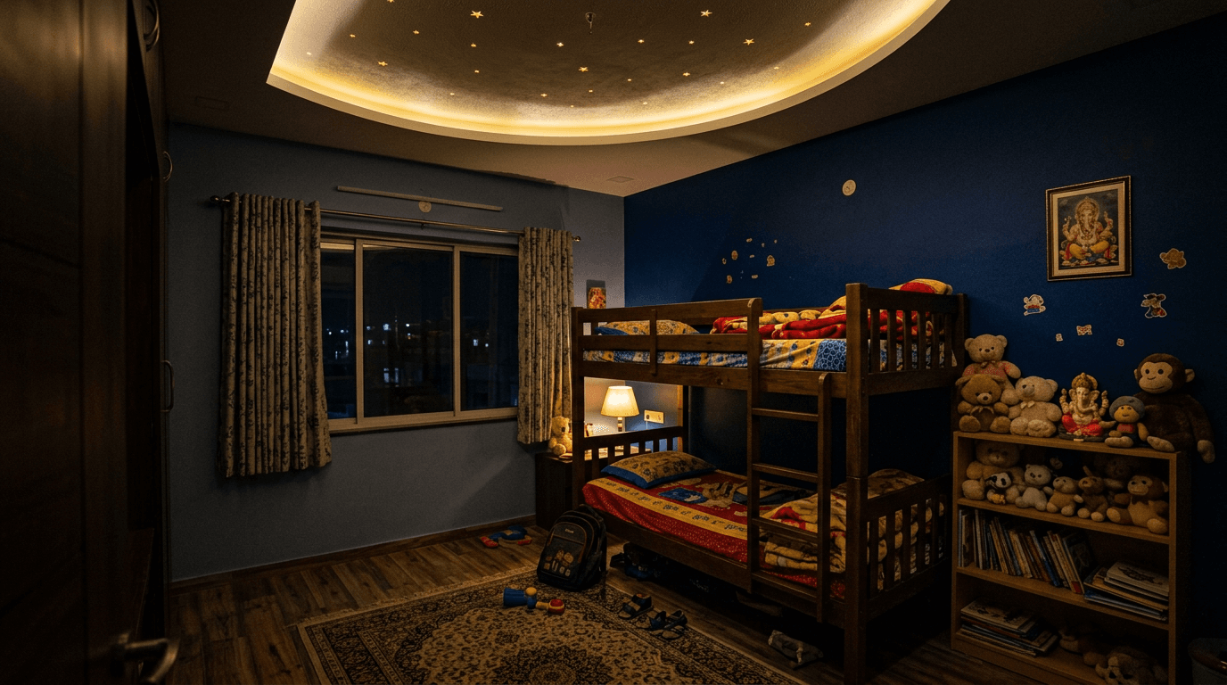
30. Star and arc grooves
Recessed lines forming a simple arc and a few star points, lit with a low-output warm strip that doubles as a night light. One of the gentlest pop design ideas for a kid's bedroom.
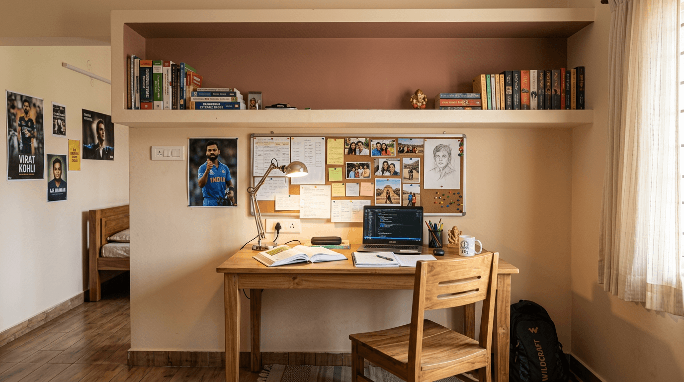
31. Two-tone study corner
The raised band stops over the study desk and the recessed panel above it is painted a deeper tone, visually zoning work from sleep in a shared room. A simple ceiling design trick for zoning.
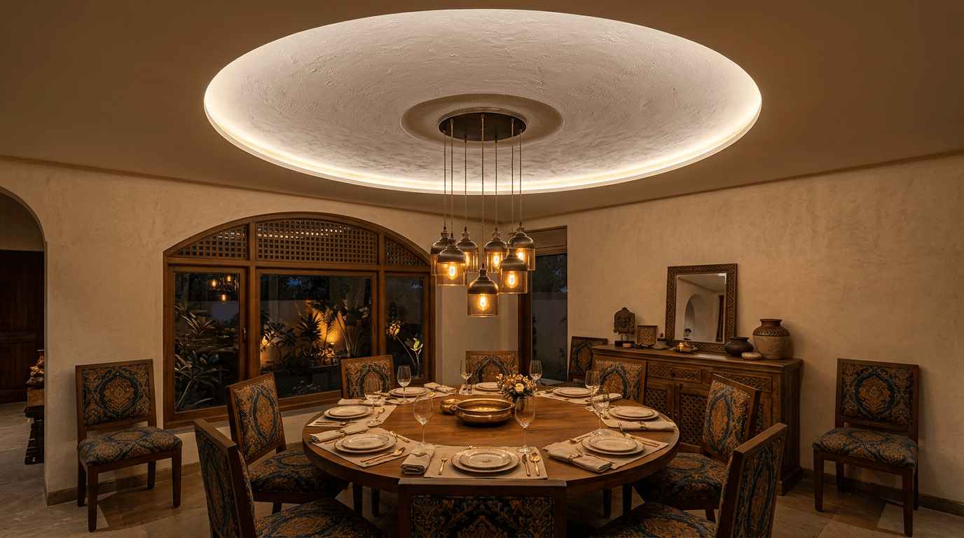
32. Round plus over the dining table
A raised disc centred on the table with a pendant dropping through it. The oldest trick in dining rooms and still the most reliable plus minus design for dining tables.
33. Rectangle mirroring the table
Same idea, rectangular. The raised form matches the table's outline exactly, which makes a long dining table look deliberately placed rather than squeezed in. A balanced design when the table runs long.
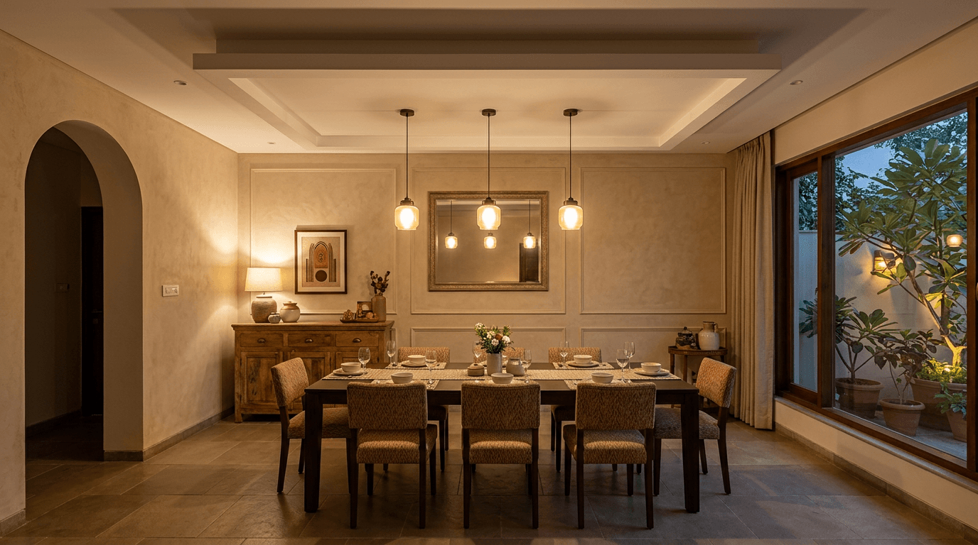
34. Slim border for open-plan dining
In a combined hall and dining, a thin recessed border marks where one zone ends and the other begins, without a partition. This ceiling design does the work a wall would.
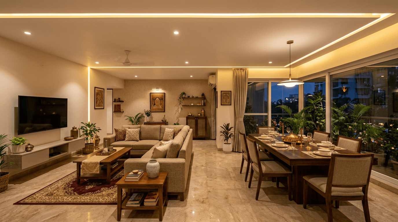
Mrs. Padmavathi's apartment at Pushpa Nilayam is the version of this problem we see most often: a 1,000 sft flat bought from a retired couple, with a separate living and dining area laid out for a completely different family. Zoning overhead was the cheapest way to make the plan read as one home again.
6 POP Designs With Colour and Geometric Patterns
Colour overhead frightens people, and mostly it should. Geometric relief has the same problem: it photographs better than it lives. But used inside a recessed groove, where you see the tint and not the surface, it behaves.
35. Colour-filled grooves
Raised sections white, channels painted in the room's accent shade. From the sofa you read a coloured line, not a coloured ceiling. A restrained POP design for people who fear colour overhead.
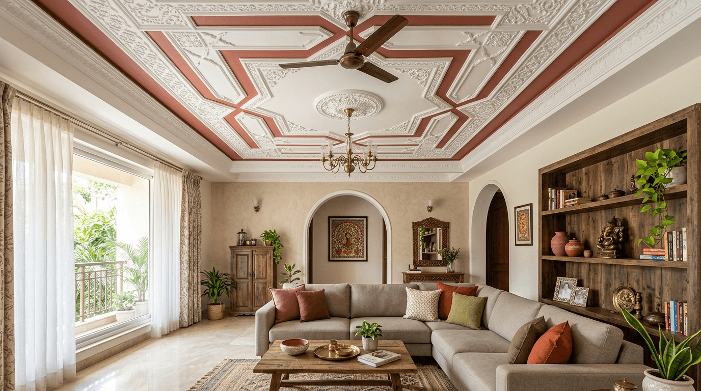
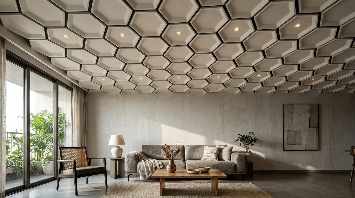
36. Hexagon facets
Repeating hexagonal raised panels in a strict geometric grid. Angular pattern pop work like this photographs extremely well, which is why it fills every inspiration board on Pinterest. It is probably the most saved POP design of the lot.
37. Chevron lines
Parallel grooves running at forty-five degrees, chevroned at the room's centre line. Strong angular patterns, and cheap, because it is all groove and no build-up. The most affordable ceiling design on this page.
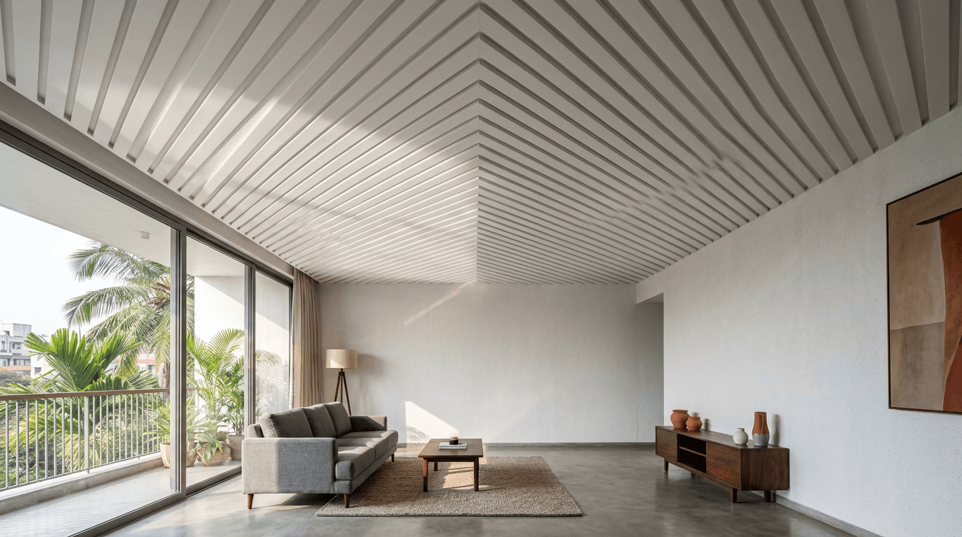
38. Contrast centre panel
The recessed centre is painted a deep shade while the raised border stays white. It lowers the visual height slightly, so keep it for rooms above ten feet. A modern twist on the classic bordered POP design.
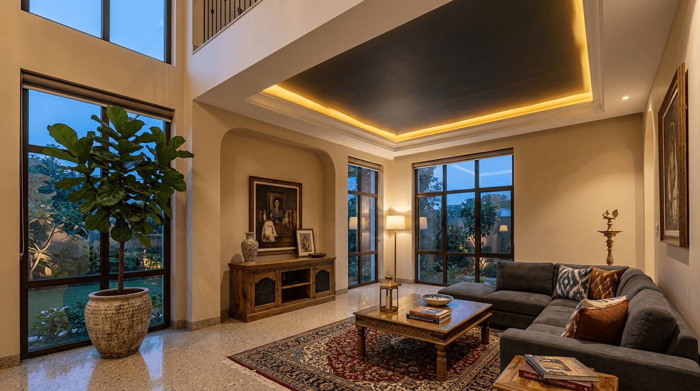
39. Concentric squares
Two or three squares nested inside each other, alternating raised and recessed. Symmetrical, formal, and a natural fit for a vastu-led plan built on a centred grid. Simpler designs rarely look this deliberate.
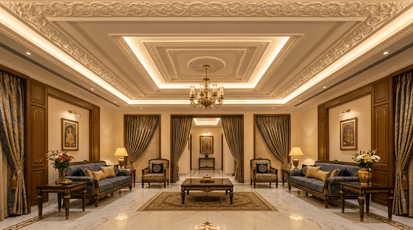
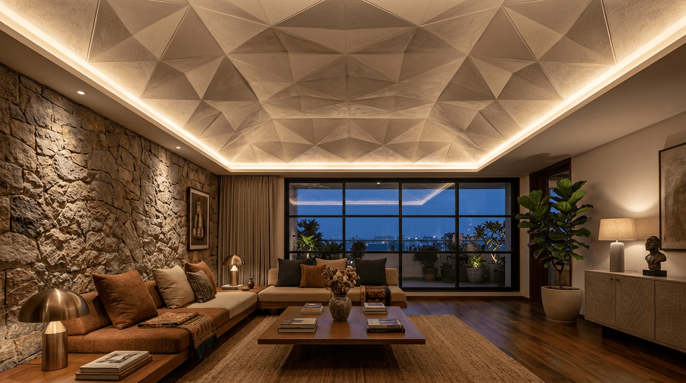
40. Triangular faceted panel
A single large panel broken into shallow triangular facets, each catching light differently. It is the most sculptural idea here and needs a skilled hand: a genuinely stunning plus-minus pop design when the plasterer is good, and a mess when they are not.
Restraint note, and we mean it: Dr. Kirti Goud's 4,000 sft apartment at My Home Bhooja was designed for rental, and the brief was finishes that almost anyone would accept. Timeless beat fashionable every time on that project. If a home is going on rent, choose from the first twelve designs on this page, not these six.
5 Double Fan Plus Minus Designs for Large Halls
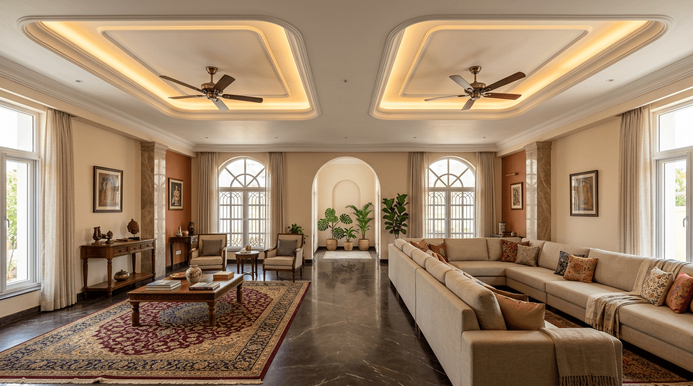
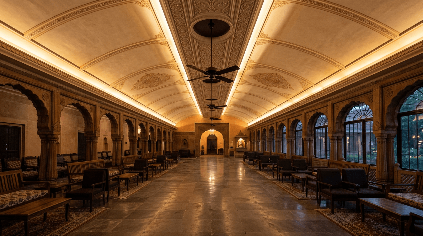
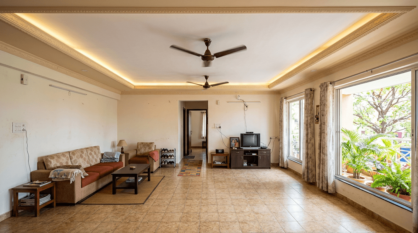
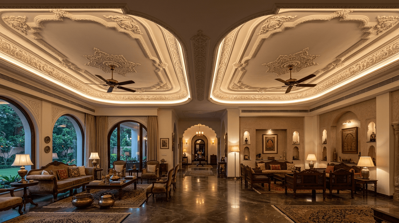
Once a hall is longer than about eighteen feet, one fan stops being enough, and a double fan layout changes the whole composition. Two fan points on one slab means the pattern has to be symmetrical about the long axis, or it will look wrong from the sofa forever.
41. Twin rectangles, one per fan
Two matching raised rectangles, each centred on a fan point. Simple, symmetrical, and it makes two fans look planned. A safe POP design for hall lengths over eighteen feet.
42. Central spine with two fan openings
One long raised band running the length of the room, with circular openings where the two fans drop through. One long ceiling design instead of two competing ones.
43. Peripheral band with generous fan clearance
The band stays at the walls, both fans stay on open slab. The safest choice when the slab height is tight and the room is wide, and the most forgiving pop ceiling design for a big hall.
44. H-form connector
Two raised zones joined by a narrow bridge, forming a stretched H. It breaks up a very large slab without needing pattern across the whole area. A modern pop plus-minus design for very large slabs.
45. Split form for hall and dining
Two related shapes, one over the seating and one over the table, each with its own fan and its own light circuit. One design language, two living spaces.
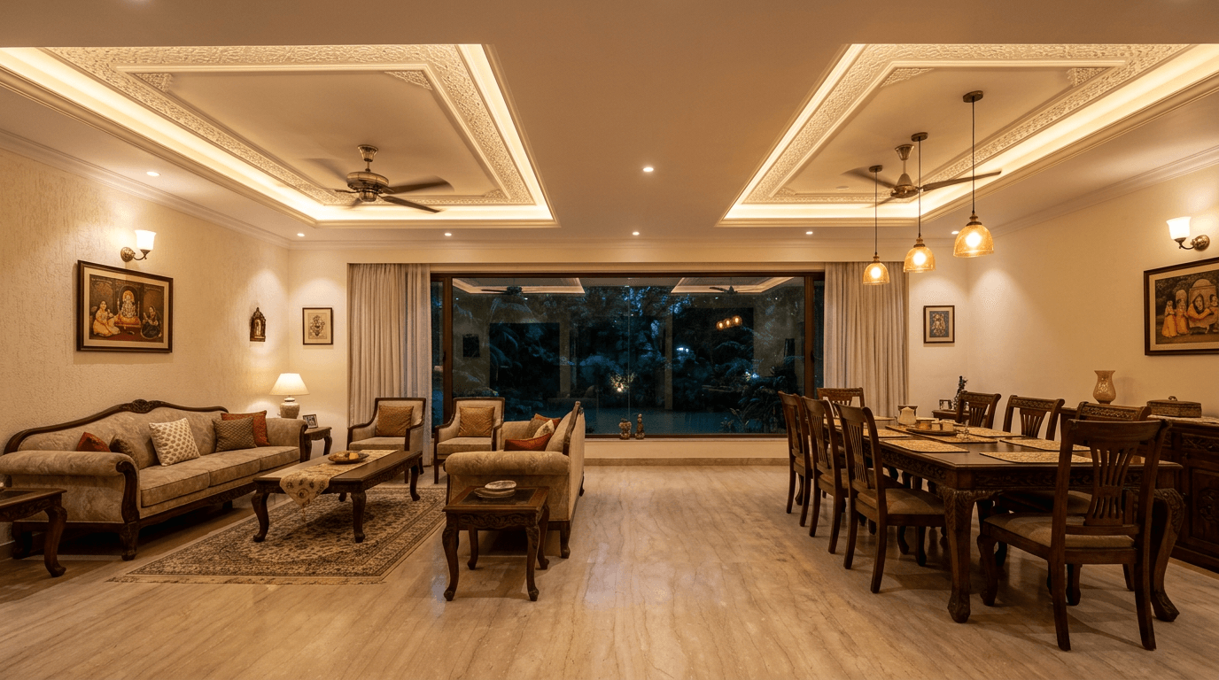
Hamsini's five-bedroom home in Hyderabad is the reason we think about this carefully. Three generations, one shared hall, and everybody in the family with different ideas about how much air they wanted moving. Fan positions came first on that drawing. The pattern followed.
Plus Minus POP Design Trends for 2026
Four things changed in what clients ask us for, and they all point the same way: less plaster, better light.
- Shallower relief. Two inches, not four. In modern homes with 9.5-foot slabs, depth is the first thing that makes a room feel small.
- One shape, not five. Most pop plus-minus designs we draw now use a single confident band or disc, which has replaced the three-layer arrangement that defined the 2010s. A modern plus minus pop design for roof slabs in 2026 is closer to a picture frame than a wedding cake.
- Warm, dimmable, concealed. Colour-changing strips are fading. Cove lighting at 2700K to 3000K on a dimmer is what people actually live with.
- Plaster paired with something else. The strongest plus-minus pop design work in 2026 mixes materials: a wood batten insert, a textured panel, a painted recess. The contrast does the work that extra layers used to do.
What has not changed: the fan still decides the layout, and a rushed drying schedule still cracks the finish. Whatever else moves, the best ceiling design in 2026 is still the one your slab height can carry.
Plus Minus POP vs a Suspended False Ceiling
Both are worth doing, and plenty of homes end up with one ceiling design in the hall and the other in the kitchen. They just solve different problems, and a contractor who only sells one will not tell you that.
| Plus-minus POP design | Suspended false ceiling | |
|---|---|---|
| Fixed to | The concrete slab directly | A metal grid hung below the slab |
| Height lost | Roughly the thickness of the relief, an inch or two at the edges | Typically four to six inches across the whole room |
| Hides services | Slim conduit and light lines only | Ducting, cassette AC bodies, deep pipe runs |
| Curves and relief | Excellent, plaster is shaped wet on site | Possible but slower, boards must be cut and jointed |
| Repair | Patch and repaint locally | Open a panel, but joints may show after |
| Best for | Low slabs, elevated relief, fan-centred halls | Service-heavy rooms, flat modern planes, acoustic infill |
Neither is a substitute for a proper drawing, and both belong in the same conversation as the wider family of false ceiling designs. If you are still choosing between false ceiling designs and materials, the full comparison lives in our false ceiling design guide, and the technique behind the plaster itself is covered in our POP design guide.
Sizing Rules: Slab Height, Proportion and Fan Clearance
Three numbers decide whether a ceiling design works before anyone argues about the shape.
- Slab height. Above about ten feet, you can afford deeper relief and more levels. Between nine and ten feet, keep the projection under two inches. Under nine feet, a single shallow band or grooves only.
- Room proportion. The raised form should sit within roughly the middle two-thirds of the room, with a clear margin to the walls. A band that runs too close to the wall makes the ceiling look tighter and the room smaller than it is.
- Fan clearance. Keep the relief clear of the fan's swept circle plus a comfortable margin, so airflow does not stall against a plaster edge. The fan hook stays in the slab, always, because that is where the load belongs.
One more, less about numbers: decide the lighting options before the plaster goes on. Concealed strips, spots, a pendant drop, a speaker cut-out. Every one of them changes the drawing.
What Actually Moves the Price
We do not publish rate cards in articles, because a genuine quote depends on your city, your slab, and how much relief you are asking for. What we can do is tell you which levers move a ceiling design quotation, so you can read one properly.
- Area covered. A perimeter band covers a fraction of the slab area of a full-field pattern. This is the biggest single lever, and it is entirely your choice.
- Number of levels. Each additional raised or recessed level is more marking, more build-up and more finishing time.
- Curves and facets. Curves and faceted panels take skilled labour and longer. Straight bands are quick.
- Lighting points. Concealed strips, spots and drop points usually bill separately, per point, over the plaster rate.
- City and labour rates. The same design costs differently in Hyderabad, Bangalore and a tier-2 town.
- Painting and finishing. Primer plus two coats over fresh POP is not optional, and it is often quoted separately.
Ask for the quotation to be itemised against a drawing, with area, levels and light points listed. For rate benchmarks across ceiling types, our false ceiling price guide is the place to look.
Mr. Srinivasa Rao's two small apartments in Hyderabad, F1 at 500 sft and F2 at 550 sft, are a good reminder of where the money should go. Both were renovated with minimum intervention, and both went on to earn better rent. Neither needed an elaborate ceiling to get there.
Mistakes We Keep Fixing
- Painting too early. Fresh POP that has not dried fully will craze under primer. This is the number one cause of hairline cracks in a new ceiling design.
- Ignoring the fan point. A pattern marked from the walls, with the fan landing off-centre inside it. It cannot be unseen afterwards.
- Relief that is too deep for the room. Four inches of build-up in a nine-foot room makes the whole home feel low. Match the ceiling design to the room, not to a photo.
- Cold light in a warm room. Daylight-white strips inside a groove make plaster look grey and blotchy. Warm white is kinder to the material.
- No drawing. Deciding on site, by pointing. It is how rooms end up with the right design for the hall drawn in the wrong place.
On maintenance: POP is easy to live with. Dust the relief occasionally, keep it away from persistent damp, and repaint every few years with the walls. If a corner chips in a plus-minus POP relief, a plasterer can rebuild that section and blend it, which is genuinely easier than patching a jointed board. What POP does not tolerate is a leaking slab above. Fix the leak first, always, because plaster will keep failing over a wet slab no matter how good the finish is.
